Python has gained immense popularity as a programming language, largely due to its simplicity and versatility. Tkinter emerges as a robust and beginner-friendly toolkit for those looking to build graphical user interfaces (GUIs) in Python. This comprehensive guide will explore Python GUI programming with Tkinter, examining its features, capabilities, and best practices. By the end, you will be equipped to create interactive and visually appealing applications with proficiency.
Why choose Tkinter for GUI development in Python?
Python provides numerous choices for crafting Graphical User Interfaces (GUIs). Among these methods, the tkinter stands out as the prevalent choice. Serving as a standard Python interface to the Tk GUI toolkit included with Python, tkinter offers the swiftest and most straightforward approach for constructing GUI applications. The process of crafting a GUI with Tkinter proves to be effortlessly manageable.
Installing Tkinter: Setup and requirements
* Make sure to install Python to your system before installing the Tkinter
* Install tkinter using the below command
sudo apt-get install python3-tk
* If you are using the customkinter install it using the command below.
python3 -m pip install customtkinter
Starting to create a Tkinter application
1. Importing required modules
import tkinter as tk
import customtkinter as ctk
Here, we import ‘tkinter’ and ‘customtkinter’. We will develop the application using customtkinder, hence we import it accordingly.
2. Creating the main window of tkinter GUI application
class GUIApp(ctk.CTk):
   width = 950
   height = 650
   def __init__(self, *args, **kwargs):
       super().__init__(*args, **kwargs)

if __name__ == '__main__':
   app = GUIApp()
   app.mainloop()
* The above code is to define a class named GUIApp that inherits from ctk.CTk. It seems that customtkinter is a module or library being used in this code.
* The constructor method (__init__) for the GUIApp class. It is called automatically when an instance of the class is created.
* The *args and **kwargs are used to accept any number of positional and keyword arguments, respectively, to provide flexibility when initializing the class.
* super().__init__(*args, **kwargs) calls the constructor of the superclass (ctk.CTk). This ensures that any necessary initialization defined in the superclass is executed.
* The script checks if it is run directly, and if so, it creates an instance of the GUIApp class named app.
* app.mainloop() starts the main event loop of the GUI application, allowing it to respond to user inputs and events until the application is closed or terminated.
Layout management
Tkinter provides functionality for managing the layout and positioning of widgets within parent windows. This includes three primary geometry manager classes:
1. The `pack()` method: This arranges widgets in blocks before positioning them within the parent widget.
2. The `grid()` method: This organizes widgets in a grid or table-like structure before placing them within the parent widget.
3. The `place()` method: This enables the programmer to specify exact positions for widgets within the parent window.
import tkinter as tk
import customtkinter as ctk


class GUIApp(ctk.CTk):
   width = 1950
   height = 1650


   def __init__(self, *args, **kwargs):
       super().__init__(*args, **kwargs)


       # Create a frame for the pack geometry manager
       pack_frame = ctk.CTkFrame(self)
       pack_frame.pack(fill=tk.BOTH, expand=True)


       # Create a frame for the grid geometry manager
       grid_frame = ctk.CTkFrame(self)
       grid_frame.pack(side=tk.LEFT, fill=tk.BOTH, expand=True)


       # Create a frame for the place geometry manager
       place_frame = ctk.CTkFrame(self)
       place_frame.place(x=100, y=100)


       # Create and pack widgets in the pack_frame
       label_pack = ctk.CTkLabel(pack_frame, text="Pack Example")
       label_pack.pack(fill=tk.BOTH, expand=True)


       # Create and grid widgets in the grid_frame
       label_grid = ctk.CTkLabel(grid_frame, text="Grid Example")
       label_grid.grid(row=0, column=1, padx=10, pady=10)


       # Create and place widgets in the place_frame
       label_place = ctk.CTkLabel(place_frame, text="Place Example")
       label_place.place(x=50, y=50)


if __name__ == '__main__':
   app = GUIApp()
   app.mainloop()
* The pack() method is used to pack a widget.
* The grid() method is used to place a widget in the grid layout.
* The place() method is used to place a widget at specific coordinates
Exploring widgets in custom tkinter
1. CTkLabel:
It's one of the widgets in the custom tkinter and is used to display some text in the window.
label = ctk.CTkLabel(self, text="Its a sample text")
label.place(x=70, y=50)
The main arguments are:
master | root, tkinter.Frame or CTkFrame |
text variable | tkinter.StringVar object |
text | string |
width | label width in px |
height | label height in px |
corner_radius | corner radius in px |
fg_color | foreground color, tuple: (light_color, dark_color) or single color or "transparent" |
text_color | label text color, tuple: (light_color, dark_color) or single color |
font | label text font, tuple: (font_name, size) |
anchor | controls where the text is positioned within a widget if the widget has more space than the text requires. The default value is "center", which centers the text within the available space. |
compound | control the position of the image relative to the text, default is "center, other are: "top", "bottom", "left", "right" |
justify | determines the alignment of multiple lines of text within a widget, allowing you to align the text to the left, center it (the default), or align it to the right. |
padx | extra space added left and right of the text, default is 1 |
pady | extra space is added above and below the text, the default is 1 |
2. CTkEntry
The CTkEntry widget in CustomTkinter provides a versatile tool for accepting text input from users within a graphical user interface (GUI) developed using Tkinter.
userName = ctk.CTkEntry(self, width=350, height=45, fg_color='white',
                       text_color='#222222')
userName.pack(pady=50)
userPassword = ctk.CTkEntry(self, width=350, show='*', height=45,
                           fg_color='white', text_color='#222222')
userPassword.pack(pady=10)
Arguments:
| argument | value |
master | root, tkinter.Frame or CTkFrame |
text variable | tkinter.StringVar object |
width | entry width in px |
height | entry height in px |
corner_radius | corner radius in px |
fg_color | foreground color, tuple: (light_color, dark_color) or single color or "transparent" |
text_color | entry text color, tuple: (light_color, dark_color) or single color |
placeholder_text_color | tuple: (light_color, dark_color) or single color |
placeholder_text | hint on the entry input (disappears when selected), default is None, doesn't work in combination with a text variable |
font | entry text font, tuple: (font_name, size) |
state | "normal" (standard) or "disabled" (not clickable) |
3. CTkCheckBox
A checkbox, also known as a tickbox or checkmark box, is a GUI element that allows users to select or deselect an option by clicking on a small square box. When the box is checked, it typically displays a checkmark or a tick symbol, indicating that the option is chosen. If unchecked, the box remains empty, indicating that the option is not selected.
def checkbox_event():
   print("Checkbox toggled, current value:", check_var.get())


check_var = ctk.StringVar(value="on")
checkbox = ctk.CTkCheckBox(self, text="CTkCheckBox", command=checkbox_event, variable=check_var,
                          onvalue="on", offvalue="off")
checkbox.pack(pady=10)
* prints a message indicating the toggled state of a checkbox along with its current value
* command=checkbox_event: Specifies the function to be called when the checkbox is toggled.
* variable=check_var: Associates the checkbox with a Tkinter variable check_var.
* onvalue="on", offvalue="off": Defines the values to be assigned to the check_var when the checkbox is checked ("on") or unchecked ("off").
4. CTkOptionMenu
* The CTkOptionMenu serves as a drop-down menu that allows users to select from a list of predefined options.
* It is commonly used in graphical user interfaces (GUIs) to provide a compact way for users to choose from a set of values.
* The values argument holds a list of values that you want to display in the menu.
* When the user selects an option, you can associate a command function to execute.
Example code without the variable:
def optionmenu_callback(choice):
    print("Optionmenu dropdown clicked:", choice)
combobox = ctk.CTkOptionMenu(self, values=["option 1", "option 2"], command=optionmenu_callback)
combobox.pack(padx=20, pady=10)
combobox.set("option 2")  # Set initial value
With the variable :
optionmenu_var = ctk.StringVar(value="option 2")  # Set initial value
def optionmenu_callback(choice):
    print("Optionmenu dropdown clicked:", choice)
combobox = ctk.CTkOptionMenu(self, values=["option 1", "option 2"], command=optionmenu_callback, variable=optionmenu_var)
combobox.pack(padx=20, pady=10)
Arguments:
| Argument | Value |
master | root, tkinter.Frame or CTkFrame |
width | box width in px |
height | box height in px |
corner_radius | corner radius in px |
fg_color | foreground (inside) color, tuple: (light_color, dark_color) or single color |
button_color | right button color, tuple: (light_color, dark_color) or single color |
button_hover_color | hover color, tuple: (light_color, dark_color) or single color |
dropdown_fg_color | dropdown fg color, tuple: (light_color, dark_color) or single color |
dropdown_hover_color | dropdown button hover color, tuple: (light_color, dark_color) or single color |
dropdown_text_color | dropdown text color, tuple: (light_color, dark_color) or single color |
text_color | text color, tuple: (light_color, dark_color) or single color |
text_color_disabled | text color when disabled, tuple: (light_color, dark_color) or single color |
font | button text font, tuple: (font_name, size) |
dropdown_font | button text font, tuple: (font_name, size) |
hover | enable/disable hover effect: True, False |
state | "normal" (standard) or "disabled" (not clickable, darker color) |
command | function will be called when the dropdown is clicked manually |
variable | StringVar to control or get the current text |
values | list of strings with values that appear in the option menu dropdown |
dynamic_resizing | enable/disable automatic resizing of optionmenu when text is too big to fit: True (standard), False |
anchor | "n", "s", "e", "w", "center", the orientation of the text inside the option menu, default is "w" |
5. CTkProgressBar
* The CTkProgressBar serves as a progress bar in your graphical user interfaces (GUIs).
* It allows you to visually represent the progress of a task or operation, such as file downloads, data processing, or any other time-consuming activity.
        self.title("Progress Bar")

        # Create a Progress Bar
        self.progress = CTkProgressBar(self)
        self.progress.pack(padx=20, pady=20)
        self.progress.set(0.25)  # Set initial progress value
* Before that we want to import the ProgressBar
from customtkinter import ctk, CTkProgressBar
* The initial progress value is set to 25% using set().
6. CTkRadioButton
* The CTkRadioButton works similarly to the standard tkinter.Radiobutton.
* It allows users to make one-of-many selections from a set of options.
* You can associate a Python function or method with each radio button. When a button is pressed, Tkinter automatically calls that function or method.
radio_var = ctk.IntVar(0)  # Initialize a variable to control the radio buttons

def radiobutton_event():
    print("Radiobutton toggled, current value:", radio_var.get())

radiobutton_1 = ctk.CTkRadioButton(self, text="CTkRadioButton 1", command=radiobutton_event, variable=radio_var, value=1)
radiobutton_2 = ctk.CTkRadioButton(self, text="CTkRadioButton 2", command=radiobutton_event, variable=radio_var, value=2)

radiobutton_1.pack(padx=20, pady=10)
radiobutton_2.pack(padx=20, pady=10)
* We create two CTkRadioButtons with different text labels.
* The command argument specifies the function to call when a button is clicked.
* The variable argument binds the radio buttons together, ensuring only one can be selected at a time.
7. CTkScrollbar
* The CTkScrollbar serves as a scroll bar within your graphical user interfaces (GUIs).
* It allows users to navigate through content that exceeds the visible area of a widget (such as a text box or canvas).
* You can use it to create scrollable text boxes, canvas views, or any other scrollable widgets.
        self.title("Scrollable Text Box")
        # Create a TextBox and disable its default scrollbar
        self.textbox = CTkTextbox(self, activate_scrollbars=False)
        self.textbox.grid(row=0, column=0)
        # Create a CTk scrollbar
        ctk_textbox_scrollbar = CTkScrollbar(self, command=self.textbox.yview)
        ctk_textbox_scrollbar.grid(row=0, column=1, sticky="ns")
        # Connect the textbox scroll event to the CTk scrollbar
     self.textbox.configure(yscrollcommand=ctk_textbox_scrollbar.set)
8. CTkTextbox
* creates a versatile textbox widget
* Scrollable: The textbox is scrollable both vertically and horizontally (with wrap='none').
* Insert, Get, and Delete Methods: It provides methods for inserting, retrieving, and deleting text based on indices.
self.grid_rowconfigure(0, weight=1) self.grid_columnconfigure(0, weight=1) self.textbox = ctk.CTkTextbox(master=self, width=400, corner_radius=0) self.textbox.grid(row=0, column=0, sticky="nsew") self.textbox.insert("0.0", "Some example text!\n" * 50)self.textbox.insert("0.0", "new text to insert\n")text = self.textbox.get("0.0", "end")print("Current Text:", text)self.textbox.delete("0.0", "end")self.textbox.configure(state="disabled")9. CTkTabview
* The CTkTabview creates a tab view, similar to a notebook, within a tkinter application.
* Tabs are created using the .add("<tab-name>") method and are represented as CTkFrames.
* These tabs can be used just like regular CTkFrames, allowing you to place any widgets (buttons, labels, etc.) on them.
Code without using classes
import customtkinter# Create the main application windowapp = customtkinter.CTk()# Create a CTkTabviewtabview = customtkinter.CTkTabview(app)tabview.pack(padx=20, pady=20, fill='both', expand=True)# Add tabstabview.add("tab 1") # Add a tab with title "tab 1"tabview.add("tab 2") # Add another tab with title "tab 2"# Set the currently visible tabtabview.set("tab 2")# Example: Add a button to the first tabbutton_1 = customtkinter.CTkButton(tabview.tab("tab 1"), text="Click Me")button_1.pack(padx=20, pady=20)# Start the applicationapp.mainloop()It’s better to organize your code using classes. Here’s an example.
import customtkinter
class MyTabView(customtkinter.CTkTabview):
    def __init__(self, master, **kwargs):
        super().__init__(master, **kwargs)
        # Create tabs
        self.add("tab 1")
        self.add("tab 2")
        # Add widgets on tabs
        self.label = customtkinter.CTkLabel(master=self.tab("tab 1"))
        self.label.grid(row=0, column=0, padx=20, pady=10)
class App(customtkinter.CTk):
    def __init__(self):
        super().__init__()
        self.tab_view = MyTabView(master=self)
        self.tab_view.grid(row=0, column=0, padx=20, pady=20)
app = App()
app.mainloop()
Designing User Interfaces:
1. Working with fonts, colors, and images.
1. CTkImage
The CTkImage serves as a versatile vessel, accommodating a pair of PIL Image objects tailored for both light and dark modes. Accompanying this are dimensions denoted by a size tuple, dictating image width and height irrespective of scaling. Therefore, it is important to make sure that PIL Images have a higher resolution than the given size. This precaution guards against blurriness, particularly on high-definition 4K monitors employing 2x scaling. To uphold crispness on such displays, the provided PIL Images should boast resolutions twice that of the specified size.
import customtkinterfrom PIL import Imageapp = customtkinter.CTk()try: light_image = Image.open(file path) dark_image = Image.open(file path)except FileNotFoundError: print("Error: The image file was not found.")except Exception as e: print(f"Error loading image: {e}")try: my_image = customtkinter.CTkImage(light_image=light_image, dark_image=dark_image, size=(300, 300))except Exception as e: print(f"Error creating CTkImage: {e}")try: image_label = customtkinter.CTkLabel(app, image=my_image, text="") image_label.pack() # Use pack or grid to display the labelexcept Exception as e: print(f"Error creating CTkLabel: {e}")# Start the app loopapp.mainloop()Arguments:
| argument | value |
light_image | PIL Image object for light mode |
dark_image | PIL Image object for dark mode |
size | tuple (width in px, height in px) for rendering size independent of scaling |
2. CTkFont
CustomTkinter offers two distinct approaches for font customization. Initially, one may opt for a tuple formation, typically structured as follows:
button = customtkinter.CTkButton(app, font=("<family name>", <size in px>, "<optional keywords>"))However, it's worth noting that once established, this font configuration remains immutable. Optional attributes like normal/bold, roman/italic, underline, and overstrike can be appended to this tuple for further specification.
button = customtkinter.CTkButton(app, font=customtkinter.CTkFont(family="<family name>", size=<size in px>, <optional keyword arguments>))
button.cget("font").configure(size=new_size)  # configure font afterwards
Alternatively, a more flexible strategy involves the creation of a CTkFont object. Unlike the tuple method, this object allows subsequent modifications and can be employed across multiple widgets:
my_font = customtkinter.CTkFont(family="<family name>", size=<size in px>, <optional keyword arguments>)
button_1 = customtkinter.CTkButton(app, font=my_font)
button_2 = customtkinter.CTkButton(app, font=my_font)
my_font.configure(family="new name")  # changes apply to button_1 and button_2
Arguments:
| argument | value |
family | The font family name as a string. |
size | The font height as an integer in pixel. |
weight | 'bold' for boldface, 'normal' for regular weight |
slant | 'italic' for italic, 'roman' for unslanted. |
underline | True for underlined text, False for normal. |
overstrike | True for overstruck text, False for normal. |
2. Styling and theming Tkinter applications
1. Color
Each widget within CustomTkinter extends the flexibility of color customization, with detailed directives available in the corresponding widget documentation. It's essential to discern that while bg_color pertains solely to the backdrop color, visible only with rounded corners, the predominant hue defining a widget remains designated as fg_color:
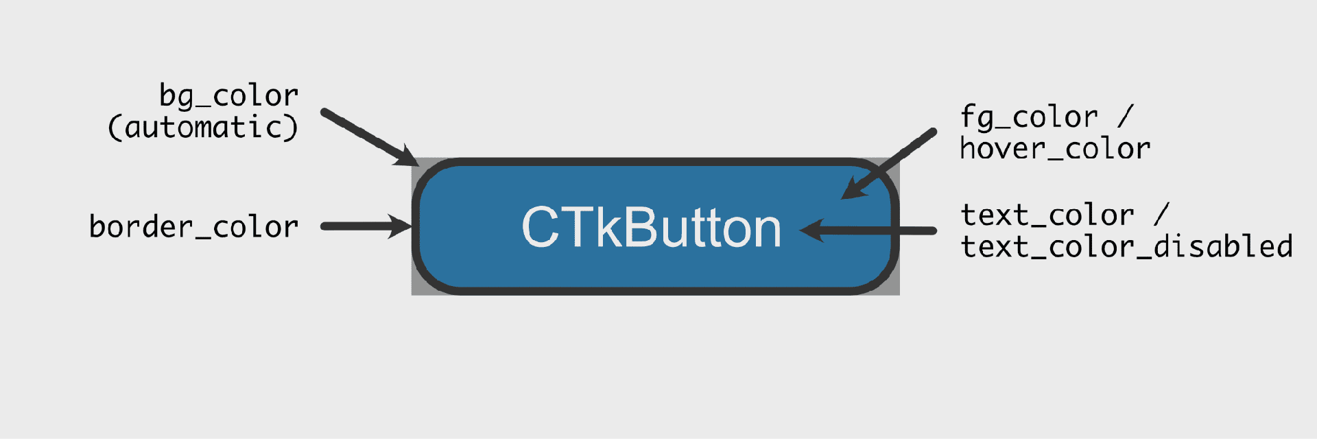
* Color customization in CustomTkinter offers versatility through three distinct formats: a single color name like "red", a hexadecimal color string such as "#FF0000", or a tuple comprising light and dark mode colors ("red", "darkred").
* Widgets intelligently select the appropriate color based on the current appearance mode.
* Utilizing a tuple color scheme empowers widgets to exhibit varying hues in light and dark modes, while opting for a single color ensures consistent appearance across both modes.
app = customtkinter.CTk()button = customtkinter.CTkButton(app, fg_color="red") # single color namebutton = customtkinter.CTkButton(app, fg_color="#FF0000") # single hex stringbutton = customtkinter.CTkButton(app, fg_color=("#DB3E39", "#821D1A"))2. Themes
In the realm of CustomTkinter, color schemes adhere to preset themes by default. Presently, three themes grace the palette: "blue", "dark-blue", and "green", with "blue" reigning as the default choice. Each theme offers tuple colors tailored for both light and dark appearance modes.
To initialize your preferred theme, simply incorporate the following code at the outset of your programming:
customtkinter.set_default_color_theme("dark-blue") # Themes: "blue" (standard), "green", "dark-blue"3. Custom Themes
Themes in CustomTkinter are delineated by .json files, exemplified by formats like dark-blue.json. Crafting bespoke themes is facilitated, eliminating the need for manual widget styling adjustments.
Simply duplicate the aforementioned .json file and tweak the values to your preference. Subsequently, loading your custom theme entails passing the path to your .json file to the .set_default_color_theme method:
customtkinter.set_default_color_theme("path/to/your/custom_theme.json")Advantages of custom tinkter widget:
1. Customization Opportunity: Utilizing `CTkEntry` offers the chance for extensive customization, elevating both the visual appeal and functionality of entry widgets.
2. Improved User Engagement: CustomTkinter empowers developers to fashion entry widgets with distinct styles, enriching the overall user experience.
3. Streamlined Data Management: The entry widget streamlines the process of gathering user input, simplifying the integration of user-generated data into Python applications.
4. User-Friendly Interface: CustomTkinter's `CTkEntry` seamlessly integrates with various GUI components, facilitating the creation of intricate interfaces with ease.
5. Community Assistance: The CustomTkinter community offers valuable resources and assistance, supporting developers in effectively utilizing and addressing issues related to the `CTkEntry` widget.
Python GUI programming with Tkinter offers limitless opportunities for developing intuitive and interactive applications. By mastering the basics and delving into advanced techniques, you can harness your creativity to build professional-grade GUIs effortlessly.