The Odoo events module is a fully-fledged platform to create and organize all events within an organization. You can manage any type of event, whether it is large or small scale, easily with this module. In a company, there are several business conferences, meetings, cultural programs, charity activities, and exhibitions that are conducted throughout the year to increase the popularity of the company among the customers and business competitors with their attractive and efficient services. So, managing all these events is a difficult task in order to make it a huge success. The Odoo ERP system is the best solution to eradicate all those obstacles in conducting a successful event.
Anyone can easily create a new event with the Events module and publish the event on the Odoo website. People can book their tickets for the event from the Odoo website. You can manage all the new, ongoing, and announced events using this module. Moreover, you can limit the seats for each event and determine the type and rate of the event ticket according to the company’s demand. It is a versatile platform to carry out all actions regarding the implementation of an event.
For a business organization, making reports of each activity held within the organization is an inevitable task. The majority of the modules in Odoo contain reporting facilities that help a user triumphantly create and analyze reports of the programs.
This blog will discuss the reporting features of the Events module in Odoo.
The events module in Odoo provides a great platform for managing and analyzing all data regarding the events created and conducted in a company with the help of this module. It will be helpful for you to create monthly or annual reports of the events that can be further used for decision-making and formulation of new plans and strategies.
From the dashboard of the events module itself, you can see the ‘Reporting’ option available on the top of the menu bar.
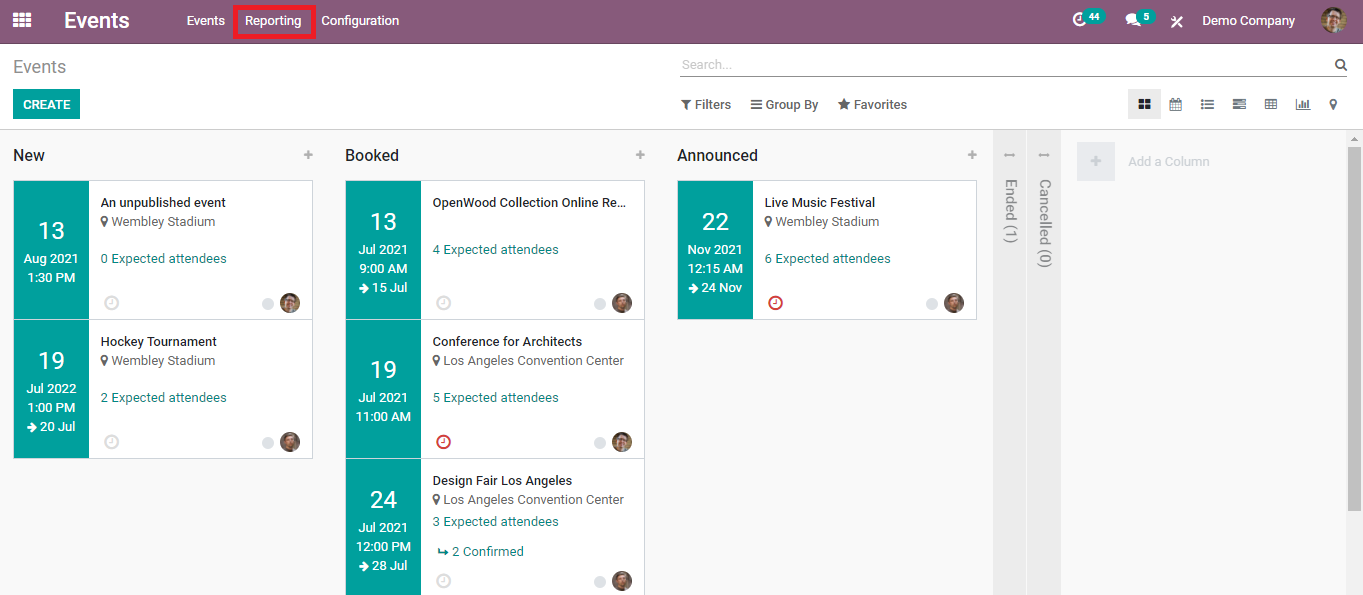
Click the ‘Reporting’ option and start analyzing and managing the events data.
There are two types of reporting that will be available under the drop-down menu on clicking on the ‘Reporting’ option, those are Events and Attendees.
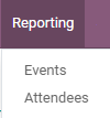
First, let’s look into the reporting of events in this module.
Events Reporting
While clicking on the ‘Events’ you will get both graphical and pivot views of the data of the events recorded in this module.
Pivot View:
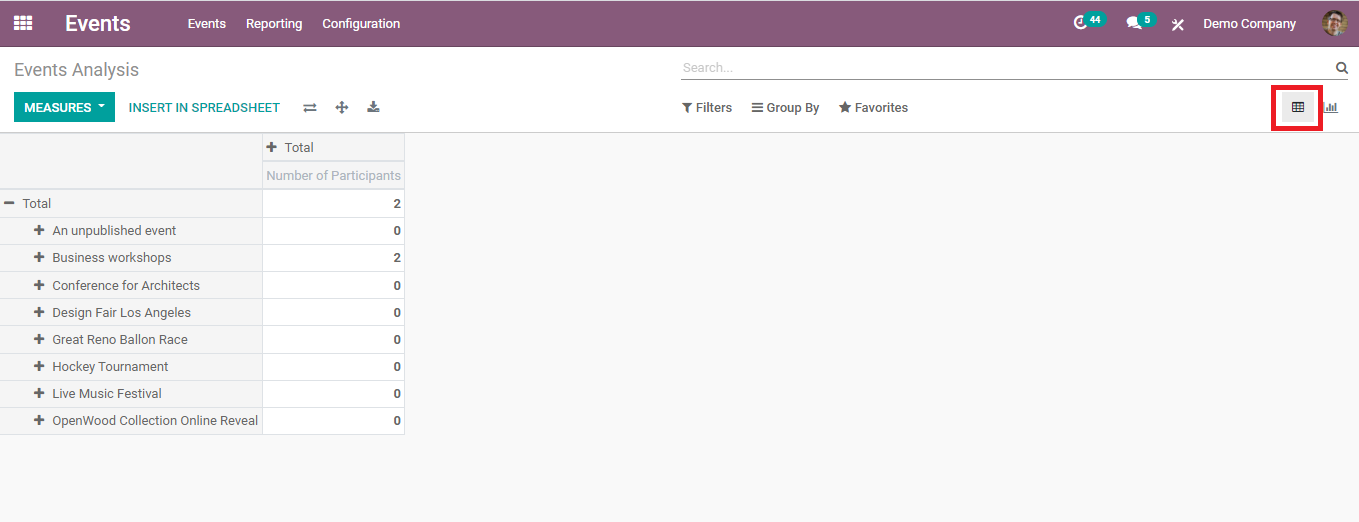
As you can see in this picture, this will be
the pivot view of your data. You can see the name of all events arranged in a
tabular column. It is easy to add new measures to this table.
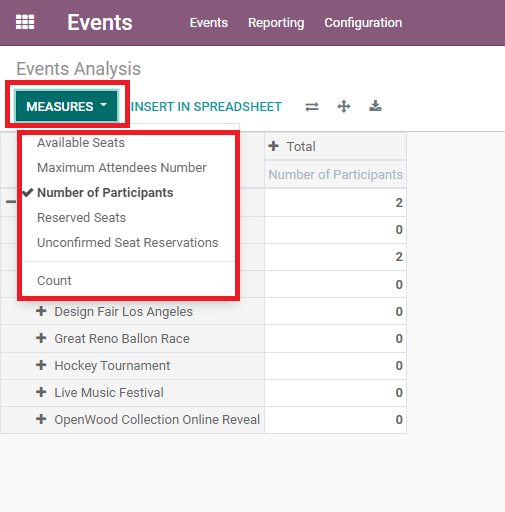
This includes the measures of all Available
Seats, Maximum Attendees Number, Number of Participants, Reserved Seats,
Unconfirmed Seat Reservations, and Count of each type of event. After applying
all these measures, this will be the final view of the table of the events.
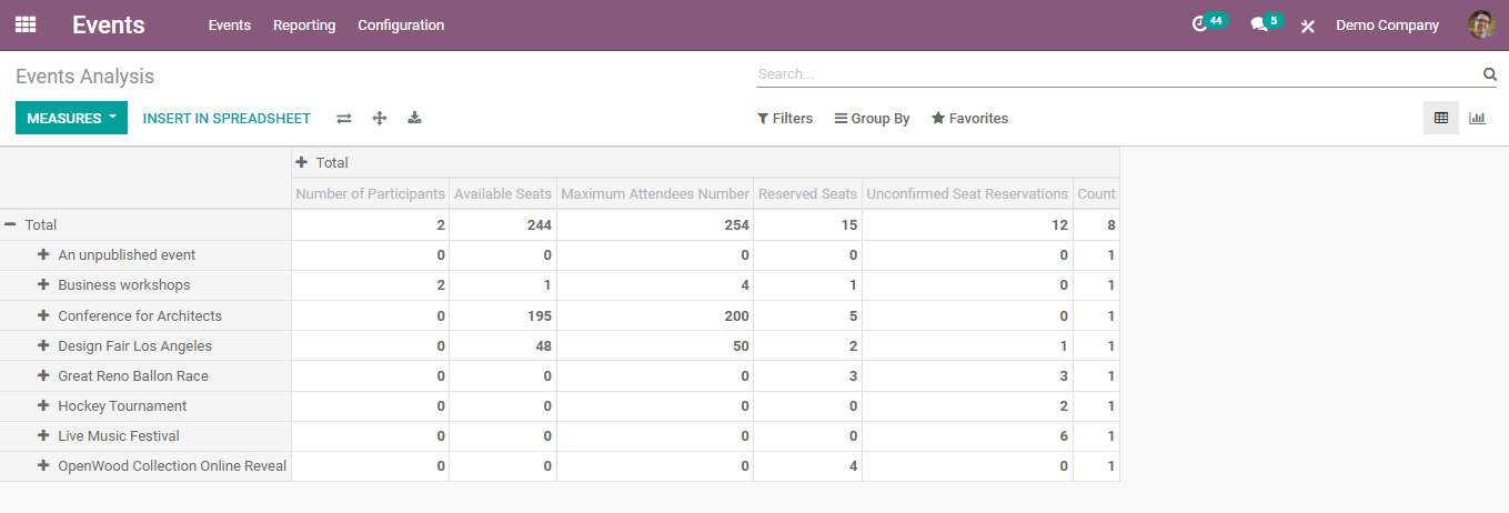
These measures can be inserted into a spreadsheet using the ‘Insert in Spreadsheet’ and create new reports according to the needs.
Graphical View:
There are three types of graphical views available in Odoo, Bar chart, Line Chart, and Pie chart. As in the pivot view, different types of measures can be applied in the graphical view also. But only one measure can be used at a time. You can analyze the data by changing the view between different measures separately.
Bar chart:
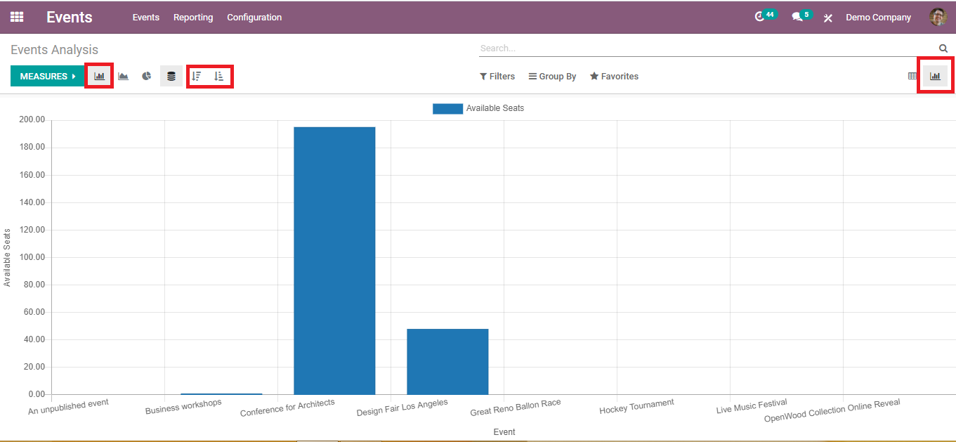
On the X-axis we can see the name of different events and the Y-axis includes one of the measures we select from the ‘Measures’ list. You can arrange the events in ascending and descending order.
Line chart:
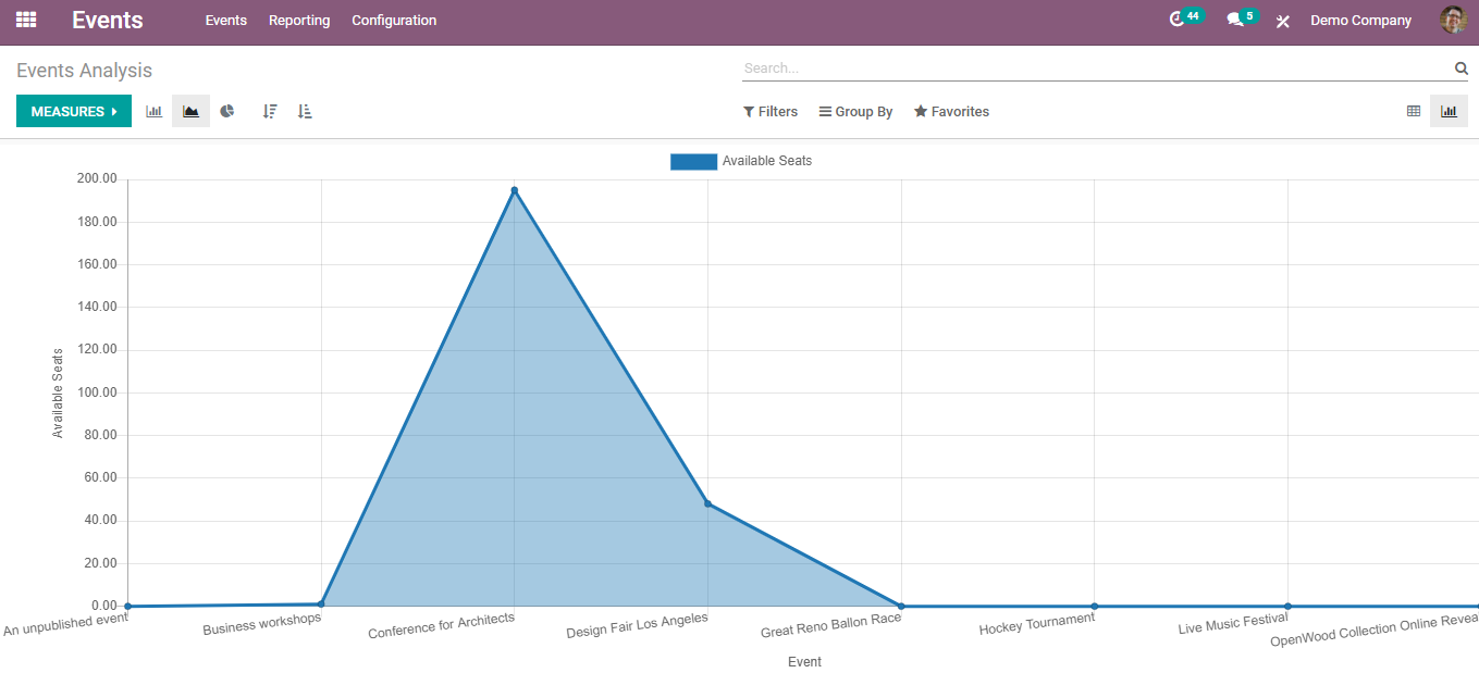
This will be the view of the line chart of the events according to the number of available seats for each event. As we have done in the bar chart, you can change the Y-axis based on the measures you have.
Pie chart:
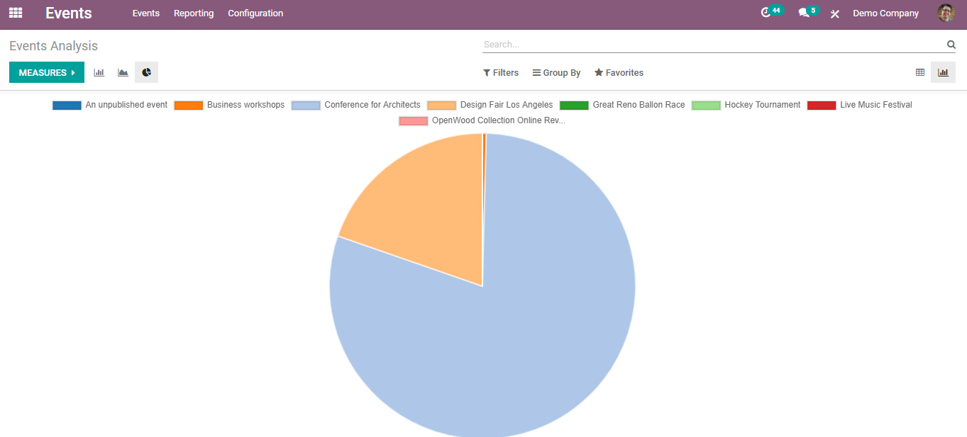
The different colors in the pie chart represent the different events in the modules. Like we said earlier, change the measures according to your demand.
These are the reports of the events recorded in the module. Now let’s get into the reporting of attendees of each event.
Reporting of Attendees
For the reporting of the number of attendees, there are many views available in the Events module. As the measuring unit, we are only considering the count of attendees in each event.
Pivot View:

This is
the pivot view of the events on the basis of the count of attendees in each
event. Clicking on any count will give detailed information about the attendees
of the respective event.

This facility is available in all views.
Graphical View:
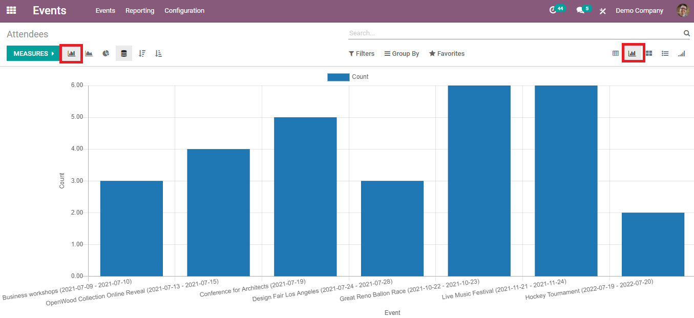
Here we have a bar chart, line chart, and pie chart of the events according to the count of the attendees.
Bar chart
Line Chart:
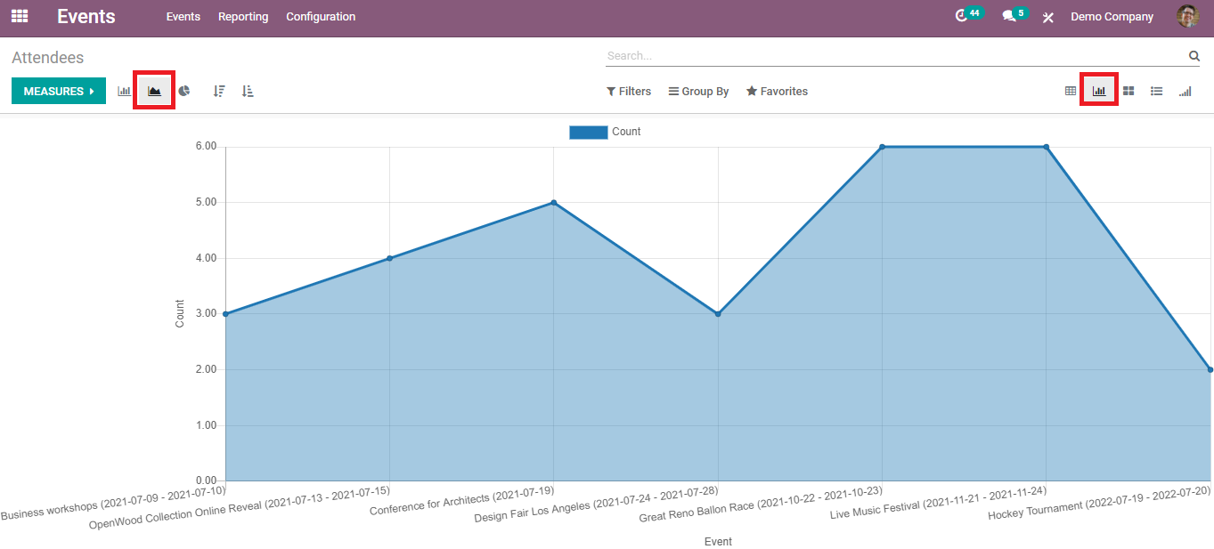
The X-axis includes the type of the events and the Y-axis includes the count of the attendees in both Bar and Line charts.
Pie Chart
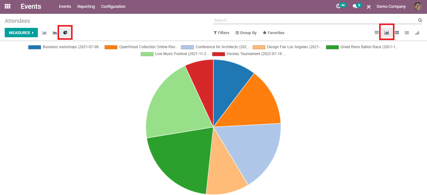
These are the different graphical views of the events based on the count in the events module.
Kanban View:
The kanban view of the attendees includes all attendees in separate fields with their name, event, date of the event, and the name of the person who registered for the event.
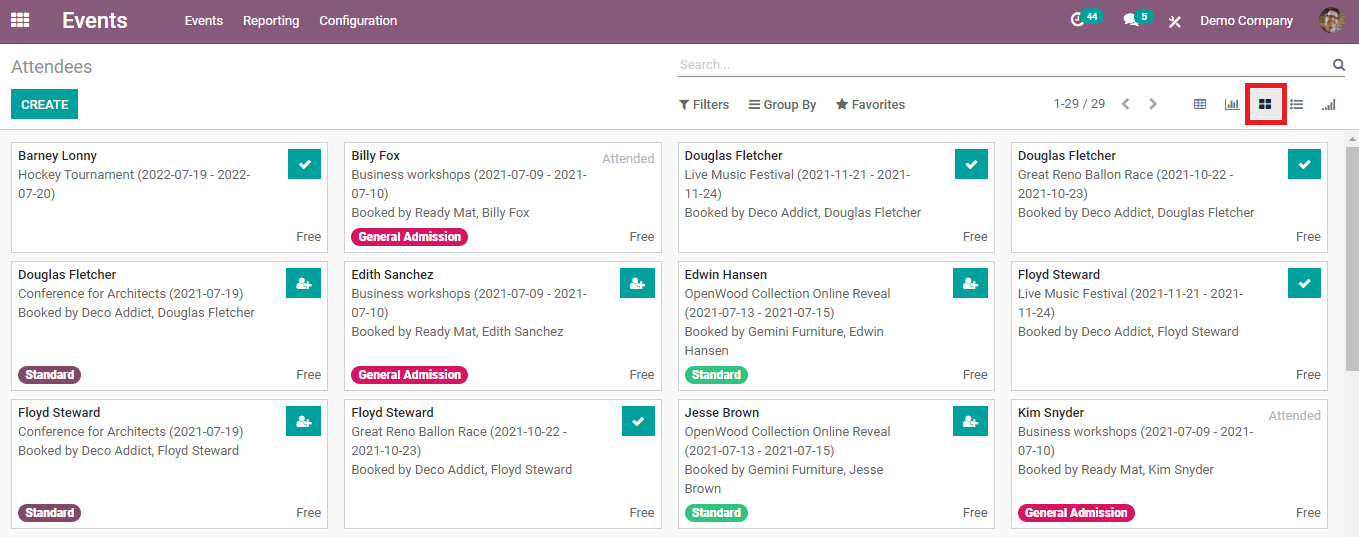
From the list, you can view the type of ticket
they have selected and the status of their registration. Some are marked as
‘Attended’ which is attended by the candidate. And also you can confirm
registration and your attendance from the same window.
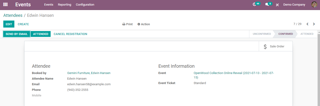
Clicking on an attendee will give a detailed view of
the respective attendee as shown below.
List View:
This view includes all attendee’s details as a list.

As you can see, this contains information about an Attendee’s Name, Registration Date, Email Address, Phone Number, Event, type of ticket selected, and the Status of attendance. There are options to confirm the attendance and cancel the registration in the list view.
Cohort View:
Last but not least the cohort view includes the percentage of attendees based on the registration date of the events.
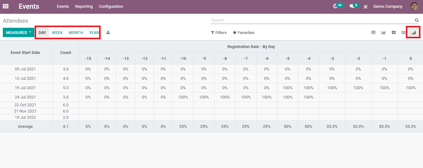
This view can be shifted between the day, week, month, and year of the registration.
You can use these reports to analyze each event and based on the analysis it is easy to bring changes and improvements in future programs.