ECharts is a powerful, open-source data visualization library developed by Baidu. It is designed to create interactive, customizable, and high-performance charts for web applications. With its robust feature set and extensive documentation, ECharts has become a popular choice for developers seeking to implement data visualization solutions.
ECharts supports various chart types, such as line charts, bar charts, pie charts, scatter plots, radar charts, heatmaps, and more. This diversity allows users to choose the most appropriate chart type for their data. ECharts charts are highly interactive. Users can zoom, pan, and hover over data points to get more detailed information.
ECharts provides extensive customization options. You can customize almost every aspect of a chart, including colors, labels, tooltips, legends, and animations. This flexibility ensures that the charts can be tailored to match the design and branding requirements of any application.
ECharts is optimized for handling large datasets efficiently. It employs data decimation techniques and asynchronous data loading to maintain smooth performance even with extensive data points.
Now, let’s see how to create different types of charts using ECharts.
ECharts uses a configuration object to define the chart type, data, and options. The primary method to create a chart is echarts.init, which initializes a chart instance on a specified DOM element.
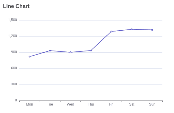
Line Chart:
Line charts are widely used to visualize data trends over a period or across categories. ECharts is a powerful charting library that allows you to create interactive and customizable line charts. Here’s how you can use ECharts to create a line chart:
<!DOCTYPE html>
<html>
<head>
    <title>Basic Line Chart</title>
    <script src="https://cdn.jsdelivr.net/npm/echarts/dist/echarts.min.js"></script>
</head>
<body>
    <div id="main" style="width: 600px;height:400px;"></div>
    <script type="text/javascript">
        var chart = echarts.init(document.getElementById('main'));
        var option = {
            title: {
                text: 'Line Chart'
            },
            xAxis: {
                type: 'category',
                data: ['Mon', 'Tue', 'Wed', 'Thu', 'Fri', 'Sat', 'Sun']
            },
            yAxis: {
                type: 'value'
            },
            series: [{
                data: [820, 932, 901, 934, 1290, 1330, 1320],
                type: 'line'
            }]
        };
        chart.setOption(option);
    </script>
</body>
</html>
This will give you an output as shown below:
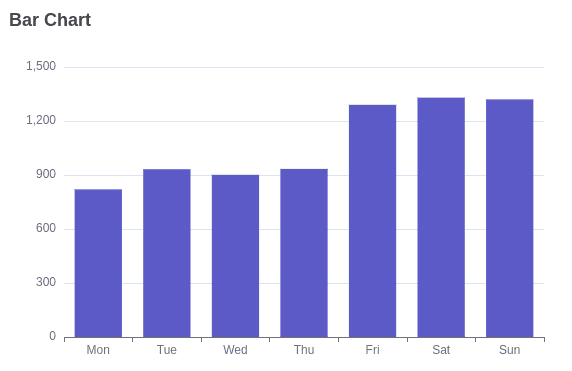
Bar Chart:
Bar charts are effective for comparing data across different categories. Here’s how you can create a bar chart using ECharts:
<!DOCTYPE html>
<html>
<head>
    <title>Basic Bar Chart</title>
    <script src="https://cdn.jsdelivr.net/npm/echarts/dist/echarts.min.js"></script>
</head>
<body>
    <div id="barChart" style="width: 600px; height: 400px;"></div>
    <script type="text/javascript">
        var chart = echarts.init(document.getElementById('barChart'));
        var option = {
            title: {
                text: 'Bar Chart'
            },
            xAxis: {
                type: 'category',
                data: ['Mon', 'Tue', 'Wed', 'Thu', 'Fri', 'Sat', 'Sun']
            },
            yAxis: {
                type: 'value'
            },
            series: [{
                data: [820, 932, 901, 934, 1290, 1330, 1320],
                type: 'bar'
            }]
        };
        chart.setOption(option);
    </script>
</body>
</html>
The bar chart you obtain with the above code is as follows:
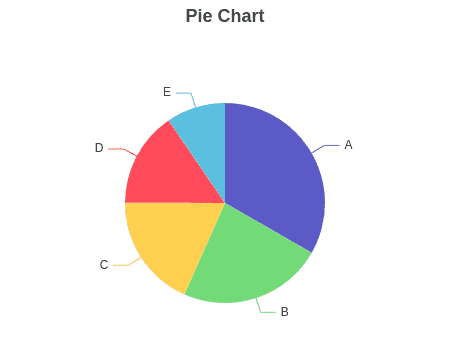
Pie Chart:
Pie charts are a popular visualization tool used to display data in a circular graph, where each slice represents a proportion of the whole.
<!DOCTYPE html>
<html>
<head>
    <title>Basic Pie Chart</title>
    <script src="https://cdn.jsdelivr.net/npm/echarts/dist/echarts.min.js"></script>
</head>
<body>
    <div id="pieChart" style="width: 600px; height: 400px;"></div>
    <script type="text/javascript">
        var chart = echarts.init(document.getElementById('pieChart'));
        var option = {
            title: {
                text: 'Pie Chart',
                left: 'center'
            },
            tooltip: {
                trigger: 'item'
            },
            series: [
                {
                    name: 'Access From',
                    type: 'pie',
                    radius: '50%',
                    data: [
                        { value: 1048, name: 'A' },
                        { value: 735, name: 'B' },
                        { value: 580, name: 'C' },
                        { value: 484, name: 'D' },
                        { value: 300, name: 'E' }
                    ],
                    emphasis: {
                        itemStyle: {
                            shadowBlur: 10,
                            shadowOffsetX: 0,
                            shadowColor: 'rgba(0, 0, 0, 0.5)'
                        }
                    }
                }
            ]
        };
        chart.setOption(option);
    </script>
</body>
</html>
This will give you an output as shown below:
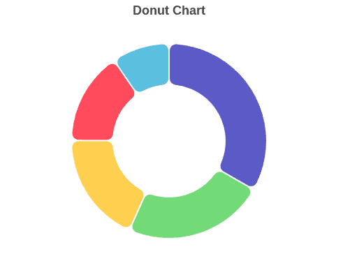
Donut Chart:
Donut charts are similar to pie charts but with a hole in the center. They are effective for displaying data proportions while also allowing for additional information to be conveyed through the center space.
<!DOCTYPE html>
<html>
<head>
    <title>Donut Chart</title>
    <script src="https://cdn.jsdelivr.net/npm/echarts/dist/echarts.min.js"></script>
</head>
<body>
    <div id="donutChart" style="width: 600px; height: 400px;"></div>
    <script type="text/javascript">
        var chart = echarts.init(document.getElementById('donutChart'));
        var option = {
            title: {
                text: 'Donut Chart',
                left: 'center'
            },
            tooltip: {
                trigger: 'item'
            },
            series: [
                {
                    name: 'Access From',
                    type: 'pie',
                    radius: ['40%', '70%'],
                    avoidLabelOverlap: false,
                    itemStyle: {
                        borderRadius: 10,
                        borderColor: '#fff',
                        borderWidth: 2
                    },
                    label: {
                        show: false,
                        position: 'center'
                    },
                    emphasis: {
                        label: {
                            show: true,
                            fontSize: '30',
                            fontWeight: 'bold'
                        }
                    },
                    labelLine: {
                        show: false
                    },
                    data: [
                        { value: 1048, name: 'A' },
                        { value: 735, name: 'B' },
                        { value: 580, name: 'C' },
                        { value: 484, name: 'D' },
                        { value: 300, name: 'E' }
                    ]
                }
            ]
        };
        chart.setOption(option);
    </script>
</body>
</html>
This will give you an output as shown below:
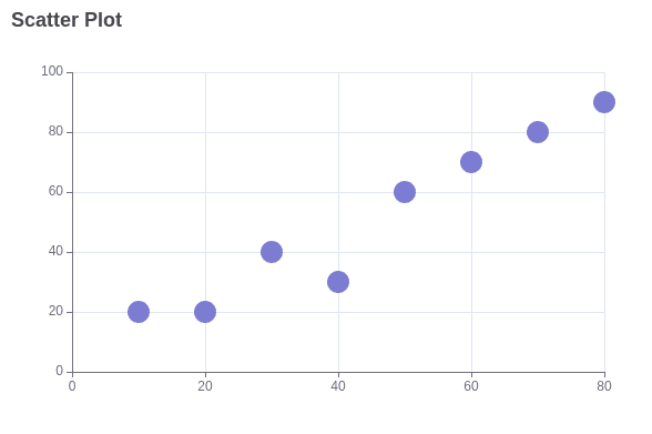
Scatter Plot:
Scatter plots are useful for visualizing relationships between two variables. They are often used to identify patterns, correlations, and outliers within data.
<!DOCTYPE html>
<html>
<head>
    <title>Basic Scatter Plot</title>
    <script src="https://cdn.jsdelivr.net/npm/echarts/dist/echarts.min.js"></script>
</head>
<body>
    <div id="scatterPlot" style="width: 600px; height: 400px;"></div>
    <script type="text/javascript">
        var chart = echarts.init(document.getElementById('scatterPlot'));
        var option = {
            title: {
                text: 'Scatter Plot'
            },
            xAxis: {},
            yAxis: {},
            series: [{
                symbolSize: 20,
                data: [
                    [10, 20],
                    [20, 20],
                    [30, 40],
                    [40, 30],
                    [50, 60],
                    [60, 70],
                    [70, 80],
                    [80, 90]
                ],
                type: 'scatter'
            }]
        };
        chart.setOption(option);
    </script>
</body>
</html>
The scatter plot you obtain with the above code is:
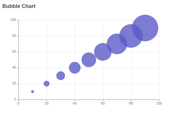
Bubble Chart:
Bubble charts, a variation of scatter plots, are useful for visualizing three-dimensional data sets. In a bubble chart, data points are represented as bubbles, where the size of each bubble corresponds to a third variable. Here's how you can use a bubble chart in ECharts:
<!DOCTYPE html>
<html>
<head>
    <title>Bubble Chart</title>
    <script src="https://cdn.jsdelivr.net/npm/echarts/dist/echarts.min.js"></script>
</head>
<body>
    <div id="bubbleChart" style="width: 600px; height: 400px;"></div>
    <script type="text/javascript">
        var chart = echarts.init(document.getElementById('bubbleChart'));
        var option = {
            title: {
                text: 'Bubble Chart'
            },
            xAxis: {},
            yAxis: {},
            series: [{
                symbolSize: function (data) {
                    return data[2];
                },
                data: [
                    [10, 10, 10],
                    [20, 20, 20],
                    [30, 30, 30],
                    [40, 40, 40],
                    [50, 50, 50],
                    [60, 60, 60],
                    [70, 70, 70],
                    [80, 80, 80],
                    [90, 90, 90]
                ],
                type: 'scatter'
            }]
        };
        chart.setOption(option);
    </script>
</body>
</html>
This will give the following bubble chart:
ECharts is a versatile and powerful tool for data visualization, offering a wide range of chart types, extensive customization options, and robust performance. Its ease of use and integration capabilities make it an excellent choice for developers and data analysts looking to create dynamic and interactive visualizations. Whether you're building simple dashboards or complex analytical tools, ECharts provides the functionality and flexibility needed to bring your data to life.
To read more about ECharts Essentials: Navigating the World of Dynamic Charts, refer to our blog ECharts Essentials: Navigating the World of Dynamic Charts.