The widget represents display screens, fields, and attributes in Odoo. It allows us to customize the view using different rendering templates. It also allows us to design according to our needs, which will help us make our development faster, simpler, scalable, and more efficient.
In Odoo we have various field widgets such as Status bar, Checkboxes, radio button, float, percentages, color selector, URL, and many more.
Field widgets allow us to define a specific field specification based on their type. In short, the Field Widget helps us perform certain tasks in our fields, which makes working in Odoo easier.
Considering the 'progress bar' widget, it shows the representation of the value in percent of the floating field. So is the functionality of the 'progress bar' widget. As such, we can add custom field functions using widgets.
In this blog let us see how to create a field widget in Odoo 15.
The basic steps of creating field widgets are,
1. Creating a widget
import { FieldChar } from 'web.basic_fields';
var CustomFieldChar = FieldChar.extend({
    _renderReadonly: function () {
      // implement some custom logic here
    },
});
2. Registering the widget in the field registry
import fieldRegistry from 'web.field_registry';
fieldRegistry.add('custom-field-widget', CustomFieldWidget);
3. Adding the widget in the view
<field name="field_name" widget="custom-field-widget"/>
Let us consider the example of creating a widget new_progress_bar’ which has the same functionality as the ‘progressbar’ widget. The widget is used for float fields. Let us change the existing progress bar to the new style. For that, we can create a new progress bar widget.
Existing progress bar (widget=”progressbar”):-

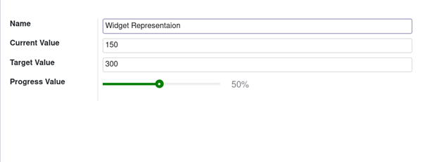
New progress bar (widget=”progress_bar_widget”) :-

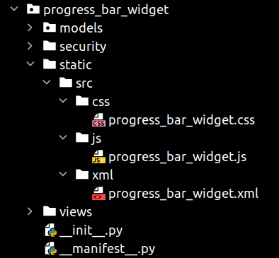
To create a new field widget, first, we need to create a module called progress_bar_widget. Then add the JS, CSS, and XML files for the new widget.
You can add files to the module as shown below:

Let us add the following code to the js file:
Progress_bar_widget.js:-
/** @odoo-module **/
import AbstractField from 'web.AbstractField';
import fieldRegistry from 'web.field_registry';
var ProgressBarWidget = AbstractField.extend({
    template: "ProgressBarWidget",
    start: function(){
        this._super.apply(this, arguments);
        if (this.recordData[this.nodeOptions.currentValue]){
            this.value = this.recordData[this.nodeOptions.currentValue]
        }
    },
    _render: function() {
        var self = this;
        var value = this.value;
        var max_value = 100;
        value = value || 0;
        var widthComplete;
        if (value <= max_value){
            widthComplete = parseInt(value/max_value * 100);
        }
        else{
            widthComplete = 100;
        }
        this.$('.progress_number').text(widthComplete.toString() + '%');
        this.$('.progress-bar-inner').css('width', widthComplete + '%');
    },
})
fieldRegistry.add('progress_bar_widget', ProgressBarWidget);
The Abstract Field is the basic field widget used to render fields at a glance. The created widgets are registering to the field_registry.
Compared to Odoo 14 js here we are using;
import WidgetName from 'module_name.WidgetName'; instead of web.require('module_name.WidgetName');  and removed the
odoo.define('module_name.WidgetName', function(require){
    'use strict';
    //code
});
And adding this /** @odoo-module **/ at the beginning of code.
Now you need to add the following XML code to the template for the widget setup. The template is loaded into the static/src/xml folder according to the standard Odoo module format.
Progress_bar_widget.xml:-
<templates id="template" xml:space="preserve">
    <t t-name="ProgressBarWidget">
        <div>
            <div class="progress_bar">
                <div class="pro-bar">
                    <small class="progress_bar_title">
                        <span class="progress_number"/>
                    </small>
                    <span class="progress-bar-inner"/>
                </div>
            </div>
        </div>
    </t>
</templates>
Now we need to add the CSS for this widget to style our progress bar.
Add the following code to the file:
Progress_bar_widget.css:-
.progress_bar .pro-bar {
	background: hsl(0, 0%, 97%);
	box-shadow: 0 1px 2px hsla(0, 0%, 0%, 0.1) inset;
	height: 4px;
	width: 200px;
	margin-bottom: 15px;
	margin-top: 10px;
	position: relative;
}
.progress_bar .progress_bar_title{
    color: hsl(218, 4%, 50%);
    font-size: 15px;
    font-weight: 300;
    position: relative;
    top: -28px;
    z-index: 1;
}
.progress_bar .progress_number {
	float: right;
	margin-top: -6px;
	margin-right: -50px;
}
.progress_bar .progress-bar-inner {
    background-color: green;
    display: block;
    width: 0;
    height: 100%;
    position: absolute;
    top: 0;
    left: 0;
    transition: width 1s linear 0s;
}
.progress_bar .progress-bar-inner:before {
    content: "";
    background-color: hsl(0, 0%, 100%);
    border-radius: 50%;
    width: 4px;
    height: 4px;
    position: absolute;
    right: 1px;
    top: 0;
    z-index: 1;
}
.progress_bar .progress-bar-inner:after {
    content: "";
    width: 14px;
    height: 14px;
    background-color: inherit;
    border-radius: 50%;
    position: absolute;
    right: -4px;
    top: -5px;
}
Then load the added files into Assets and of the Odoo 15 asset files, we can add files to the manifest as shown below:
'assets': {
    'web.assets_backend': {
        '/progress_bar_widget/static/src/css/progress_bar_widget.css',
        '/progress_bar_widget/static/src/js/progress_bar_widget.js',
    },
    'web.assets_qweb': {
        '/progress_bar_widget/static/src/xml/progress_bar_widget.xml',
    },
},
This is how we create a field widget in Odoo 15.
We can use the created widget in char fields by using widget=’'progress_bar_widget'’.
For example:
<field name="progress_value" widget="progress_bar_widget"/>
For displaying the widget, create a module and add these files and create some fields to get values to it.

In this manner, you can easily create Field Widgets in Odoo which will be extremely useful in the functioning of the platform and bring in more advancements to it.