Behind every successful business management, there must be some pages of previous experiences. Only a better analysis can make further decisions and improvements. So we can define business analysis as one of the main reasons for your business growth. It is an important aspect for an organization to frequently analyze the performance of your business and make suitable actions and decisions to improve your business standards. It will also provide you an insight into making wise business decisions.
Better business analysis allows you to understand the business structure, policies, operations, and needs, to find out better business strategies for making wise business decisions. The concepts reviews and analysis are more significant when concerning an eLearning platform. A better and proper analysis of the eLearning activities will help you to find out which learning strategy or materials are appropriate and which one is irrelevant for the learners and also identifies what will bring more results.
The Odoo eLearning module gives you an exclusive platform for handling the report and reviews analysis based upon the operations conducted in the platform. The reporting features of Odoo are designed to help you and your team to analyze the various courses, contents, reviews, quizzes, Forum, and Certifications created and performed on the platform. For managing reports, Odoo provides you a separate menu named Reporting. Under this reporting tab, you can easily generate various reports in various measures.
This blog will describe the various reporting aspects which Odoo offers for different Courses and Contents described in the eLearning platform.
In the Odoo eLearning platform, you can view the Reporting tab. Under the Reporting tab, you have so many features as you can see various menus such as Courses, Contents, Revenues, Reviews, Quizzes, Forum, and Certifications.
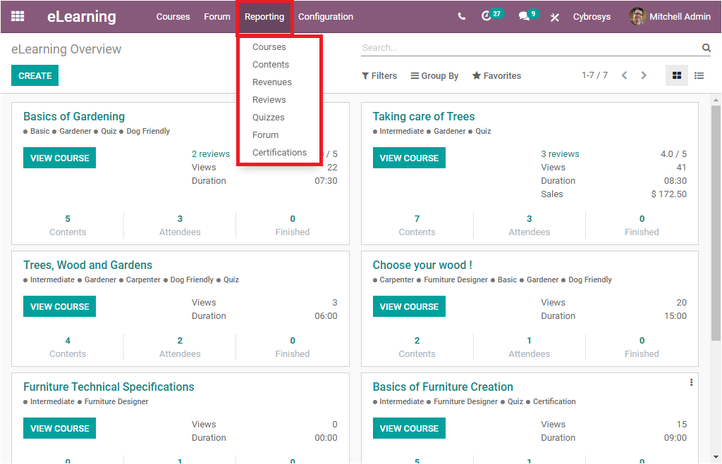
First, we can discuss the Courses window available under the reporting section of the eLearning module.
Courses
The Courses window available under the Reporting tab of the eLearning module will List out all the courses defined in the platform. The window can be viewed in both List view and Graph view. In the List view, the data are displayed in a list format. The image of the list view of the Curses window is given below.
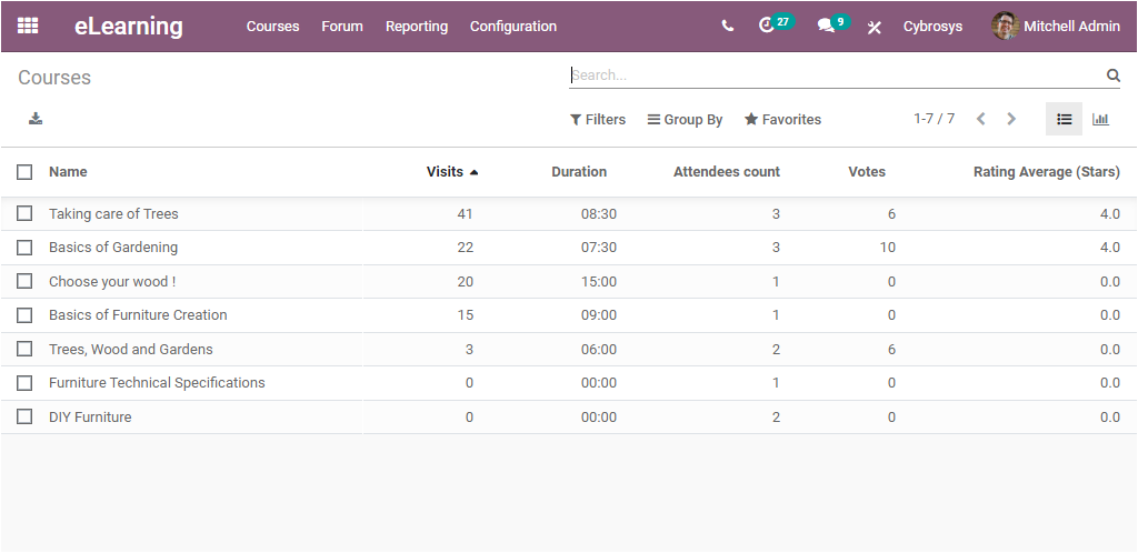
In the window, you can view the Course Name, the number of Visits in each course along with the Course Duration, Attendees count, Votes, and Rating Average(Stars). It is also possible to export all the data in the window to an Excel file by clicking on the export option available on the top left side of the window. The window allows you to quickly search data, Filter data, and also can easily Group By a condition to find your required information instantly. These options are very useful when the platform is filled with so much data.
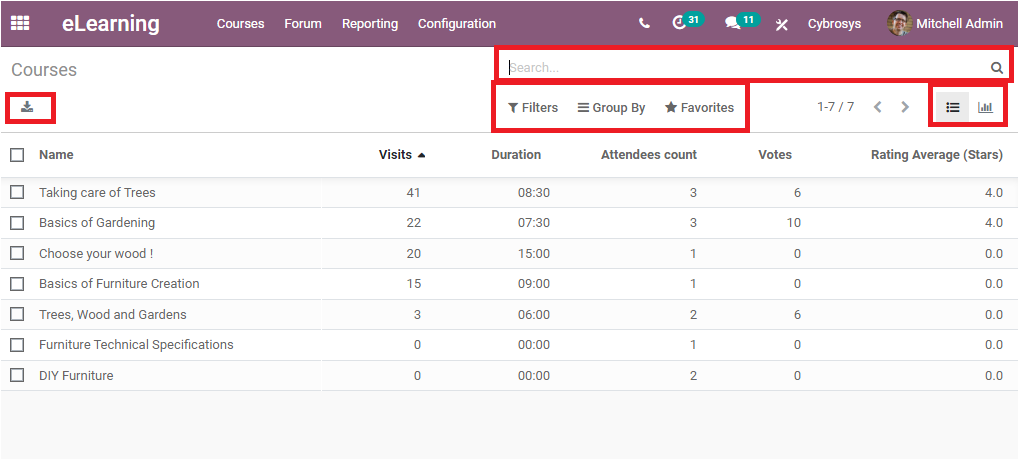
Now let us click on the Graph view button to get all the reports in the window in graphical representation. The screenshot of the window is pasted below.
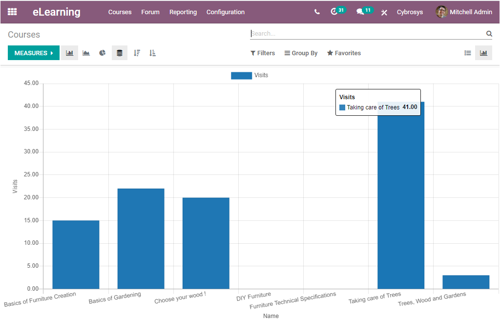
In this graphical representation, the X-axis of the graph represents the Name of the course, and Y-axis represents the number of visits. In the same way, as it represents the number of visits, You can also view the window in various measures such as Content, Course finished, Add comment, Add a review, and many more aspects. This can be selected from the MEASURES tab available as highlighted in the below window.
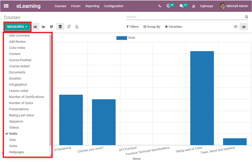
For example, if you want to view the window on the basis of Contents created in each course you can select the Content option available under the MEASURES tab. Then the Y-axis of the graph will represent its measure on the basis of Content. Now the window will look like the below image.
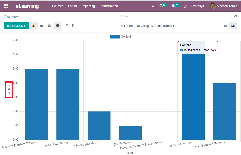
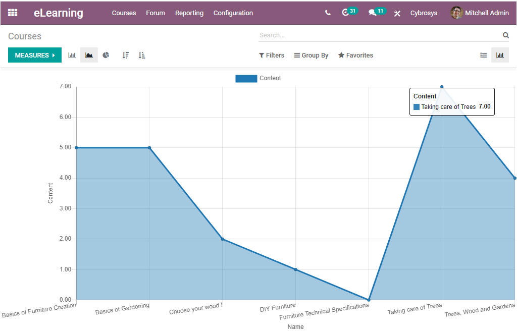
Apart from this Bar chart view, you can also view the reports in Line Chart and Pie chart. Let us have a glance at the Line chart representation.
Now we can look at how the window will look in Pie chart representation.
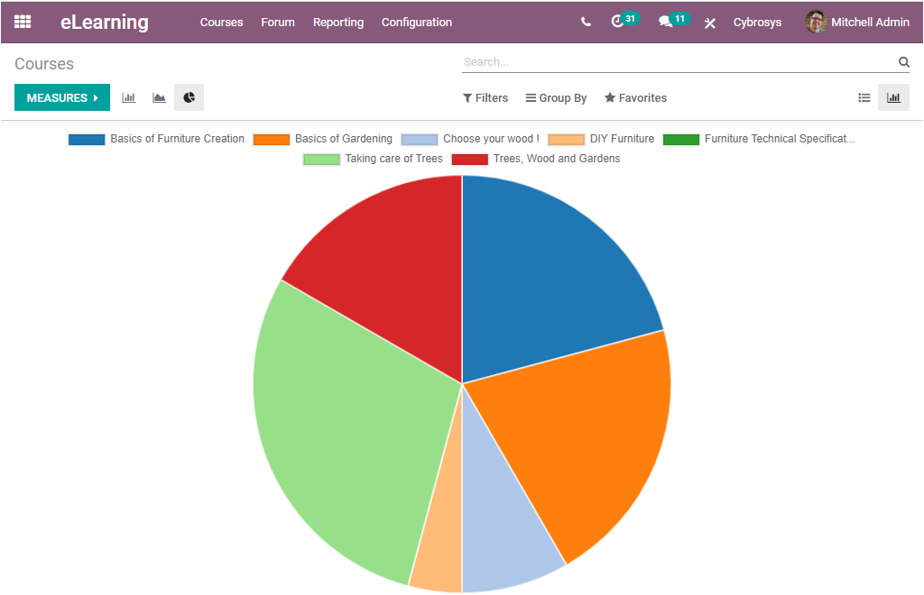
The Pie chart visually displays the data in a circular graph. The different slices of the pie chart represent each data in different colors. Here in this pie chart representation, each of the slices represents different courses described.
So far we were discussing all the important reporting aspects of the courses described in the platform and now let us have a look at the Contents menu available.
Contents
The Reporting tab of the Odoo eLearning module also gives you access to the Contents report window. This Contents window allows you to generate reports on the basis of the various descriptive contents described in the platform in a single chart.
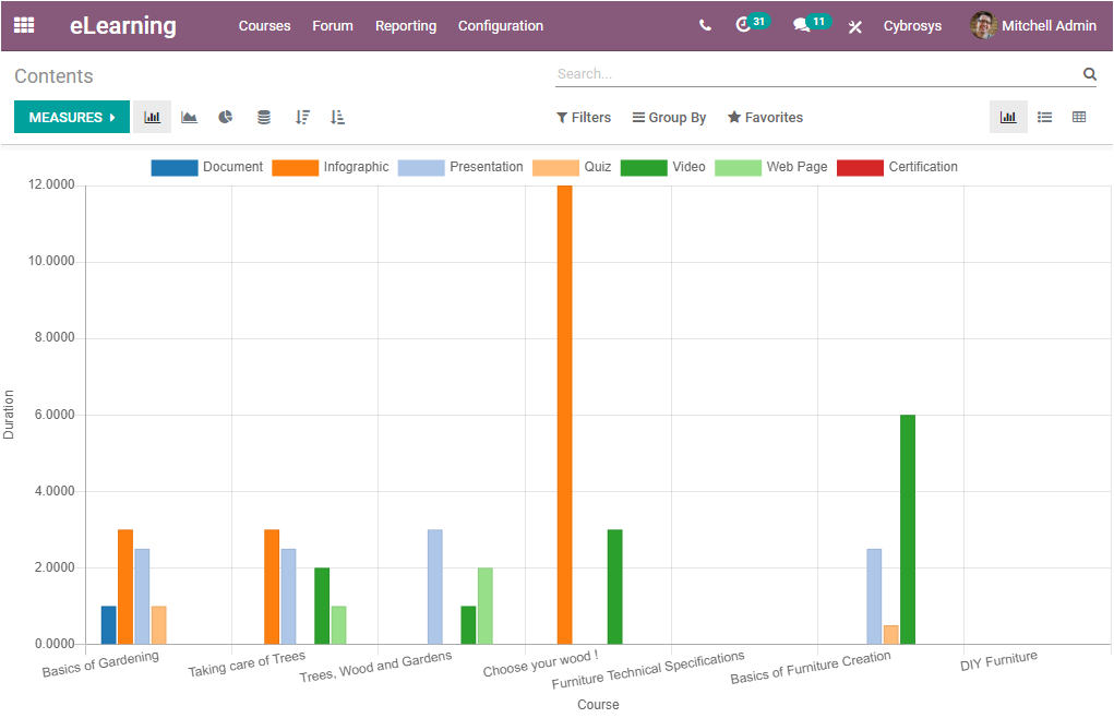
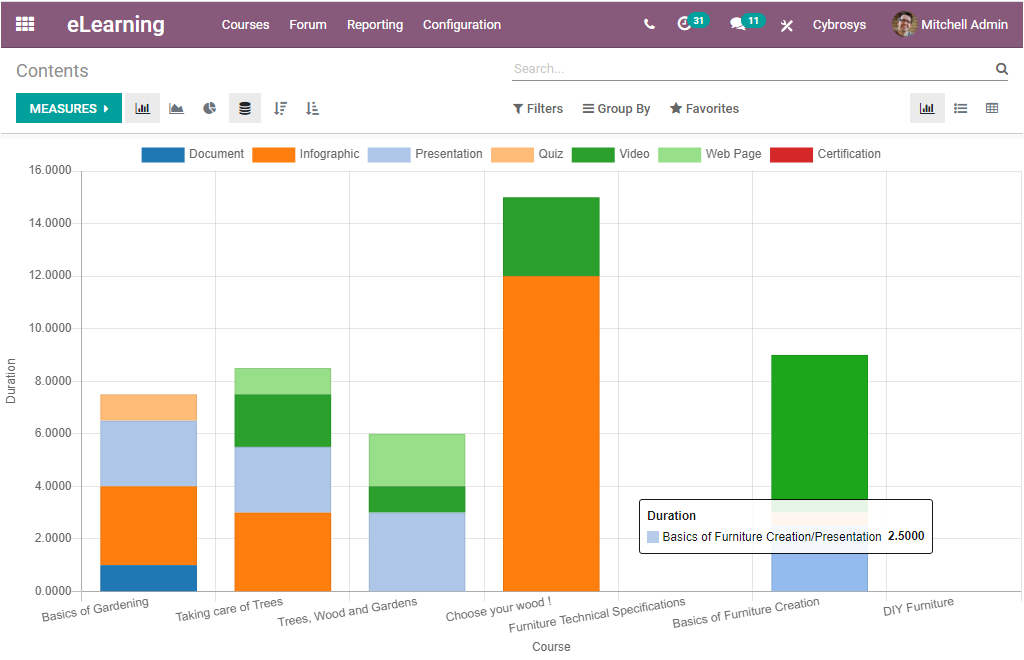
In this graph, the reports are generated based upon the duration of all the eLearning courses defined in the platform. The Document, Infographic, Presentation, Quiz, Video, Web page, Certification, etc are represented in separate color formats for easy analysis. Here also you can generate reports on the various measures by selecting the required options from the drop-down menu available under the MEASURES button. The reports in the window can also be viewed in different views such as Bar chart, Line Chart, and Pie chart. In addition, the Stacked button available in the window allows you to view the reports in the window in a stacked format as displayed in the below image.
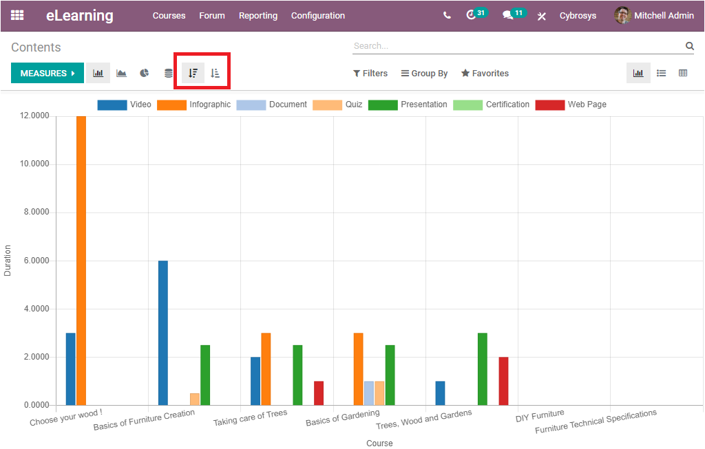
Moreover, you can arrange the reports in both Ascending or Descending order by accessing the Ascending and Descending buttons available and the respective buttons are highlighted in the below image.
We discussed all about the Graph view representation of the window. Apart from the Graph view, we can also view the window in List format. The image of the window is depicted below.
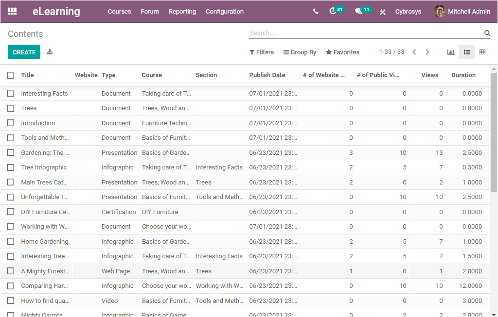
The list view allows you to describe the contents of the entire eLearning courses defined in the platform in a list format. In this window you can view all the contents described in the platform along with their Title, the website published, Type of content, Respective Course details, Section, Published date, Number of Website Views, Number of Public Views, Views, and Duration of content. You also have the provision to export all the data to an Excel file by selecting the Export option available. Moreover, the Create icon available in the window allows you to create new content. The screenshot of the creation window is displayed below.
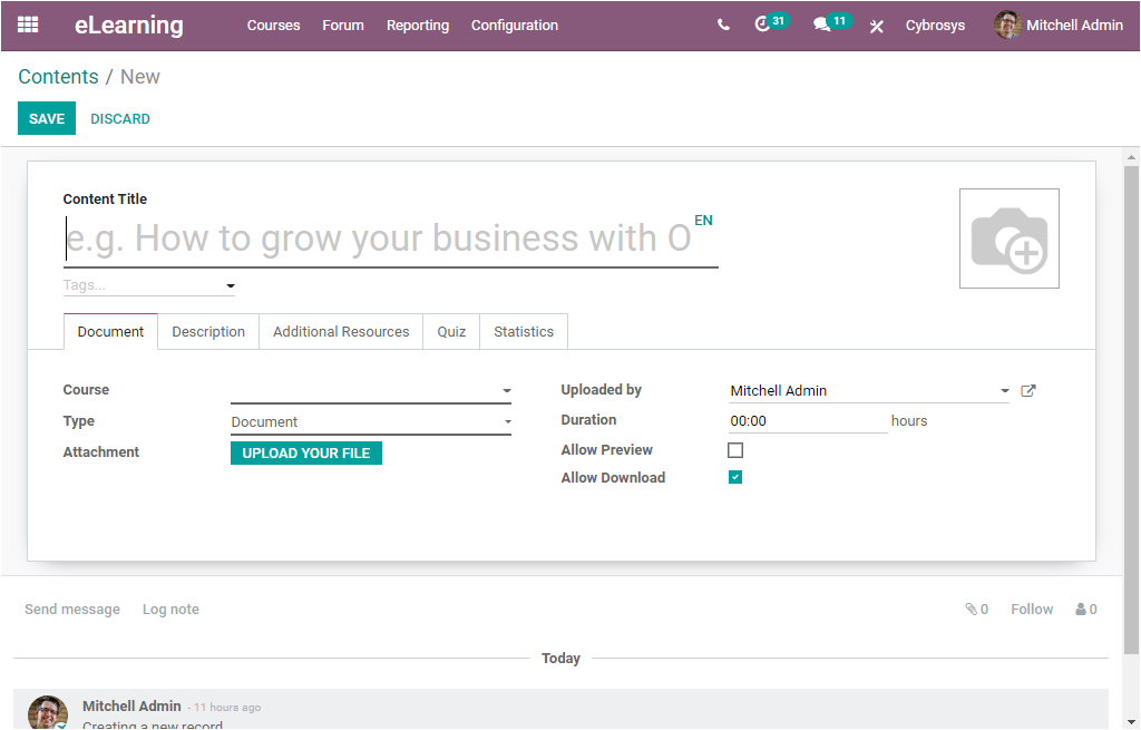
In this Contents creation window, you can provide the Content Title and then you can assign certain tags to easily identify the Content. You can also paste a photograph related to the content in the provided space. There you have the Edit and Delete option. Under the Document tab, you can mention the course using the drop-down menu available. After that, you can allocate the Type from the drop-down menu. If it is a Document, you can attach the document using the UPLOAD YOUR FILE button available. The responsible person for the uploading is auto-allocated. Now you can set the Duration of the content. Then you can enable or disable the option Allow Preview.If you enable this option, the course is accessible by anyone. The users don't need to join the channel to access the content of the course. Finally, you have the option to Allow Download. Enabling this option allows the user to download the content of the slide. After providing all the required data, you can save the details by clicking on the Save button available. You can also discard the created content by selecting the Discard option available.
Back to the Contents window, we are discussing both the graph view and List view of the window and now let us have a look at the Pivot view available. The image of the content window in Pivot view is portrayed below.
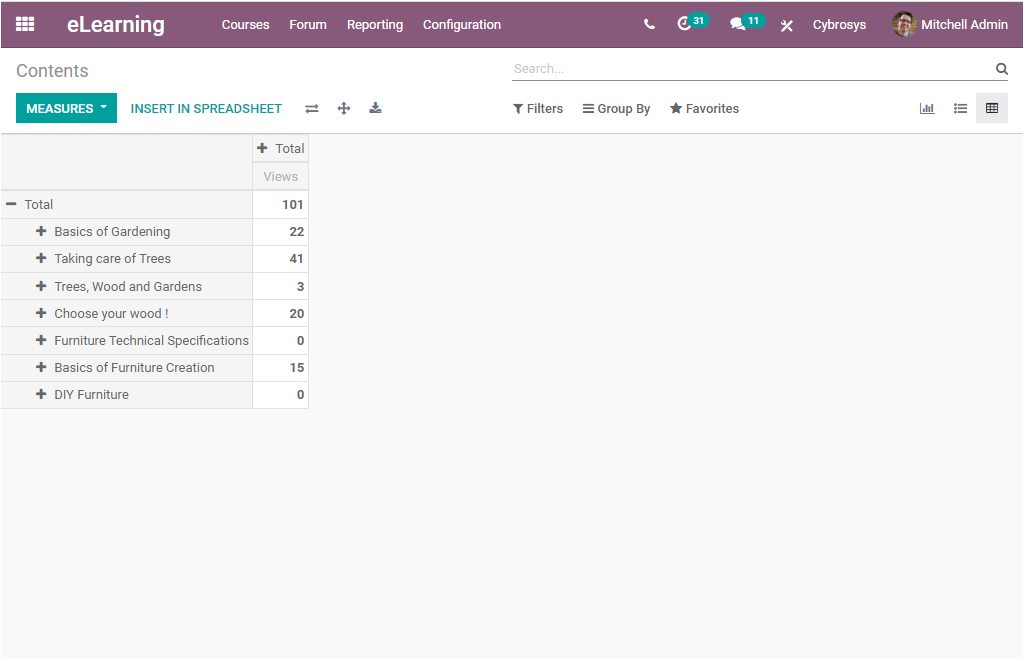
The Pivot view depicts the data in a tabular format. Here also you can generate reports in different measures. This can be done by selecting the MEASURES icon available on the top left corner of the window. If you select this button, you will be depicted with a dropdown menu where you can select various measures.
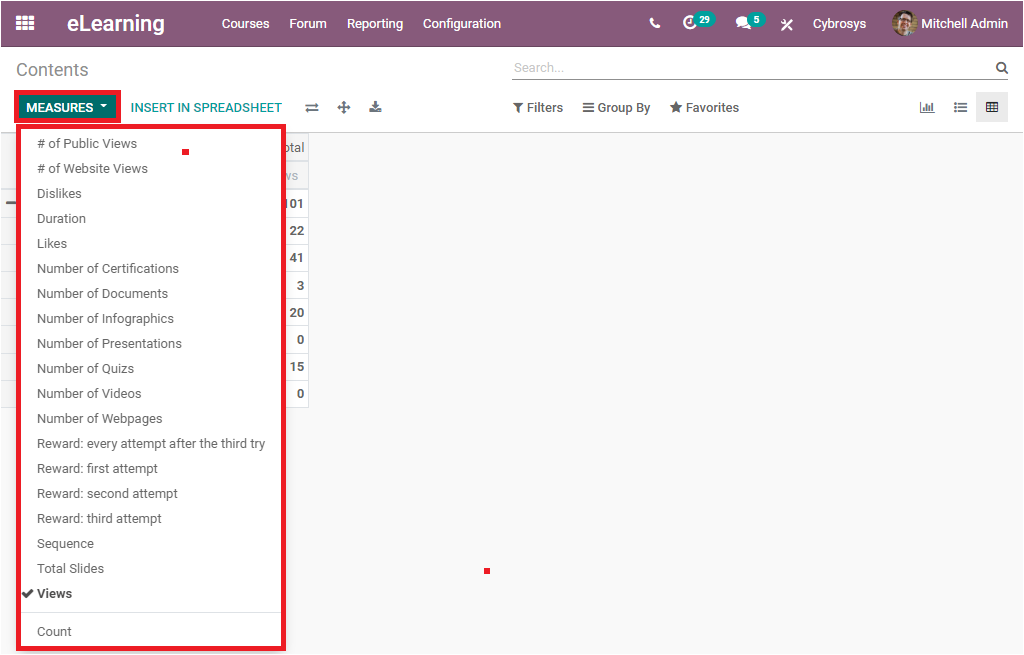
For example, if I want to generate reports on the basis of the Number of Quizzes conducted and the Duration of content, you can select these options from the dropdown menu. Now the window shows the measures as shown in the below image.
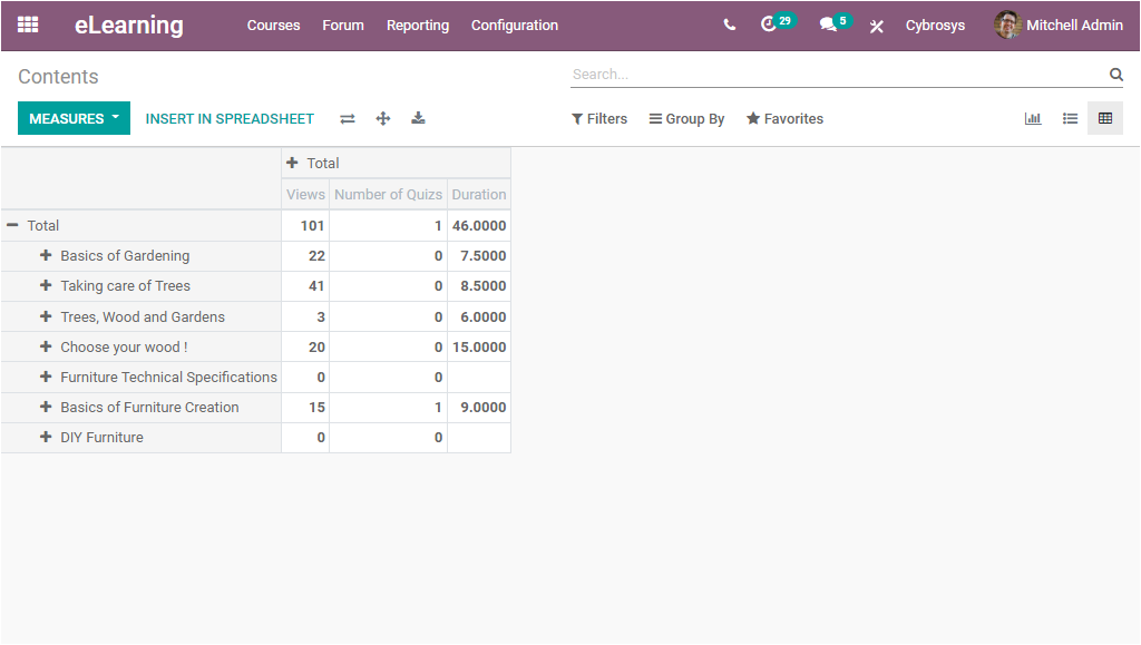
In this way, you can generate various reports. In addition, you can insert your pivot reports to a spreadsheet by selecting the INSERT IN SPREADSHEET button available. For doing so you can click on the button, then you will be displayed with a pop-up window as shown in the below image.
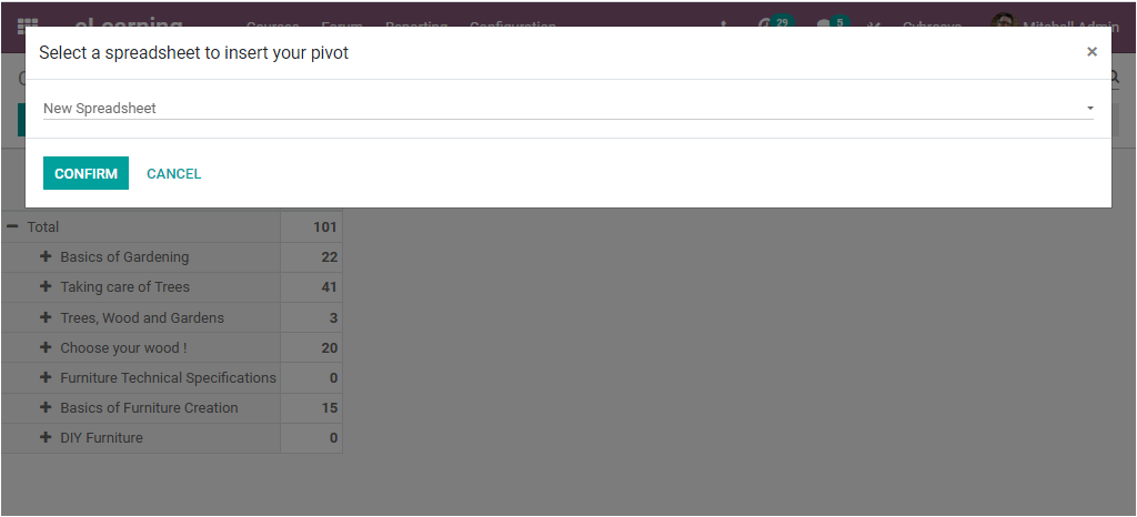
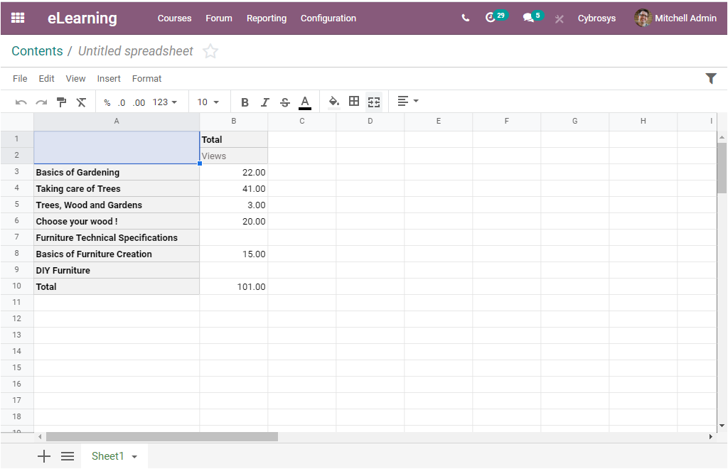
After selecting a spreadsheet for inserting your pivot table you can select the CONFIRM button. Now the excel file will look like the below image.
Back to the Pivot table, you are also able to view the options like Flip axis, Expand all, which will allow you to represent your data in multidimensional tables. Additionally, you can view the Download XLSX option also.
Here, we discussed the reporting features of the Courses and Contents menu of the Odoo eLearning platform and the left menus such as Reviews, Quizzes, Forum, Certifications will be discussed in the coming blog.