Power BI is a business intelligence tool by Microsoft that enables users to connect, analyze, and visualize data from different sources. It provides interactive dashboards, real-time reporting, and AI-driven insights, helping organizations make data-driven decisions efficiently. It has a user-friendly interface that makes it more accessible for even beginners and experts.
In today’s data-centric environment, businesses use interactive dashboards to present visually insightful insights that help to track performance and make informed decisions. Power BI, a powerful business intelligence tool by Microsoft, allows users to create interactive dashboards that bring data to life. In this blog, we will walk through the step-by-step process of building an interactive dashboard in Power BI.
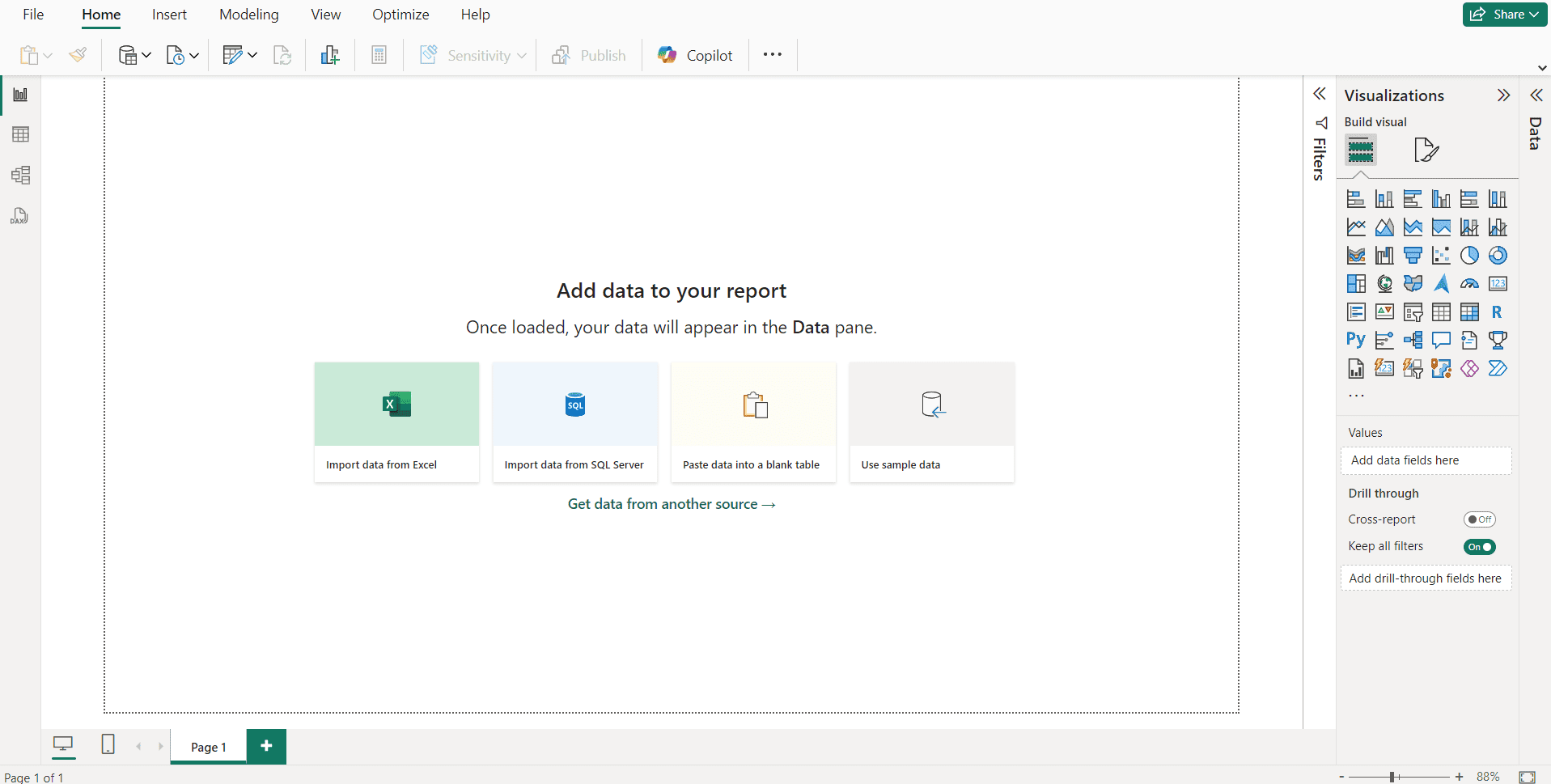
Step 1: Connect to Data Sources
The first step in building an interactive dashboard is to connect Power BI to relevant data sources. Power BI supports a variety of sources, including Excel files, SQL Server databases, online services like Google Analytics, SharePoint, Azure, etc., and cloud-based sources like Power BI Dataflows, OneDrive, AWS, etc. To connect data, open Power BI Desktop, click on Home > Get Data, select your data source, and click Connect. Once connected, load the data into Power BI and begin transforming it as needed.
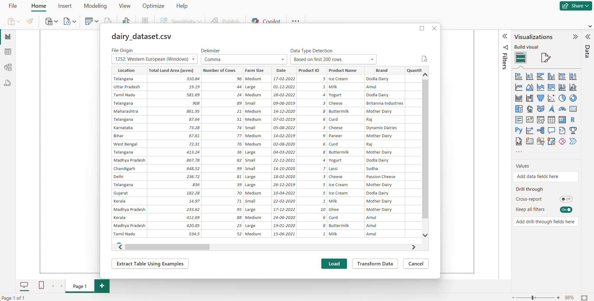
Step 2: Transform and Clean Data
Before creating visualizations, it’s crucial to clean and structure the data properly. Power BI provides a Power Query Editor, which helps refine and shape data for better analysis. Key data cleaning steps include removing duplicate values, filtering out irrelevant data, formatting columns (date, text, numbers, etc.), creating calculated columns using Data Analysis Expressions (DAX), and establishing relationships between tables using the Model view.
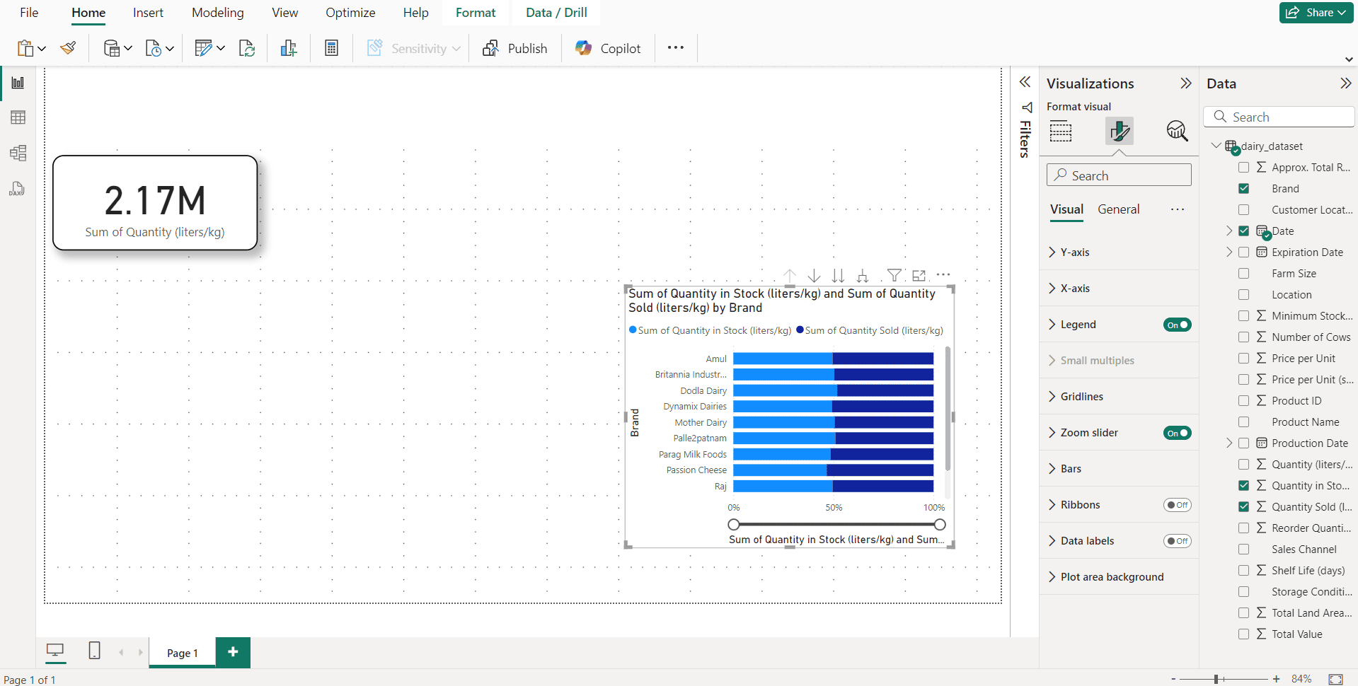
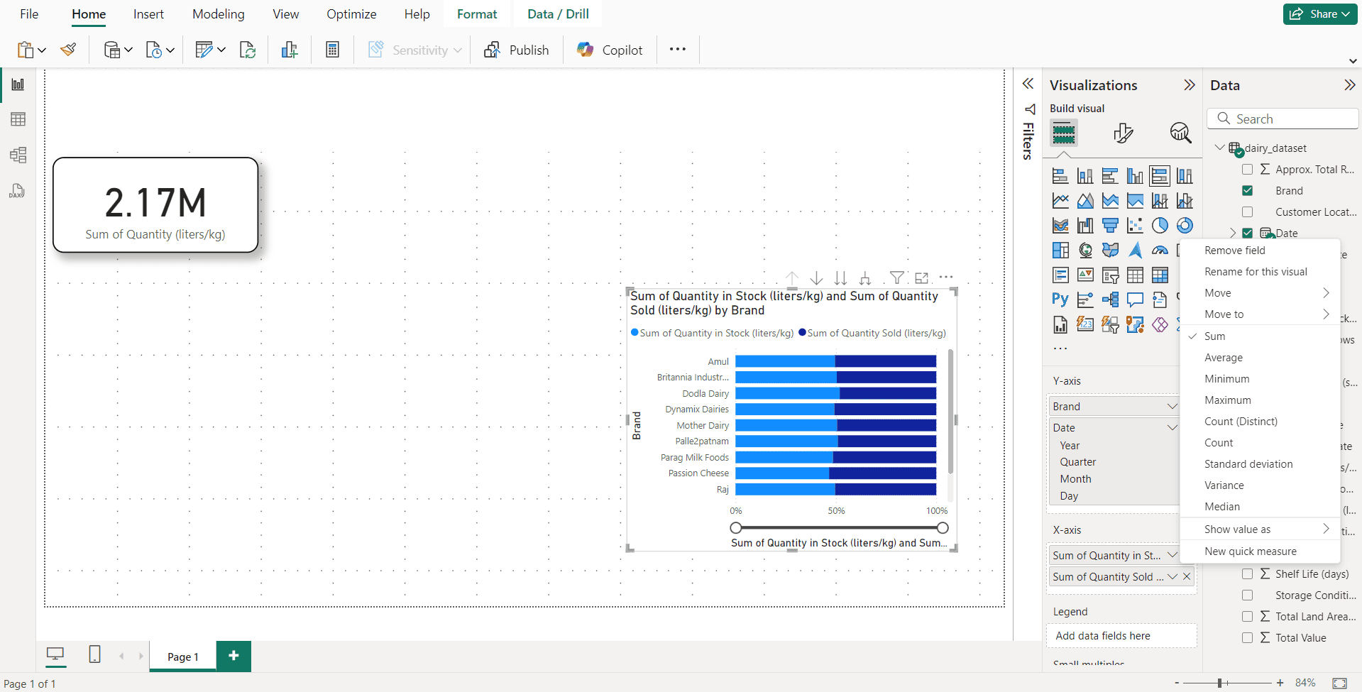
Step 3: Design Your Dashboard with Visualizations
Once your data is prepared, you can start building visualizations. Power BI offers various built-in visuals, such as bar charts, line graphs, tables, pie charts, maps, and cards for key performance indicators (KPIs). To add visuals, go to Report View, drag and drop fields from the Fields Pane onto the report canvas, and select the desired visualization from the Visualizations Pane. You can then customize the appearance using the Format Pane, adjusting colors, fonts, and tooltips to enhance readability and user experience.
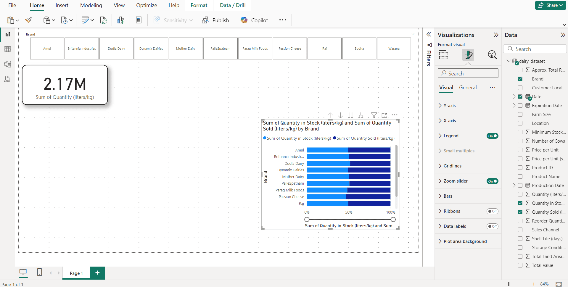
Step 4: Add Interactive Features
A static dashboard alone is insufficient; enhance user experience by incorporating interactivity using Power BI’s built-in features. Slicers will help to filter the dashboard data by different categories. You can use the slicer from the visualizations panel and specify a field to filter by its content. Drill-through pages enable users to click on a visual to get more detailed insights. To set this up, right-click on a visual, select Drill-through, and choose a target page. Bookmarks and buttons help create interactive reports by setting up bookmarks to switch between views. You can add buttons from the Insert menu and link them to bookmarks for easy navigation. Additionally, tooltips provide extra details when hovering over a data point and can be enabled in the Format Pane of any visual.
Step 5: Use DAX for Advanced Calculations
Data Analysis Expressions is a powerful formula language in Power BI that helps create custom metrics, calculated columns, and measures. It helps the users to do complicated data operations and enhance dashboard functionalities. We can use aggregation functions, Filter functions, logical functions, and many more.
DAX also supports time intelligence functions, helping users analyze data over different time periods. By leveraging DAX, you can create dynamic KPIs, perform trend analysis, and generate insightful reports tailored to business needs.
Step 6: Publish & Share
We can publish the dashboard or reports to the Power BI service. It can be easily accessible from around the globe. We can set up responsive views exclusively for every screen-sized device. Sharing the created databases via Power BI app, Microsoft Teams, or Power BI embedded are also possible. Setting up the scheduled data refresh enables the real-time syncing of data from the connected Data sources.
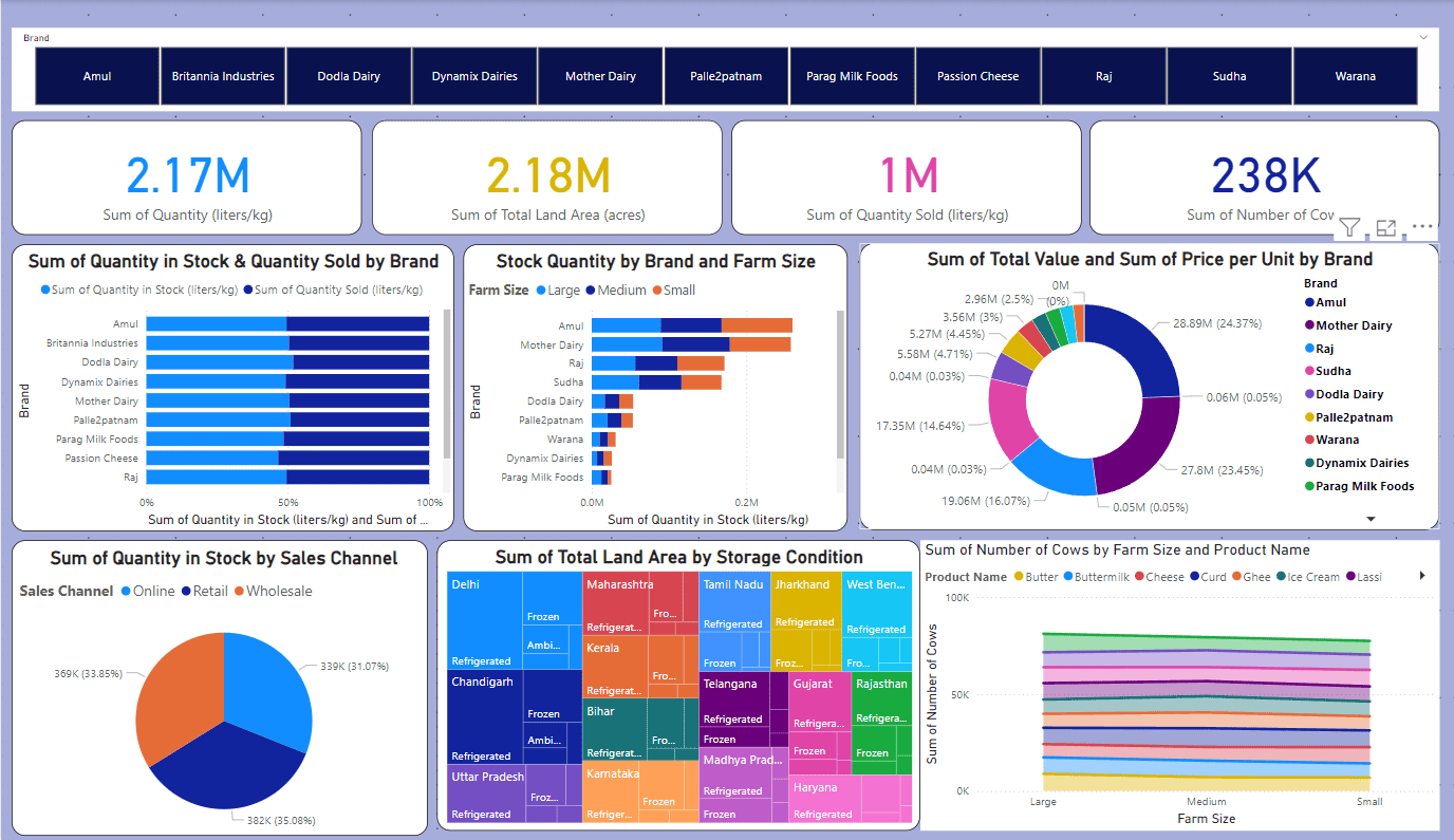
By adding multiple visualizations, we can build interactive Dashboards, and this is the final result:
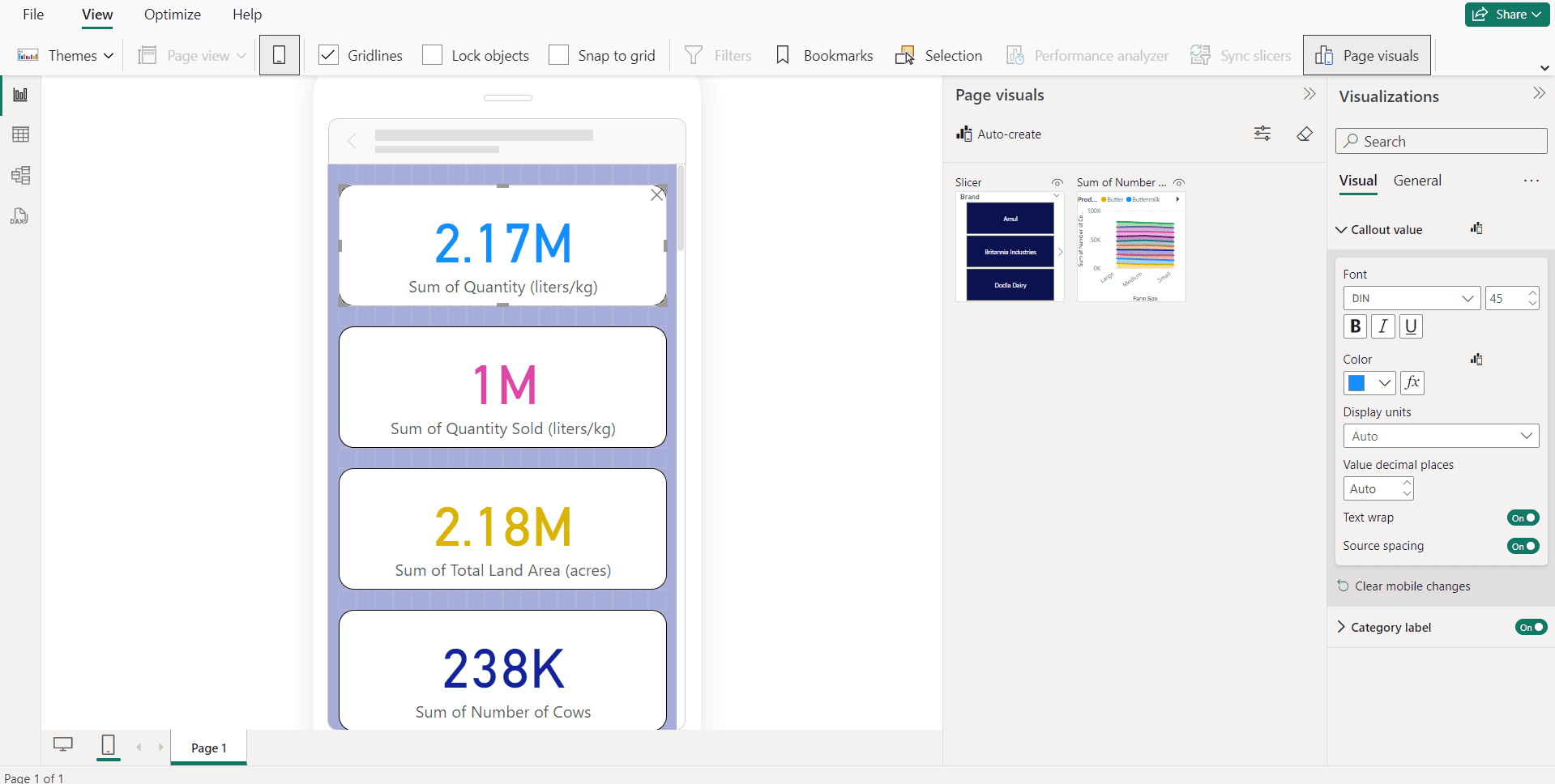
The mobile view will be like this:
Now it is your turn to make one as per your requirements and creativity.
To read more about Data Insights: Power BI vs. Other BI Tools, refer to our blog Data Insights: Power BI vs. Other BI Tools.