Odoo includes a variety of widgets available in the backend user interface to carry out various activities, such as one2many, many2many, many2many_tags, etc., which simplifies and streamlines the operations of the selection fields in Odoo. It is, therefore, difficult to establish an advanced selection field similar to the widgets without the aid of external libraries when we create a form that includes one2many or many2many fields. These one2many, many2many_tags, etc. widgets in Odoo are created using the Select2 JS package.
This blog will describe the many selection field types created by the Select2 library for easier form building, its function, implementation syntax, and examples.
1. Simple Select2 Field
It is quite difficult for visitors to find the choice they are looking for from a list of possibilities when using a standard Select tag with a large number of options. Select2 provides an easy-to-use built-in filter mechanism, which allows users to filter and search for options within the select element.
We must supply a Selector (Class or ID) to the select tag in order to create this.
We are using Class as the selector in the example below.
<select style="width:300px" class="advanced-select">
   <option value="AK">Alaska</option>
   <option value="HI">Hawaii</option>
   <option value="CA">California</option>
   <option value="NV">Nevada</option>
   <option value="OR">Oregon</option>
   <option value="WA">Washington</option>
</select>
Next, we activate select2 from the JS file using the selector class advanced-select.
function applySelect2() {
   self.$('select.advanced-select').select2();
   };
applySelect2();
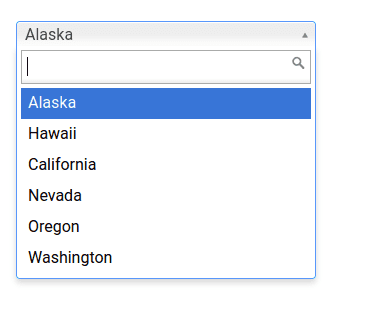
We now have a new Select field with live search filter capabilities after adding the select2 enhancement, as shown in the image below.
2. Select2 with grouping
We'll create the Select2 field with grouped options next. The optgroup> tag is used for this.
<select style="width:300px" id="source2">
   <option/>
   <optgroup label="Alaskan/Hawaiian Time Zone">
       <option value="AK">Alaska</option>
       <option value="HI">Hawaii</option>
   </optgroup>
   <optgroup label="Pacific Time Zone">
       <option value="CA">California</option>
       <option value="NV">Nevada</option>
       <option value="OR">Oregon</option>
       <option value="WA">Washington</option>
   </optgroup>
</select>
The select2 choose tag improvements are enabled by JS code like the one below. In this instance, the selector was the id of the select tag.
function applySelect2() {
   $('select#source2').select2();
   };
applySelect2();
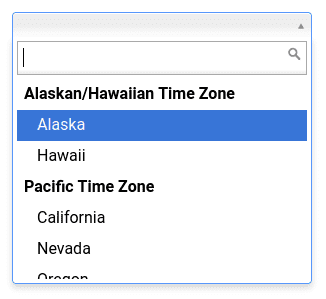
An example of a select2 field with grouped elements is shown in the figure below.
3. Select2 with Clear option enabled
We will then construct a sample select2 enhanced field with clear options. We use the JS file's attribute 'allowClear: true' to make a clear option available.
<select id="custom-select" style="width:300px">
   <option/>
   <optgroup label="Alaskan/Hawaiian Time Zone">
       <option value="AK">Alaska</option>
       <option value="HI">Hawaii</option>
   </optgroup>
   <optgroup label="Pacific Time Zone">
       <option value="CA">California</option>
       <option value="NV">Nevada</option>
       <option value="OR">Oregon</option>
       <option value="WA">Washington</option>
   </optgroup>
By turning on the Clear option, the user has the option of clearing the selected choice in the select tag and leaving it empty if they so choose.
function applySelect2() {
   self.$('#custom-select').select2({
       allowClear: true,
   });
   };
applySelect2();
});
The example image is provided here, and to clear the selection, click the x symbol that appears after the chosen option.

4. Select2 with Multiple Selection
Next, we are creating a select2 field with Multi-selection enabled. We add more than one option to the select tag to enable visitors to select several alternatives from the list.
Following is a sample of code.
<select style="width:300px" class="advanced-select" multiple="">
    <option value="AK">Alaska</option>
    <option value="HI">Hawaii</option>
    <option value="CA">California</option>
    <option value="NV">Nevada</option>
    <option value="OR">Oregon</option>
    <option value="WA">Washington</option>
    <option value="AZ">Arizona</option>
    <option value="CO">Colorado</option>
</select>
Then, similar to the straightforward select2 example, we utilize JS to connect the select2 with the select tag.
function applySelect2() {
   self.$('#custom-select').select2({
   });
   };
applySelect2();
});
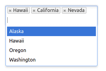
Below is an example of select2 with multiple selections enabled.
5. Select2 PlaceHolder
A placeholder for the select2 field will then be enabled. This option is enabled in the JS file using the select2 attribute Placeholder.
function applySelect2() {
   self.$('#custom-select').select2({
       placeholder: 'Select an Option',
   });
   };
applySelect2();
});
Note: In order to add the placeholder in this manner, we must ensure that the select field's first choice is empty, as seen in the code example below.
<select style="width:300px" id="source1">
    <option />
    <option value="AK">Alaska</option>
    <option value="HI">Hawaii</option>
    <option value="CA">California</option>
    <option value="NV">Nevada</option>
    <option value="OR">Oregon</option>
    <option value="WA">Washington</option>
</select>
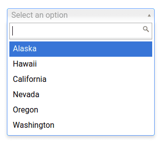
The placeholder will appear in the select2 area when none of the options are selected, as shown in the accompanying image.
6. Select2 with Minimum/ Maximum search input
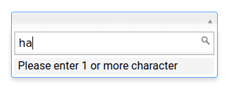
Select2 offers an option to enable minimum and maximum search input length, allowing us to choose the minimum and maximum lengths needed to activate and deactivate filtering based on these parameters. Small search strings are insufficient for effective filtering when there is a huge dataset available. Therefore, the minimum attribute is helpful.
The graphic below is an example of how to enable both minimum and maximum search length limitations.
function applySelect2() {
   self.$('#custom-select').select2({
          minimumInputLength: 3,
          maximumInputLength: 10
   });
   };
applySelect2();
});
Here you can see that the filtering is only activated when the minimum input length property is satisfied. An example outcome image is also provided.
7. Select2 with Maximum selection Limit
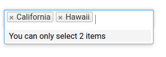
In this part, we'll set a maximum number of available options for the select2 field with multi-select functionality enabled. To do this, as in the example below, we utilize the JS attribute MaximumSelectionSize to determine the cap.
function applySelect2() {
   self.$('#custom-select').select2({
           maximumSelectionSize: 2
   });
   };
applySelect2();
});
The choose field allows visitors to select a maximum of two alternatives, as demonstrated in the sample above. As users make their selections, select2 adapts dynamically, as depicted in the example images below.
The Select2 JS package also offers a wide range of other properties and features. Certain of them are
Width - regulates the select2's width style attribute.
Id - used to obtain the id from the chosen option.
Locked: This attribute is used to prevent visitors from changing the status of the selected option.
Disabled - used to make optional options unavailable so that users can't inadvertently choose them.
Tokenizer: This feature transforms the user input entered into the search area into available selections.
Query: When data is loaded dynamically, this function is used to query the results.
In essence, the synergy between Odoo's native widgets and external libraries like Select2 opens up a realm of possibilities for developers, enabling them to craft customized and advanced selection fields that align precisely with the requirements of the application. This amalgamation of built-in functionalities and external tools exemplifies Odoo's commitment to flexibility and extensibility, providing a robust platform for creating tailored solutions in the realm of selection fields and beyond.