In Odoo 18, customizing UI elements can greatly improve the user experience by providing clearer visual feedback. A notable feature is the progress bar, which indicates the status of various processes. By adjusting the color of a progress bar based on its completion level, users can easily gauge task progress at a glance. This guide will walk you through changing the color of a progress bar in Odoo 18.
Step 1: Update the XML File
First, ensure that the progress bar is included in the appropriate form view. For this example, we’ll add a progress bar to the res.partner form view by creating or updating the res_partner.xml file.
Here's the XML code to include the progress bar:
<?xml version="1.0" encoding="utf-8"?>
<odoo>
    <data>
        <record id="view_partner_base_vat_form" model="ir.ui.view">
            <field name="model">res.partner</field>
            <field name="name">view.partner.base.vat.form</field>
            <field name="inherit_id" ref="base.view_partner_form"/>
            <field name="arch" type="xml">
                <xpath expr="//field[@name='vat']" position="after">
                    <field name="progress" widget="progressbar"/>
                </xpath>
            </field>
        </record>
    </data>
</odoo>
In this XML file, the base partner form view is inherited, and a progress bar field is added immediately after the VAT field, ensuring that the progress bar is visible in the partner form.
Step 2: Extend the Progress Bar JavaScript
Next, enhance the current progress bar widget by integrating custom logic that changes its color according to the completion percentage. This requires creating or modifying a JavaScript file, progress_bar.js.
Next, enhance the current progress bar widget by integrating custom logic that changes its color according to the completion percentage. This requires creating or modifying a JavaScript file.
Here is the JavaScript code:
/** @odoo-module **/
Import {progressBarField} from "@web/views/fields/progress_bar/progress_bar_field";
import { patch } from "@web/core/utils/patch";
patch(ProgressBarField.prototype, {
    setup() {
        super.setup(...arguments);
        // Additional setup if needed
    },
    get progressBarColorClass() {
        // Custom logic for the progress bar color class
        const widthComplete = this.currentValue;
        if (widthComplete > 0 && widthComplete <= 40) {
            return "o_progress_red";
        } else if (widthComplete > 40 && widthComplete <= 70) {
            return "o_progress_yellow";
        } else if (widthComplete > 70 && widthComplete <= 90) {
            return "o_progress_light_green";
        } else if (widthComplete > 90 && widthComplete <= 100) {
            return "o_progress_green";
        }
        return "bg-primary";
    }
});
This JavaScript file uses the patch utility to enhance the ProgressBarField class. The progressBarColorClass method selects the appropriate CSS class by evaluating the current progress value and assigning different class names according to the progress bar's completion level.
Step 3: Define Custom CSS Classes
To differentiate the progress bar colors visually, define custom CSS classes. The progress bar will be styled using the classes determined by the progressBarColorClass method, based on the value it returns.
Create or update the progress_bar.css file with the following content:
.o_progress_red {
    background-color: red !important;
}
.o_progress_yellow {
    background-color: yellow !important;
}
.o_progress_light_green {
    background-color: lightgreen !important;
}
.o_progress_green {
    background-color: green !important;
}
These CSS classes specify the background colors for various ranges of the progress bar's completion percentage. The !important directive ensures that these styles override any default ones.
Step 4: Load the CSS and JS Files
To ensure your custom CSS and JS files are loaded in the Odoo backend, update your module’s __manifest__.py file to include references to your custom assets.
Here is an example of how to update the __manifest__.py file:
{
    'name': 'Your Module Name',
    'version': '17.0.1.0.0',
    'category': 'Category',
    'summary': 'Summary',
    'description': 'Description',
    'depends': ['base'],
    'data': [
        'views/res_partner.xml',
    ],
    'assets': {
        'web.assets_backend': [
            'your_module_name/static/src/js/progress_bar.js',
            'your_module_name/static/src/css/progress_bar.css',
        ],
    },
    'installable': True,
    'application': False,
}
This manifest file's data section references the XML file, while the assets section ensures that the JavaScript and CSS files are loaded upon initializing the Odoo backend.
Detailed Explanation of the JavaScript Logic
The key to this customization lies in the JavaScript logic, particularly the progressBarColorClass method.
This method determines the correct CSS class by evaluating the currentValue property of the progress bar, which indicates its completion percentage. Here's an overview of how the logic functions:
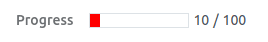
If currentValue is more than 0 but less than or equal to 40, the method assigns the CSS class o_progress_red, turning the progress bar red.
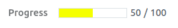
If currentValue is above 40 and up to 70, the method applies the CSS class o_progress_yellow, which changes the progress bar to yellow.
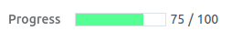
If currentValue is more than 70 but does not exceed 90, the method assigns the CSS class o_progress_light_green, coloring the progress bar light green.
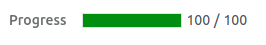
If currentValue is above 90 and up to 100, the method applies the CSS class o_progress_green, which changes the progress bar to green.
If currentValue doesn't match any of these ranges, the method defaults to the bg-primary class, applying the standard Bootstrap primary color.
Once this logic and styling are defined, Odoo will automatically apply these customizations when rendering the progress bar. As users engage with the form and the progress value changes, the progress bar will automatically adjust its color to represent the current level of completion.
By implementing these steps, you can adjust the colors of progress bars in Odoo 18 according to their completion levels, which enhances the user interface's clarity and visual appeal. This customization allows users to easily gauge the status of different tasks and processes at a glance. Improving UI elements such as the progress bar can greatly enhance user experience and increase productivity.
To read more about How to Change the Color on a Progress Bar in Odoo 17, refer to our blog How to Change the Color on a Progress Bar in Odoo 17.