Tooltips are essential for improving user experience since they give users more information or brief hints when they hover over components. The useTooltip hook in Odoo 15 provides a flexible method for handling customized tooltips on different components' elements. This article will examine the main characteristics that give this hook its potency as well as effective approaches to employing it.
What is the useTooltip Hook?
With Odoo 15, developers can show custom tooltips on components that have the data-tooltip attribute by using the useTooltip hook. This custom tooltip gives you greater flexibility over its positioning and dynamic content compared to the native tooltip, which displays the contents of the title attribute.
Basic Usage
The useTooltip hook's fundamental application is simple. Add the data-tooltip attribute to every element that requires a custom tooltip. Here's an illustration:
<button data-tooltip="This is a tooltip">
       Do something
</button>
In this case, the custom tooltip will appear and then display "This is a tooltip" when the user hovers over the button.
Customizing Tooltip Position
One of the most important features of the useTooltip hook is its ability to set the tooltip's optimal position using the data-tooltip-position parameter. You can use this property to position the tooltip relative to the element in a way that best meets your UI or design specifications.
As an example:
<button data-tooltip="This is a tooltip" data-tooltip-position="left">
        Do something
</button>
The tooltip in this particular case will appear to the left of the button.
Advanced Tooltips with Dynamic Content
The data-tooltip-info and data-tooltip-template properties are useful in situations when a tooltip must include more complex or dynamic content. You can use dynamically generated data or HTML material for tooltip creation with these characteristics.
Assume the following QWeb template is yours:
<t t-name="some_template">
  <ul>
	<li>info.x</li>
	<li>info.y</li>
  </ul>
</t>
To utilize this template in a tooltip, provide an element with the following properties:
<button data-tooltip-template="some_template" data-tooltip-info="info">
       Do something
</button>
In this case, the dynamic data keys x and y would be contained in a stringified object called info. The tooltip, which has been generated from the some_template template and supplied with the info data, appears when the user hovers over the button.
We'll go through an example that demonstrates how to use dynamic data collected from the backend to create a custom tooltip for products in a list view.
Step 1: Patching the List Renderer
odoo.define('product_web_hover.ListRenderer', function (require) {
   "use strict";
   var ListRenderer = require('web.ListRenderer');
   ListRenderer.include({
       _renderBodyCell: function (record, node, colIndex, options) {
           var result = this._super.apply(this, arguments);
           if (typeof record.data[node.attrs.name] === "object" &&                                       record.data[node.attrs.name].model === "product.product") {
               this.getProductFromBackend(record.data[node.attrs.name].data?.id)
                   .then(productInfo => {
                       result.attr('data-tooltip-info', JSON.stringify(productInfo))
                             .attr('data-tooltip-template', "product_web_hover.HoverTemplate");
                   })
           }
           return result;
       },
   });
});
Every single cell in a list view is rendered by this approach. To add custom tooltip characteristics to cells containing product data, we override it. We check the record.data object to see if the cell matches a product. If so, we use a custom function called getProductFromBackend to retrieve more product details. After the product data is obtained, the data-tooltip-info attribute is used to add it to the cell and convert it to a JSON string. To indicate how the tooltip should be presented, we additionally include the data-tooltip-template.
Step 2: Fetching Product Data from the Backend
getProductFromBackend: async function(productId) {
if (productId) {
const requiredData = await this._rpc({
model: "product.product",
method: "read",
args: [[productId], []],
});
if (requiredData && requiredData.length > 0) {
return {
name: requiredData[0].name,
categ_id: requiredData[0].categ_id[1],
code: requiredData[0].code,
list_price: requiredData[0].list_price,
standard_price: requiredData[0].standard_price,
qty_available: requiredData[0].qty_available,
image_1920: requiredData[0].image_1920
};
}
}
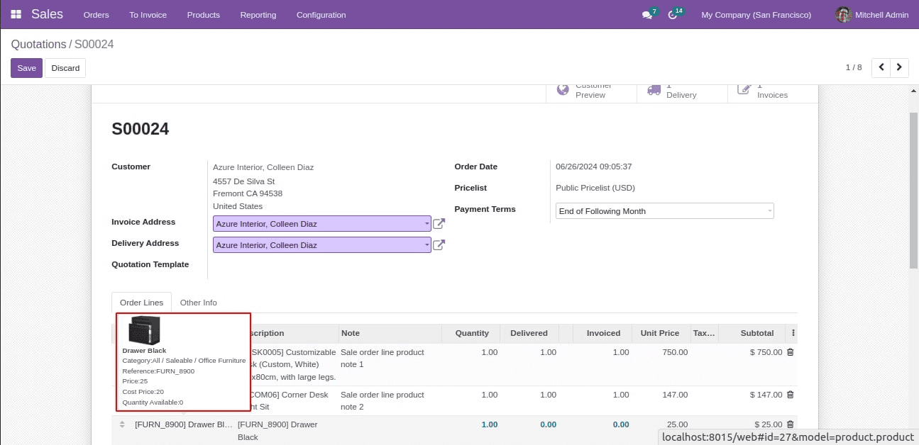
}Here If the data is found, an object with the name, category, reference, price, and available quantity of the product is returned. The tooltip template will receive this info.
Step 3: Creating the Tooltip Template
The next step is to define the QWeb template that will render the tooltip after the data has been retrieved from the backend. The data-tooltip-template attribute that was previously given is used by this template.
Here is the tooltip template's XML code:
<?xml version="1.0" encoding="UTF-8"?>
<templates id="template" xml:space="preserve">
<!--    Template shows the necessary details about the product-->
   <t t-name="product_web_hover.HoverTemplate" owl="1">
       <t t-if="info">
           <t t-if="info['image_1920']">
               <img t-attf-src="data:image/png;base64,{{info['image_1920']}}" class="img-fluid text-center" style="width: 50px; margin-left: 10px;"/>
           </t>
          <br/><b><t t-esc="info.name"/></b><br/>
           <span>Category:</span><t t-esc="info.categ_id"/><br/>
           <span>Reference:</span><t t-esc="info.code"/><br/>
           <span>Price:</span><t t-esc="info.list_price"/><br/>
           <span>Cost Price:</span><t t-esc="info.standard_price"/><br/>
           <span>Quantity Available:</span><t t-esc="info.qty_available"/>
       </t>
   </t>
</templates>
The data-tooltip-template attribute references the template name, which is defined by the t-name="product_web_hover.HoverTemplate".
In conclusion, the useTooltip hook offers a strong method for implementing dynamic content and adjustable positioning for customized tooltips in Odoo 15. Developers can construct user-friendly, interactive interfaces using data-tooltip, data-tooltip-position, data-tooltip-template, and data-tooltip-info. This capability is a great addition to your Odoo toolset, whether you're adding straightforward text suggestions or complex HTML tooltips.
To read more about An Overview of Field Attributes in Odoo 16, refer to our blog An Overview of Field Attributes in Odoo 16.