Organizing an event is a difficult task. It entails numerous trials and tribulations, from planning to execution. Individuals and organizations use a variety of methods to manage all aspects of an event, including event management groups, websites, and contracting. However, the company or person organizing the event won't be aware of most of its internal workings or specifics.
Odoo is a complete event management system that enables the user (individual or organization) to easily manage all aspects of their business event from beginning to end. This platform also aids in the improvement of sales, business promotion, ticket sales, event organization, and so on.
Odoo events include a variety of features that help to improve the overall process of organizing any type of event, from small to large, for both personal and business purposes.
We have already covered some of the most important features of the events module, including adding a new payment provider, publishing, registering for events, inviting attendees, and creating new events.
Users can now see a quick summary of their events by using the reporting menu in the events platform after creating, registering, and selling tickets. This menu is extremely useful for reviewing previous, postponed, and upcoming events. As a result, the user can quickly grasp the ups and downs of their business based on events.
Let's have a look at the reporting menu. You can view the report details by clicking on the "Reporting" option from the events module main menu. as shown in the screenshot below
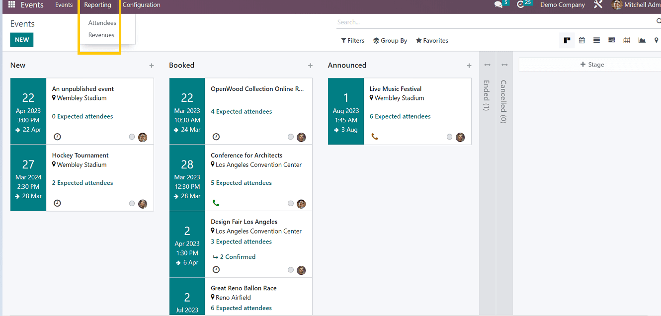
In the report menu, users can get two types of reports such as
1. Attendees
2. Revenues
Attendee based Report
Users can view attendee-based reports for various events in this reporting section.
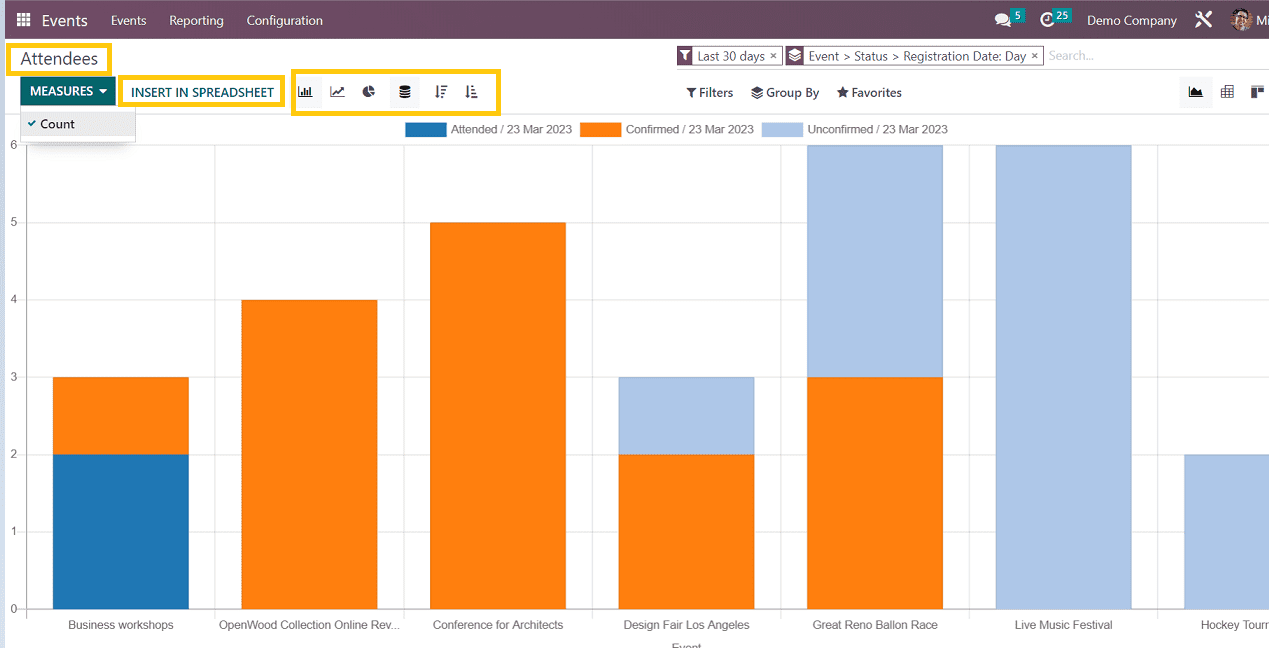
Various metrics are available for viewing the report. This view only uses counting measures to display the information.
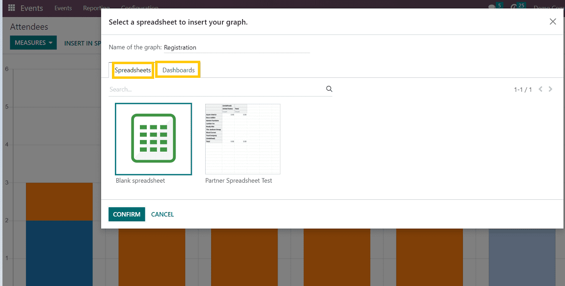
Insert Spreadsheet: Users can insert spreadsheets to analyze additional data relevant to their event business by choosing the "INSERT IN SPREADSHEET" option. So, as shown in the screenshot below, it will open a window where we can upload spreadsheets and dashboards pertinent to the particular report.
By choosing one of the options, as shown in the screenshot below, users can view the report in various visualization formats, including bar charts, pie charts, and line graphs.

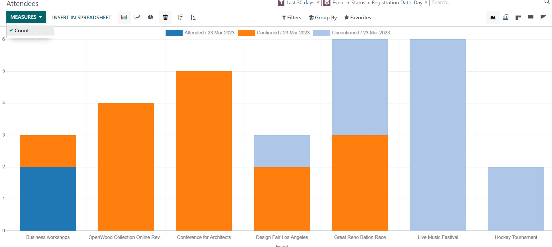
Bar Chart View
By selecting the bar chart icon, users can view the data as a bar chart.

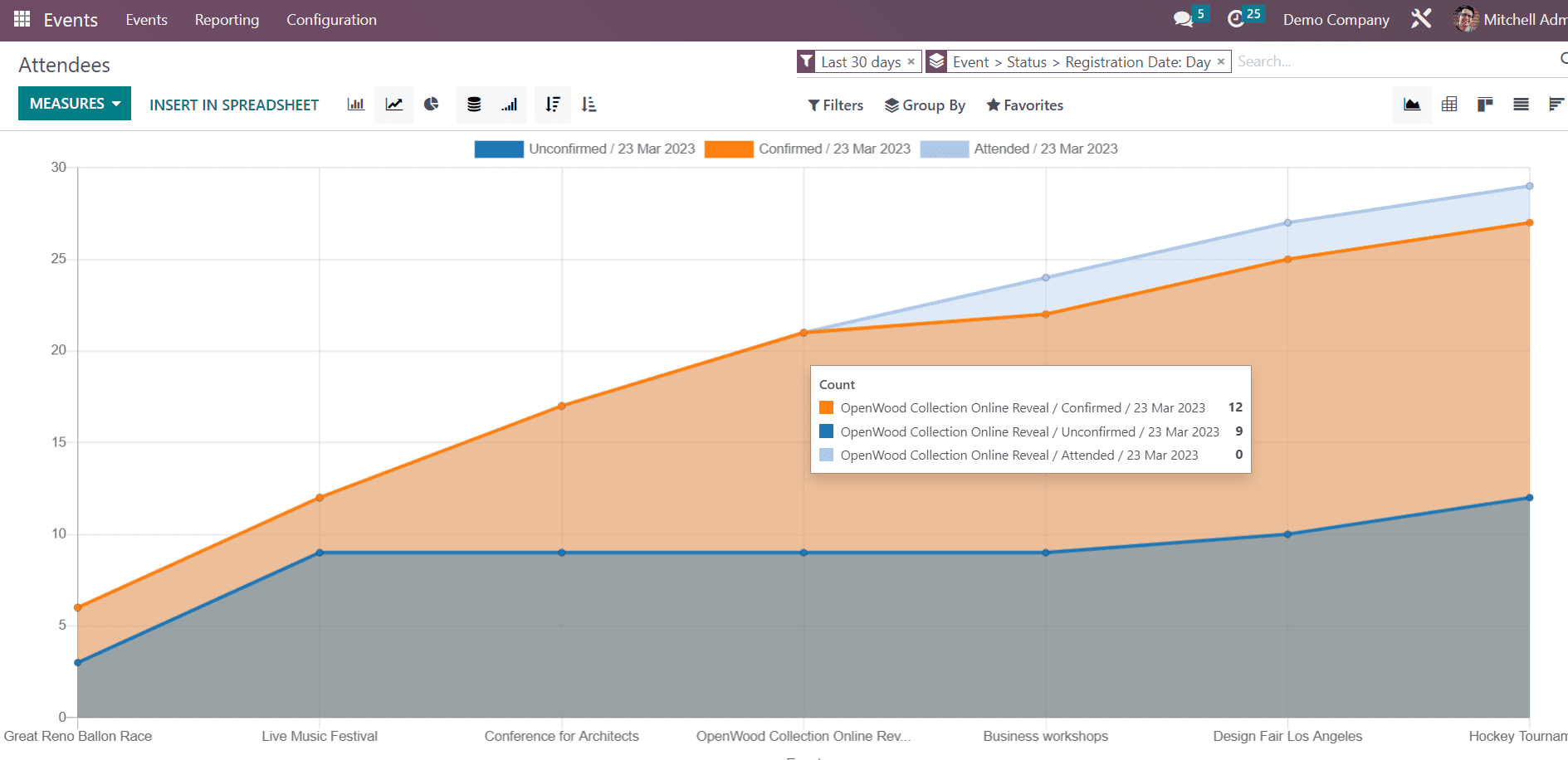
Line chart View
By clicking on the line chart view option the report will be shown like the screenshot below

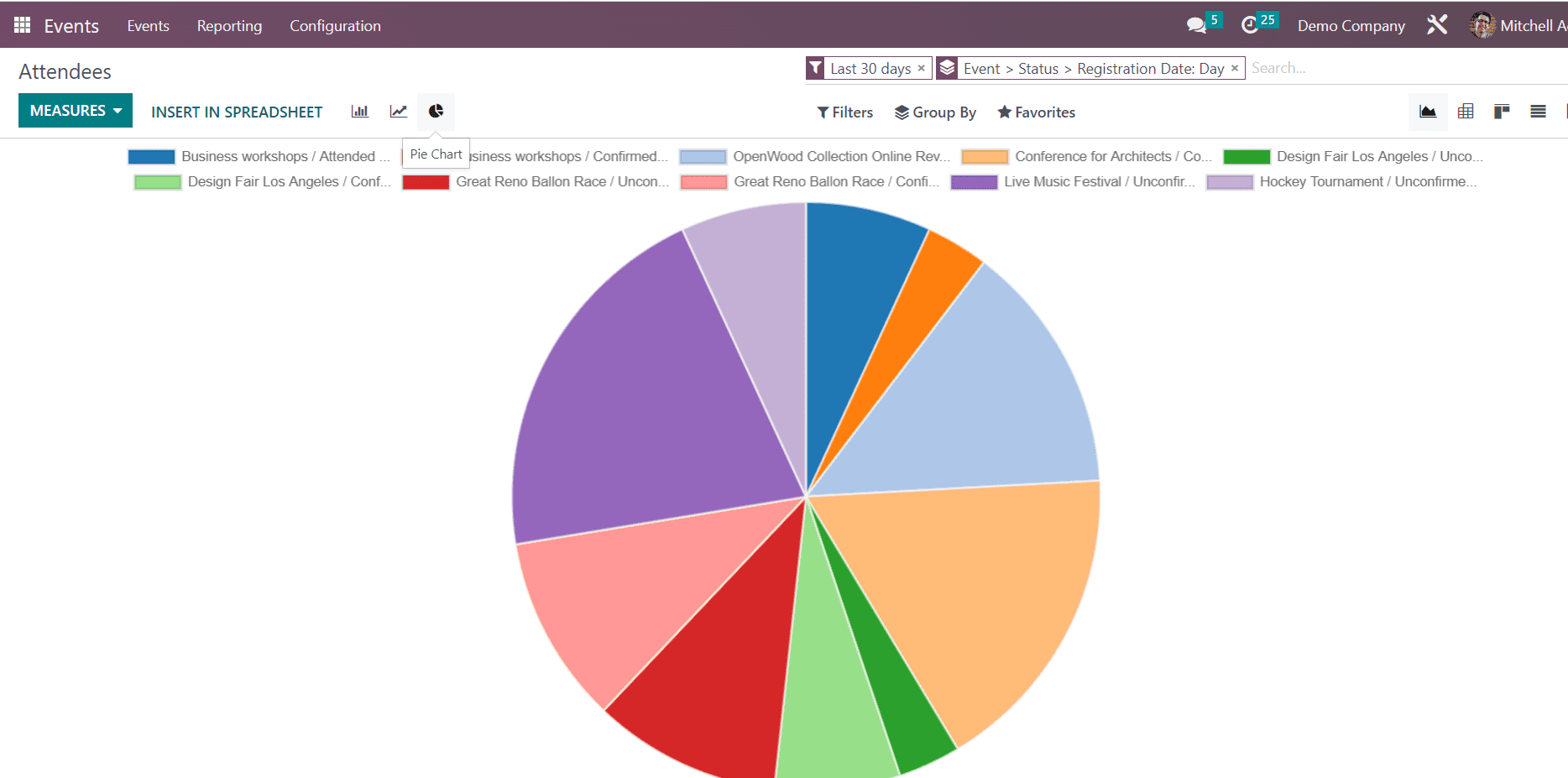
Pie Chart view
Using Pie chart view option data reports can be shown as

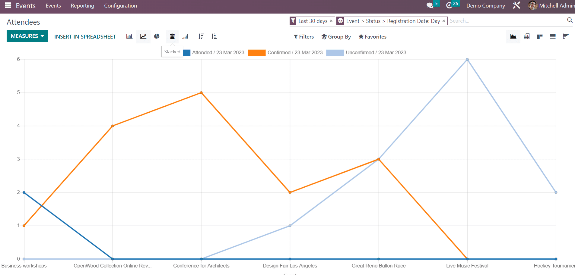
Stacked view
Using Stacked view button, we can see the Report in a stacked view

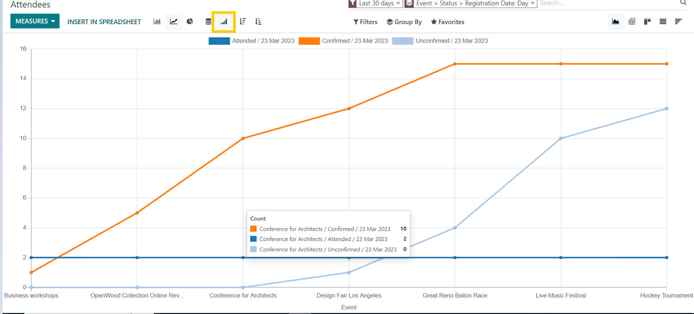
Similarly, the user will get various views for the reports which are shown in the screenshots below.
Cumulative view
Descending Chart view

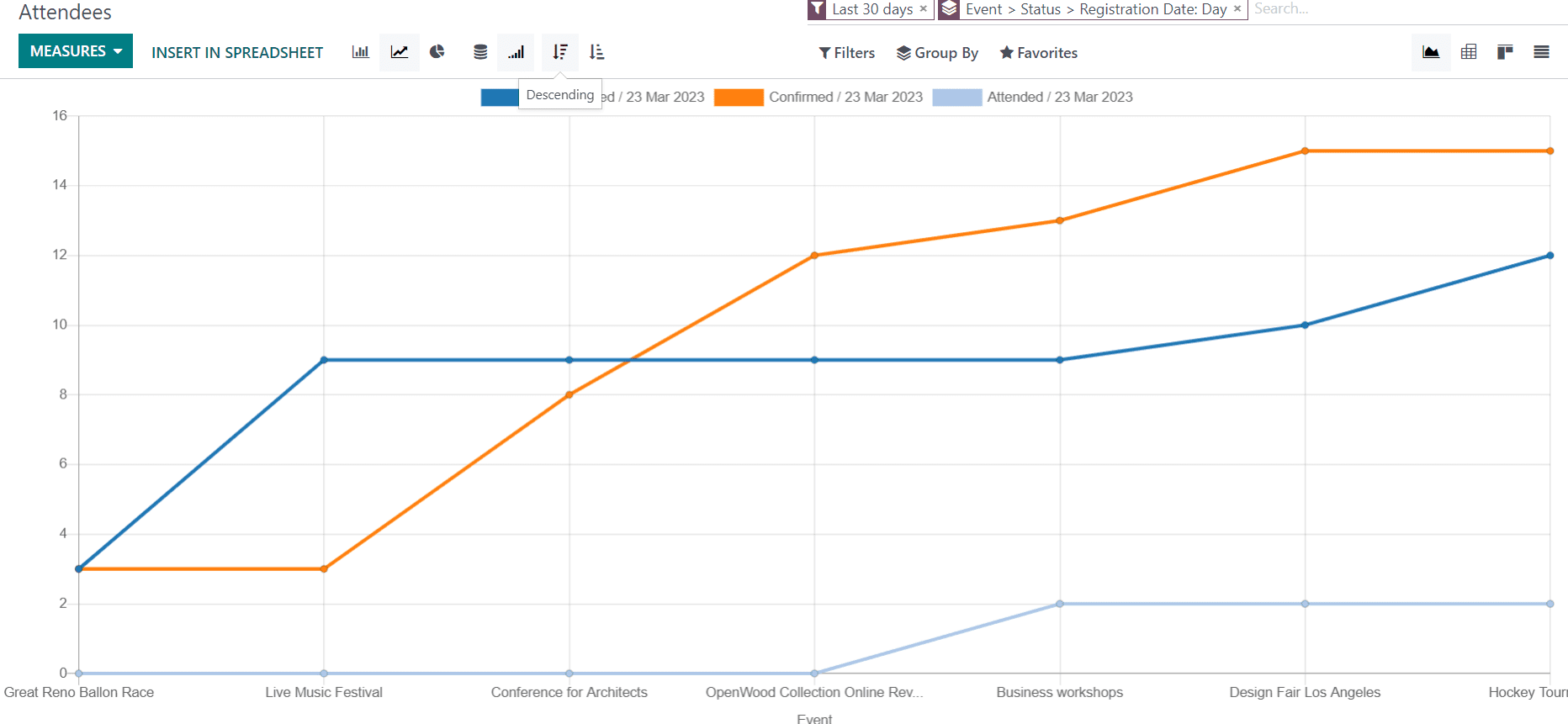
Ascending Chart view

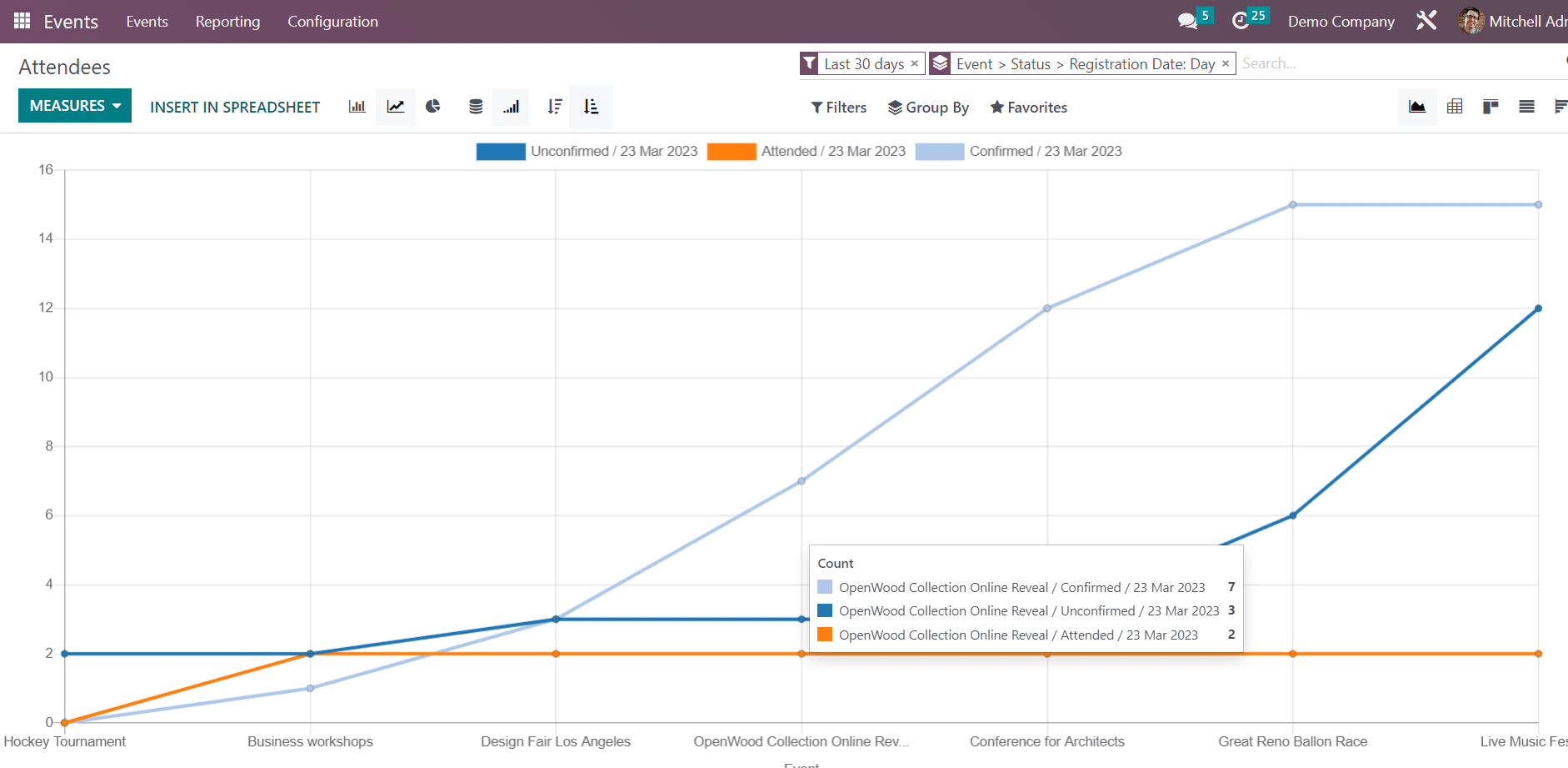
With the aid of this reporting section, users can review various aspects of their events and analyze their businesses. In this case, the user can easily understand information about event attendees, such as how many attendees have confirmed or unconfirmed registration, etc.
In the graph view, by selecting a particular measurement, we can look at the details of that measurement in relation to each section.
For example, if we want to see the number of attendees whose registration is not confirmed, we can sort out the graphical data based on that particular measurement. A graphical representation of the number of unconfirmed attendees will then appear.
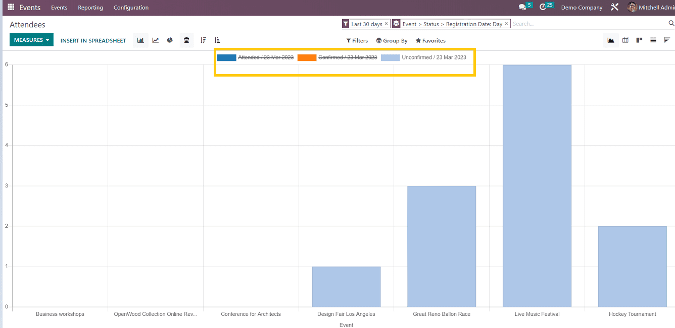
By disabling the other measures, we can extract the necessary data just like in the screenshot above.
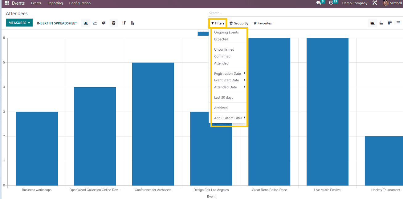
Filter Views

We can filter the data by various measurements, as seen in the screenshot above.
Users can filter the reports in this filter view based on information such as expected attendees, confirmed attendees, registration dates, etc.
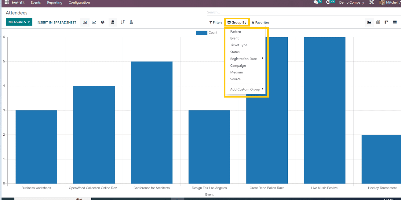
Group By views
By pressing this button, users can select a subset of the data from the graphical view to view according to partners, events, statuses, registration dates, etc. For instance, it is possible for the user to view the report for a specific registration date. or, depending on the needs, we can modify the group by adding customizable group names
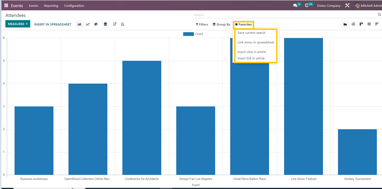
Favorites
Users can mark graphical view as favorites, link the graphical view in spreadsheets, insert views in articles, insert the link of report views in article by using this option
Revenue based Reporting
In this section of the reporting interface, users can view revenue-based reports. As a result, this reporting view will be extremely helpful in enhancing business performance and generating revenue.
Although there are more options in this report than in attendee-based reporting, revenue management efficiency is still increased.
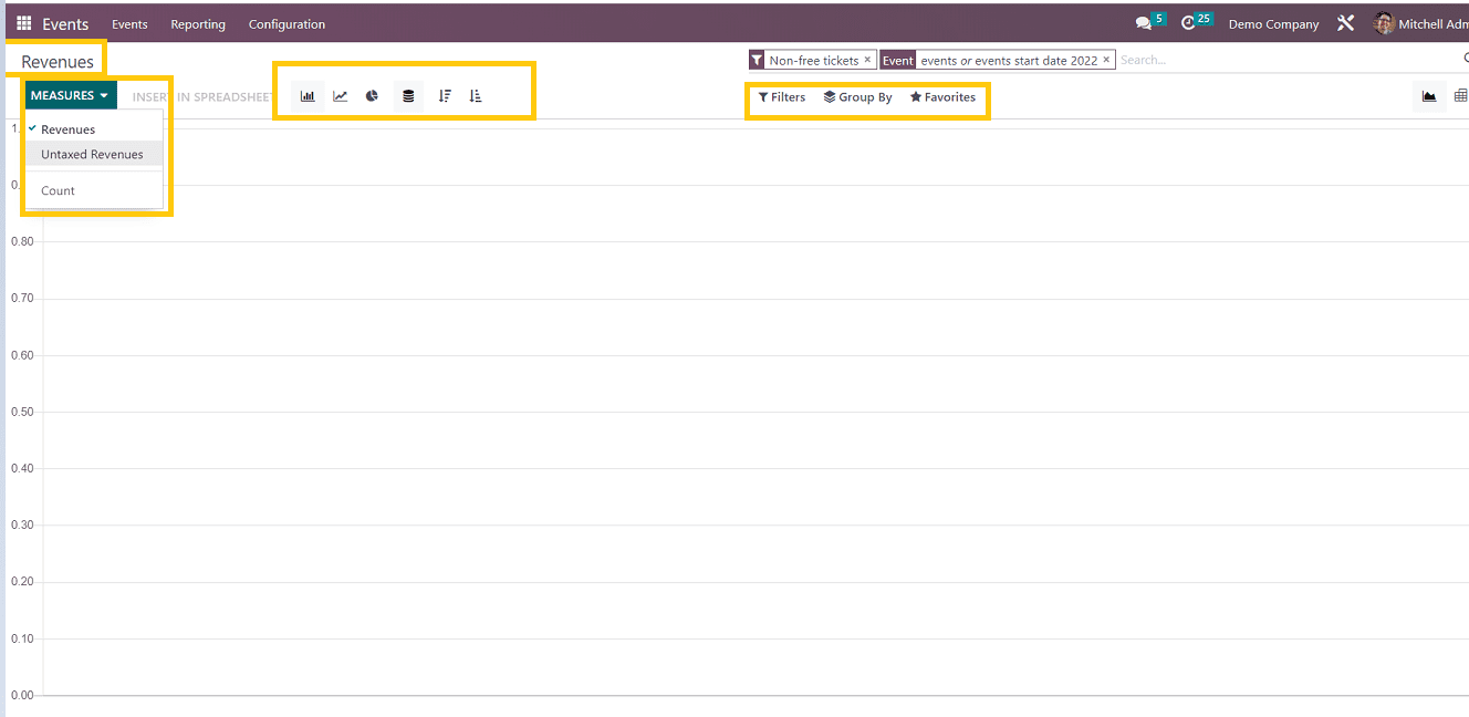
Measures
In the Measures, we can sort the data by revenue, untaxed revenues, and count
Also we can view the report in different graphical views as shown earlier in the attendees reporting section like line chart view, bar chart, pie chart etc.
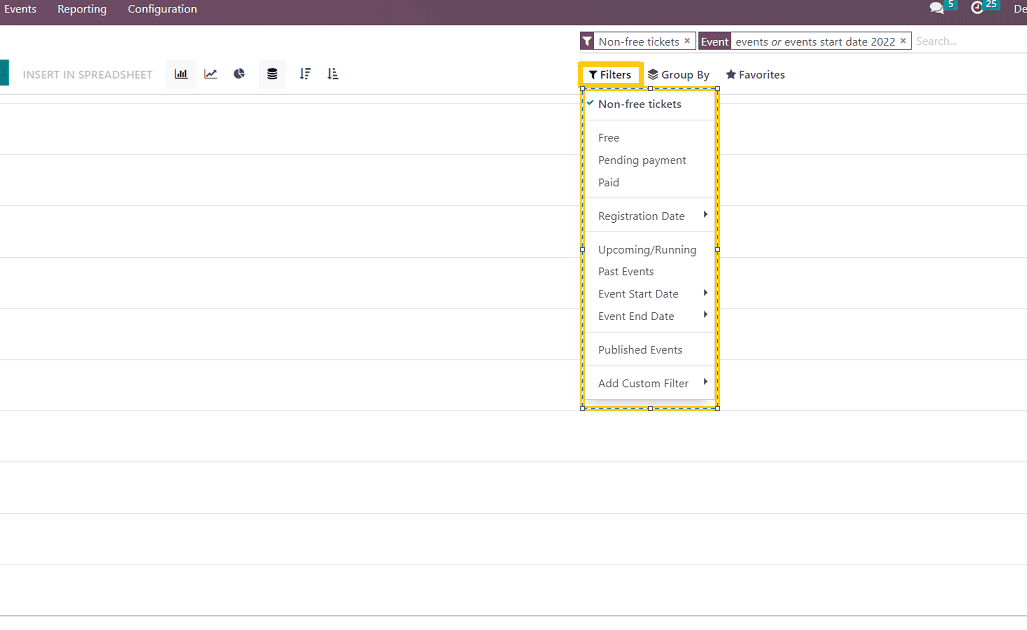
Filters
With regard to revenue management, the filters section provides options like "free," "paid, "pending payment," "paid, "registration date," "event start date," etc. this filter options we can easily understand the revenue generated, profit, sales etc related to the events coordinated by the user
Group by
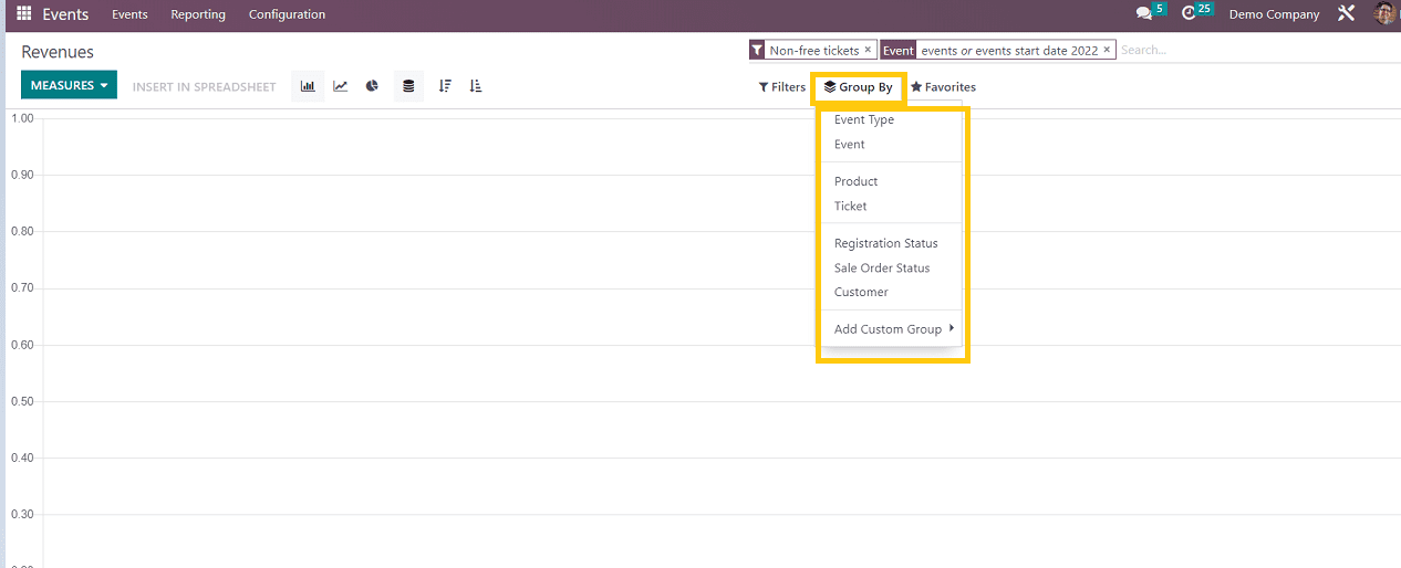
Here the group by section also changed a bit according to the revenue management we can group the data in based on Event type, Product, Ticket, sales order status etc.
Favorites
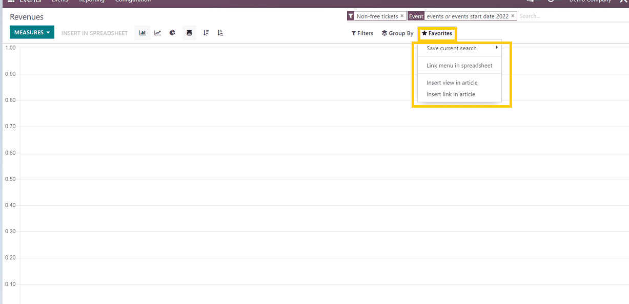
This option is identical to the attendees' reporting page. We can link the menu in a spreadsheet, insert the view in articles, and insert the link in articles.
These are some of the options available in the Events platform's 'Reporting' menu that allow users to easily analyze their event data by using these various data visualization formats, which improves performance, growth, and overall business functions.