In Odoo, JS dialog boxes or popups are very helpful in showing messages, confirming actions, alerts, warnings, etc.
By default in Odoo, the Dialog Boxes have default properties and styles.
But it’s also possible to modify the properties and style of the Dialog boxes to fit our business needs.
In this blog, we will explore how to modify the JS Dialog boxes in Odoo 16, which will help to enhance the appearance, behavior, and functionalities of Dialog boxes.
/** @odoo-module */
import {patch} from "@web/core/utils/patch";
import { KanbanRenderer } from "@web/views/kanban/kanban_renderer";
var Dialog = require('web.Dialog');
var core = require('web.core');
var _t = core._t;

patch(KanbanRenderer.prototype, "custom_stage_notification.KanbanRenderer", {
 	async sortRecordDrop(dataRecordId, dataGroupId, { element, parent, previous }) {
    	element.classList.remove("o_record_draggable");
    	if (
        	!this.props.list.isGrouped ||
        	parent.classList.contains("o_kanban_hover") ||
        	parent.dataset.id === element.parentElement.dataset.id
    	) {
        	parent && parent.classList && parent.classList.remove("o_kanban_hover");
        	while (previous && !previous.dataset.id) {
            	previous = previous.previousElementSibling;
        	}
        	const refId = previous ? previous.dataset.id : null;
        	const targetGroupId = parent && parent.dataset.id;
        	var Record = this.props;

         	var save =  function() {
            	Record.list.moveRecord(dataRecordId, dataGroupId, refId, targetGroupId);
        	};
         	Dialog.confirm(self, "Are you sure you want to change the stage?", {
            	title: _t("Confirmation"),
            	confirm_callback: async function(){
                         	Record.list.moveRecord(dataRecordId, dataGroupId, refId, targetGroupId);
            	},
            	cancel_callback: function(){
                	console.log("Click Cancel");
            	}
        	});
    	}
    	element.classList.add("o_record_draggable");
	}
});
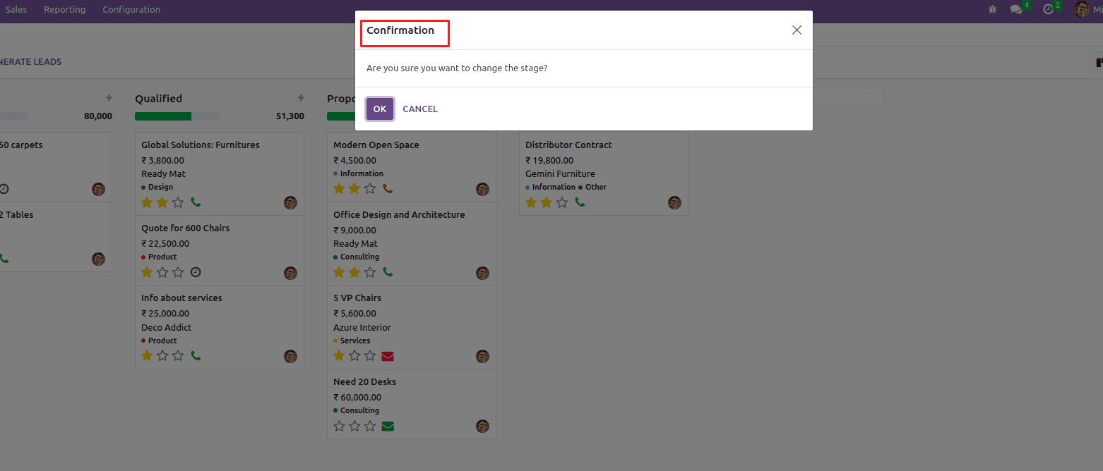
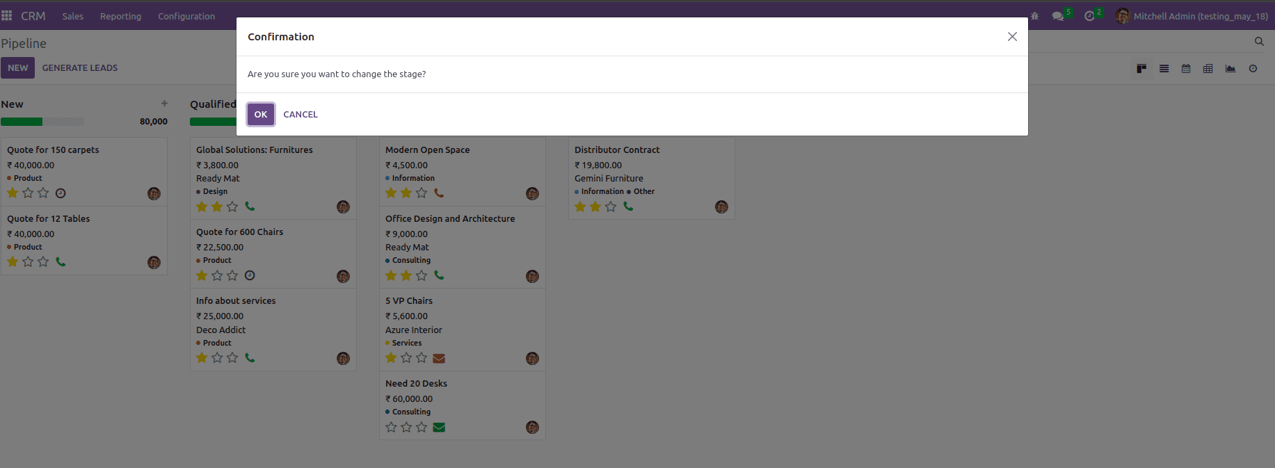
Above shown is a simple Confirmation Dialog. Let’s see how we can modify this Dialog using different predefined parameters in JS.
1). title :
The “title” parameter can be used to specify the title or heading of the message
Dialog.confirm(self, "Are you sure you want to change the stage?", {
         title: _t("Confirmation"),
         confirm_callback: function(){
         		console.log("Click Confirm");
         },
         cancel_callback: function(){
                    console.log("Click Cancel");
        }
 });
2. size :
The “size” parameter can be used to adjust the width of the Dialog box. Four options are available for this parameter and they are 'extra-large', 'large', 'medium', and 'small'.
Below is an example of a size set as 'extra-large', likewise we can set any of the four options as per our desire
Dialog.confirm(self, "Are you sure you want to change the stage?", {
         title: _t("Confirmation"),
         size: ‘extra-large’,
         confirm_callback: function(){
         		console.log("Click Confirm");
         },
         cancel_callback: function(){
                    console.log("Click Cancel");
        }
 });
3. fullscreen :
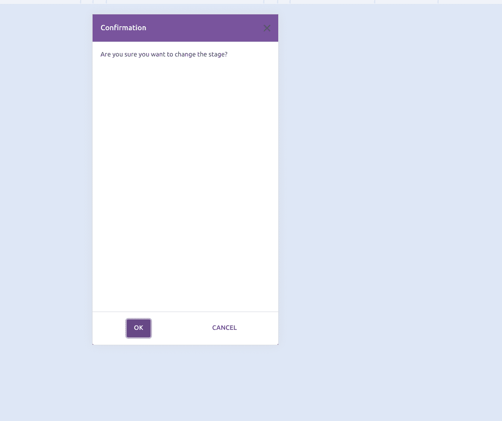
Fullscreen is used to determine whether or not the dialog should be open in fullscreen mode. Its main use case is mobile.
Dialog.confirm(self, "Are you sure you want to change the stage?", {
         title: _t("Confirmation"),
         fullscreen: true,
         confirm_callback: function(){
         		console.log("Click Confirm");
         },
         cancel_callback: function(){
                    console.log("Click Cancel");
        }
 });
4. dialogClass :
In the dialogClass parameter, we can specify the class that needs to be added to the body of the Dialog box.
.dialog-body{
      background-color: #ccf9ff;
 }
Dialog.confirm(self, "Are you sure you want to change the stage?", {
         title: _t("Confirmation"),
         dialogClass: 'dialog-body',
         confirm_callback: function(){
         		console.log("Click Confirm");
         },
         cancel_callback: function(){
                    console.log("Click Cancel");
        }
 });
5. $content :
$content is a jQuery parameter. It will replace the modal body.
Dialog.confirm(self, "Are you sure you want to change the stage?", {
         title: _t("Confirmation"),
         $content: $('<div>', {
                        	text: _t("Need to change the stage?")
                    	}),
         confirm_callback: function(){
         		console.log("Click Confirm");
         },
         cancel_callback: function(){
                    console.log("Click Cancel");
        }
 });
6. buttons:
buttons is a list parameter that will include a list of button descriptions. If the “buttons” parameter is not specified, then an "OK" primary button will added to allow closing the dialog.
The options that can be used inside the buttons parameter are listed below.
a) text - the label of the button.
b) classes - specify the class to be added to the buttons. If there is only one button, classes will default to the 'btn-primary' otherwise 'btn-secondary'.
c) close - decides whether to close the dialog box after clicking the button.
d) click - define the function that is to be called when clicking the button.
e) disabled - if set as true then that button will be disabled and will not be clickable.
Dialog.confirm(self, "Are you sure you want to change the stage?", {
         title: _t("Confirmation"),
         buttons: [
                        	{
                            	text: _t("Confirm"),
                            	classes: 'btn-primary',
                            	close: true,
                            	click: function () {
                                	console.log("Confirm button clicked")
                            	},
                        	},
                        	{
                            	text: _t('Cancel'),
                            	close: true,
                            	disabled: true,
                            	click: function () {
                                	console.log("Cancel button clicked")
                            	},
                        	}
                    	]
 });
7)technical :
If set to false, the Dialog box will have the standard frontend style.
Dialog.confirm(self, "Are you sure you want to change the stage?", {
         title: _t("Confirmation"),
         technical: false,
         confirm_callback: function(){
         		console.log("Click Confirm");
         },
         cancel_callback: function(){
                    console.log("Click Cancel");
        }
 });
8) $parentNode :
$parentNode is a jQueryElement parameter. This will determine the element in which the dialog box will be appended, by default it will be in the body.
Dialog.confirm(self, "Are you sure you want to change the stage?", {
         title: _t("Confirmation"),
         $parentNode: $(document.body.querySelector(".o_dialog_container")),
         confirm_callback: function(){
         		console.log("Click Confirm");
         },
         cancel_callback: function(){
                    console.log("Click Cancel");
        }
 });
9) backdrop :
Determines the kind of modal backdrop to use. It will take true/false and string values.
Dialog.confirm(self, "Are you sure you want to change the stage?", {
         title: _t("Confirmation"),
         backdrop: 'static',
         confirm_callback: function(){
         		console.log("Click Confirm");
         },
         cancel_callback: function(){
                    console.log("Click Cancel");
        }
 });
If “backdrop” is set as “true”, then we can click outside of this Dialog to close it. If it is “static” or “false”, cannot click outside to close it.
10) renderHeader :
Decide the visibility of the header in the Dialog box. If it is set as true, then the Header section will show in the Dialog, otherwise, it will not rendered.
Dialog.confirm(self, "Are you sure you want to change the stage?", {
         title: _t("Confirmation"),
          renderHeader: false,
         confirm_callback: function(){
         		console.log("Click Confirm");
         },
         cancel_callback: function(){
                    console.log("Click Cancel");
        }
 });
11)renderFooter :
Decide the visibility of the footer in the Dialog box. If it is set as true, then the Footer section will show in the Dialog, otherwise, it will not rendered.
Dialog.confirm(self, "Are you sure you want to change the stage?", {
         title: _t("Confirmation"),
          renderFooter: false,
         confirm_callback: function(){
         		console.log("Click Confirm");
         },
         cancel_callback: function(){
                    console.log("Click Cancel");
        }
 });
12)onForceClose :
Here we can define the Callback function that triggers when the Dialog is closed by other means (e.g. pressing ESC ) than with the buttons.
Dialog.confirm(self, "Are you sure you want to change the stage?", {
         title: _t("Confirmation"),
            onForceClose: function() {

                    	}
         confirm_callback: function(){
         		console.log("Click Confirm");
         },
         cancel_callback: function(){
                    console.log("Click Cancel");
        }
 });
By using the above-mentioned parameters, we can modify the JS Dialog boxes in Odoo16. Refer to our previous blog about How to Use the Odoo JS Dialog/Popup to read more about the JS Dialog Box in Odoo.