The ExpansionTile widget tool in Flutter is suitable for creating detailed, expandable list items. When you have limited space in your application but need to display more information, the ExpansionTile widget allows you to expand and collapse list items efficiently. This makes it ideal for applications where detailed information is required without cluttering the interface. Some of the properties of Expansion Tile are listed below.
* title: This property sets the title for the ExpansionTile widget, ensuring it is always visible to the user.
* children: This property can contain multiple widgets, such as cards or simple text, which are revealed when the title is clicked.
* leading: Positioned on the left side of the title, similar to the ListTile widget's leading property.
* trailing: Positioned to the right of the title, allowing the addition of text or icons.
* backgroundColor: Sets the background color for the expanded part of the tile, affecting only the expanded area, not the title itself.
Let us take an example below and check the way of customization.
import 'package:flutter/material.dart';
void main() => runApp(const ExpansionTileApp());
class ExpansionTileApp extends StatelessWidget {
  const ExpansionTileApp({super.key});
  @override
  Widget build(BuildContext context) {
    return MaterialApp(
      theme: ThemeData(useMaterial3: true),
      home: Scaffold(
   	 appBar: AppBar(title: const Text('ExpansionTile Customization'),backgroundColor: Colors.blue),
   	 body: const ExpansionTileExample(),
      ),
    );
  }
}
class ExpansionTileExample extends StatefulWidget {
  const ExpansionTileExample({super.key});
  @override
  State<ExpansionTileExample> createState() => _ExpansionTileExampleState();
}
class _ExpansionTileExampleState extends State<ExpansionTileExample> {
  bool _customTileExpanded = false;
  @override
  Widget build(BuildContext context) {
    return Column(
      children: <Widget>[
   	 const ExpansionTile(
 		 title: Text('Tile 1'),
 		 subtitle: Text('Expansion Tile 1'),
 		 children: <Widget>[
   		 ListTile(title: Text('This is tile number 1')),
 		 ],
   	 ),
   	 const ExpansionTile(
 		 title: Text('Tile 2'),
 		 subtitle: Text('Expansion Tile 2'),
 		 children: <Widget>[
   		 ListTile(title: Text('This is tile number 2')),
 		 ],
   	 ),
   	 const ExpansionTile(
 		 title: Text('Tile 3'),
 		 subtitle: Text('Expansion Tile 3'),
 		 children: <Widget>[
   		 ListTile(title: Text('This is tile number 3')),
 		 ],
   	 ),
      ],
    );
  }
}
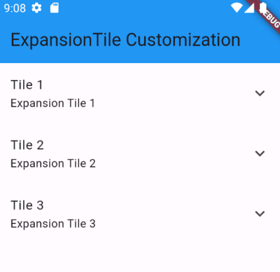
Here a simple example for ExpansionTile is created.
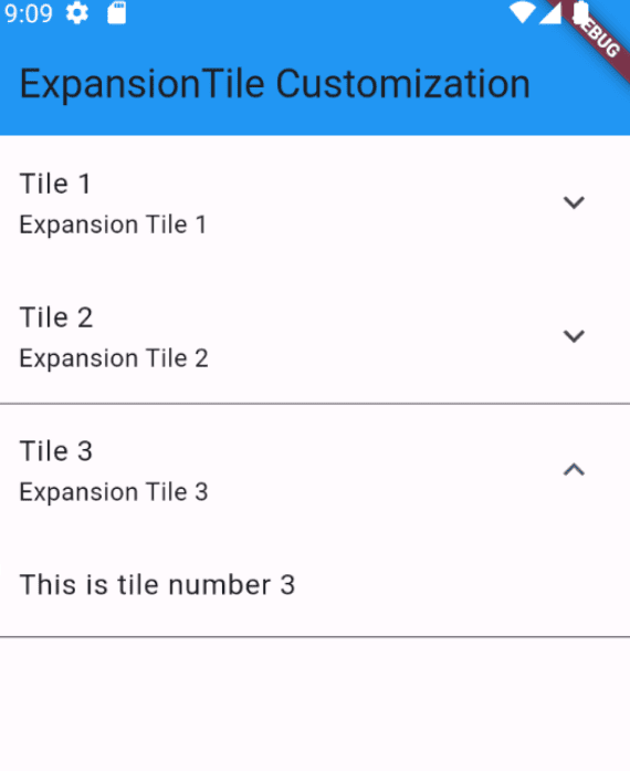
If I click the arrow, the tile expands.
Remove Trailing Expandable Icon
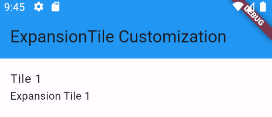
In an ExpansionTile, the arrow icon typically appears at the end of the title, and there isn't a direct boolean parameter to toggle its visibility. However, since ExpansionTile inherits from ListTile, you can customize the trailing widget by replacing the default icon with any other widget. To hide the arrow, you can simply set the trailing property to an empty widget like SizedBox.
const ExpansionTile(
      	title: Text('Tile 1'),
      	subtitle: Text('Expansion Tile 1'),
      	trailing: SizedBox(),
      	children: <Widget>[
        	ListTile(title: Text('This is tile number 1')),
      	],
    	),
Expandable Icon in Left
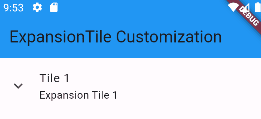
The expansion arrow icon in an ExpansionTile is typically displayed on the right side (trailing edge) in left-to-right languages. This can be altered using the controlAffinity property, which determines whether the icon is positioned at the leading or trailing edge. The following example shows how you can customize both the location and appearance of the expansion icon in an ExpansionTile.
    	const ExpansionTile(
      	title: Text('Tile 1'),
      	subtitle: Text('Expansion Tile 1'),
      	controlAffinity: ListTileControlAffinity.leading,
      	children: <Widget>[
        	ListTile(title: Text('This is tile number 1')),
      	],
    	),
Disable the Expansion of ExpansionTile
When a tile in an ExpansionTile is clicked, it typically expands or collapses. However, if you need to prevent the expansion in certain situations, you can do so by wrapping the ExpansionTile with an IgnorePointer widget. This will block gesture detection, effectively disabling the expansion.
bool _disableExpansion = true;
 IgnorePointer(
      	ignoring: _disableExpansion,
      	child: const ExpansionTile(
        	title: Text('Tile 1'),
        	subtitle: Text('Expansion Tile 1'),
        	children: <Widget>[
          	ListTile(title: Text('This is tile number 1')),
        	],
      	),
    	),
Change Expansion Text Color
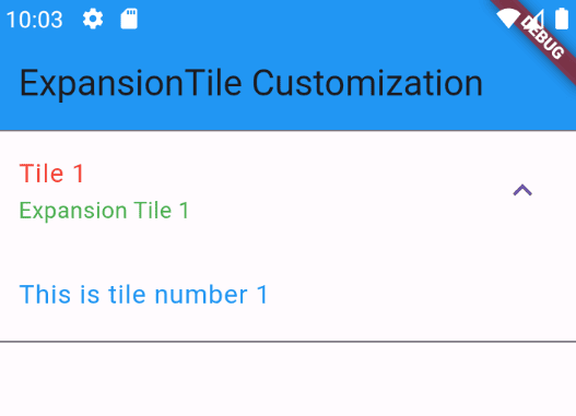
To customize the text color of the ExpansionTile title when it's expanded without overriding the entire Theme, you can directly specify the textColor in the TextStyle for the title and subtitle. Here's how you can do it:
const ExpansionTile(
      	title: const Text(
        	'Tile 1',
        	style: TextStyle(color: Colors.red),
      	),
      	subtitle: const Text(
        	'Expansion Tile 1',
        	style: TextStyle(color: Colors.green),
      	),
      	children: <Widget>[
        	ListTile(title: Text('This is tile number 1',style: TextStyle(color: Colors.blue))),
      	],
    	),
Remove Divider Line
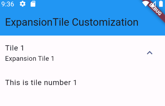
Customizing the ExpansionTile in Flutter by modifying the divider color without removing it directly. Since ExpansionTile internally creates a divider and uses the divider color from the Theme, you can set the divider color to Colors.transparent by overriding the dividerColor in the Theme.
Theme(
      	data: Theme.of(context).copyWith(dividerColor: Colors.transparent),
      	child: const ExpansionTile(
        	title: Text('Tile 1'),
        	subtitle: Text('Expansion Tile 1'),
        	children: <Widget>[
          	ListTile(title: Text('This is tile number 1')),
        	],
      	),
    	),
Note that overriding the Theme will affect all descendant widgets under the ExpansionTile. If you have child widgets that rely on the original dividerColor from the material theme, you should wrap those specific widgets with another Theme widget to retain their intended divider color.
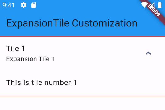
Also, change the color of the divider line by replacing transparent color to any other color.
data: Theme.of(context).copyWith(dividerColor: Colors.red),
The flexibility of ExpansionTile customization not only enriches the user interface but also helps in organizing information effectively, making your app more user-friendly and visually appealing. Embracing these customization techniques can lead to better user retention and satisfaction.
To read more about How to Create Bottom Bar Navigation in Flutter, refer to our blog How to Create Bottom Bar Navigation in Flutter.