Form view shows data in a form manner based on a single record. Users can add, remove, or rearrange fields to create and modify the view.
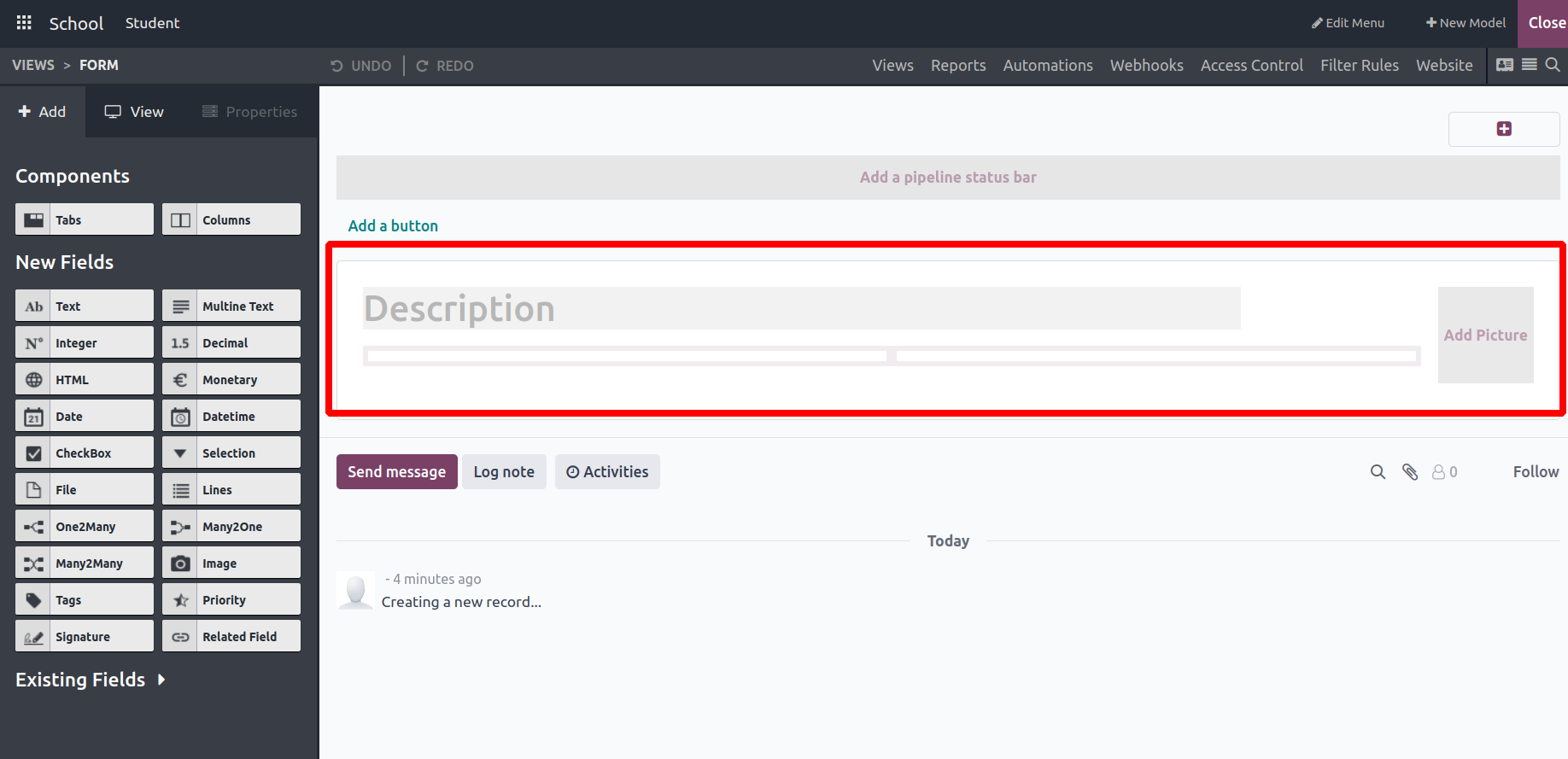
This is a sample of the standard form display. It appears we have the flexibility to modify it by removing current fields and incorporating new ones that suit our needs. On the left-hand side, within the 'Add' section, various field types and components are available. By simply dragging and dropping these elements onto the form, anyone can tailor the view to meet specific requirements.
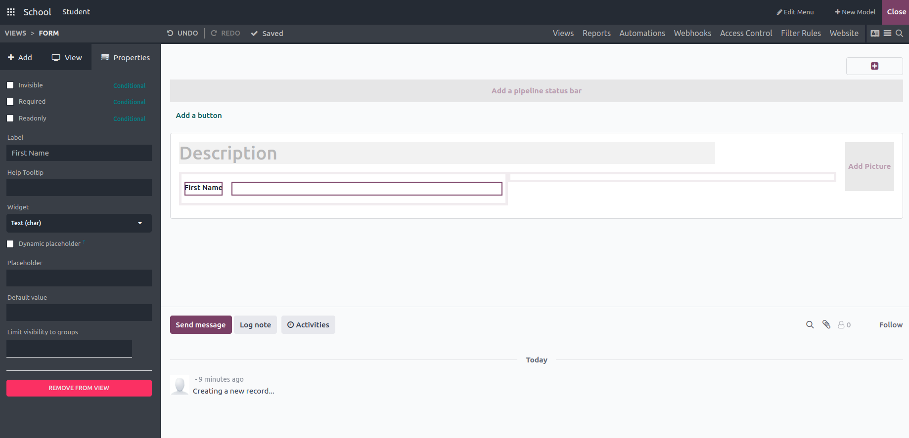
‘Text’: The field type ‘Text’ is used to create a text field by dragging and dropping wherever you want to display it in the form. Using the label field, we can provide the field name, and we can also choose the widget type, add a default value to display the field, also limit visibility only to particular groups.
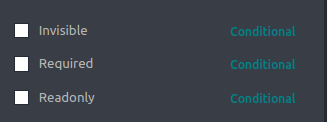
Also, through the activation of these checkboxes, we can include field attributes such as invisibility, requirement status, and read-only mode.
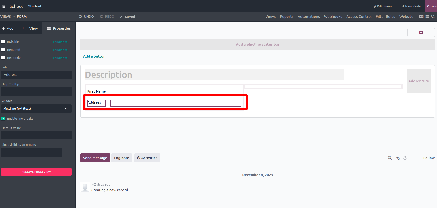
'Multiline text': This feature allows the addition of multiple text fields to the form view as required.
E.g.: Address

Checkbox’: This function adds checkboxes to the form view, allowing the creation of a field label and the assignment of a default value (either True or False). It also enables restricting field visibility to specific groups as needed.
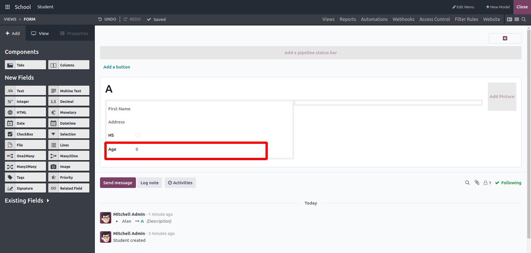
‘Integer’: This function incorporates an Integer field into the form, enabling the addition of a label, restricting field visibility to specific groups, and setting a default value (which is 0 by default).
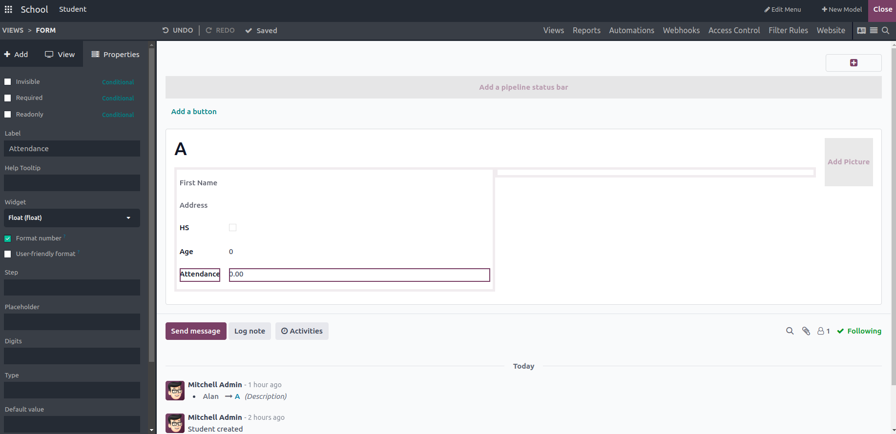
‘Decimal’: This field allows the user to input decimal values into the form view.
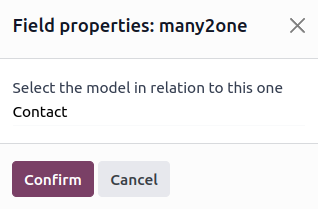
‘Many2One’: Here, users can select the relation model. I have chosen the Contact model
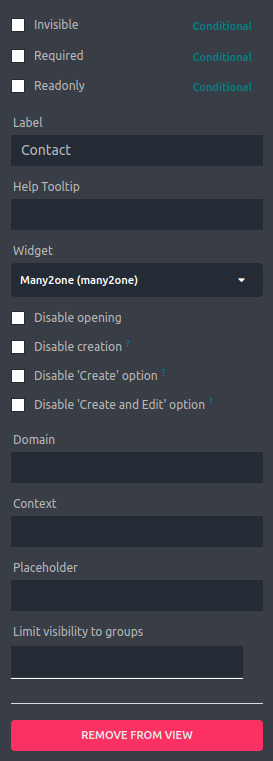
Unlike before, here we can set the domain and context for the field. Adding a domain expression can limit the selection options for the Many2One field based on specific conditions and by setting a context for the Many2One field you can set a default value for a related field.
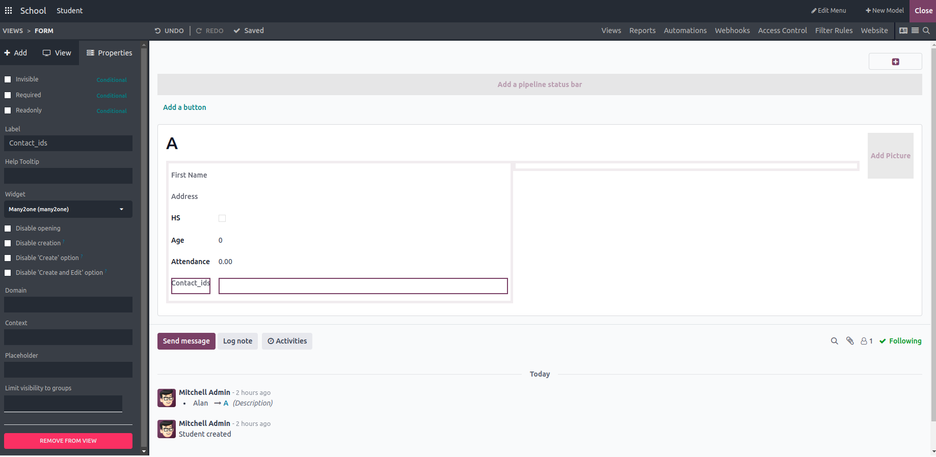
In the same way, we can create the Many2Many fields and choose the widget as Many2Many tags.
‘Date’: This field allows users to input and display the date. You can also set the label of the field and help text.
‘Date & Time’: Unlike the Date field, this field shows the time along with the date.
‘HTML’: Used to create and display an HTML field in the form view, where users can input long words as a description
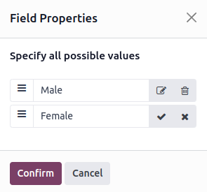
Here we can create multiple options and confirm
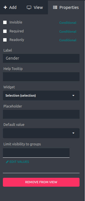
‘Selection’: Allows users to select a value from a pre-defined list of options created.
‘Image’: Allows users to upload and display images in the form.
‘Priority’: Allows users to set a priority level for a record, like a rating.
‘File’: Allows users to upload and attach files to a record.
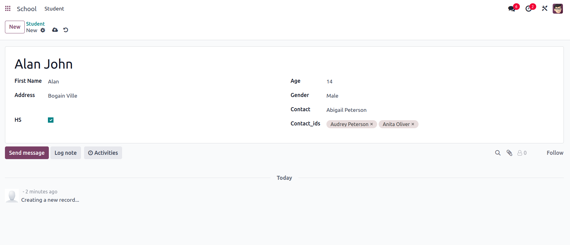
This is the final view of the form view with values in the fields. We can adjust the positions of the field by drag and drop.
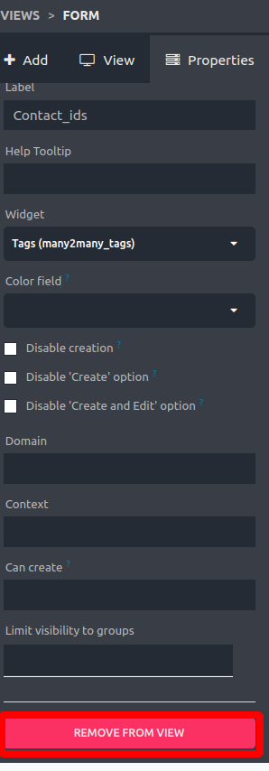
To remove a created field from the form, just select the field and click on the ‘REMOVE FROM VIEW’ button.