Form view displays data from a single record in a form format. Users can
create and customize the view by adding, removing, or rearranging
fields.
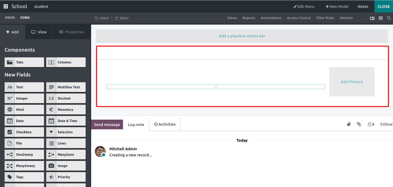
Here’s an example of the default form view. We can likely edit this form
by deleting the existing fields and adding new fields based on our
requirements. Under the ‘Add’ tab on the left,
we can see different field types and components. By dragging and
dropping these fields to form, anyone can create a form view as per
requirements.
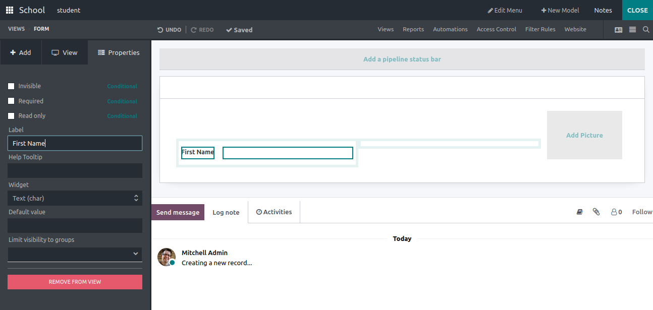
‘Text’: The field type ‘Text’ is used to create a text field by
dragging and dropping wherever you want to display it in the form. Using
the label field, we can provide the field name, and we can also choose
the widget type, add a default value to display the field, also limit
visibility only to particular groups.
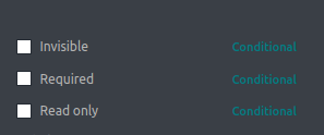
In addition, by enabling these checkboxes, we can add field attributes
like invisible, required, and read-only.
‘Multiline text’:
By using this, we can add multiple text fields to the form view in case
of need
E.g.: Address
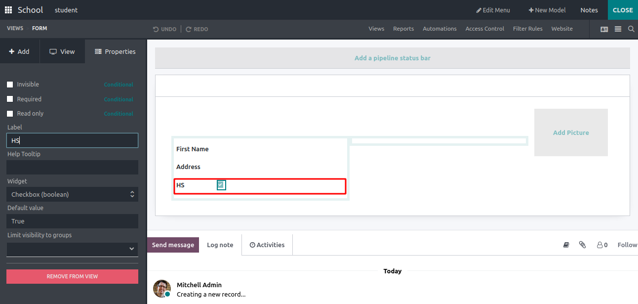
Checkbox’: Is used to add checkboxes to the form view. We can
create a label to this field,
and add a default value whether True or False. Also can limit the field
visibility to particular groups.
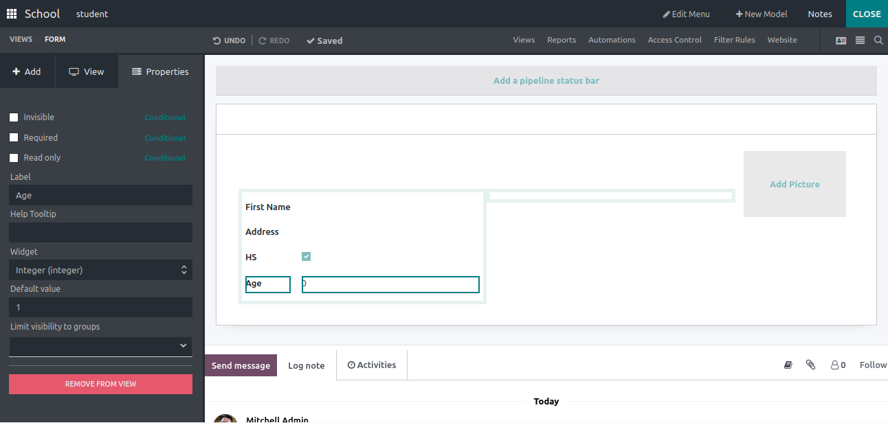
‘Integer’: Used to add an Integer field to the form field, we can
add the label, limit field visibility to particular groups, and also set
a default value to the field. By default, it is 0.
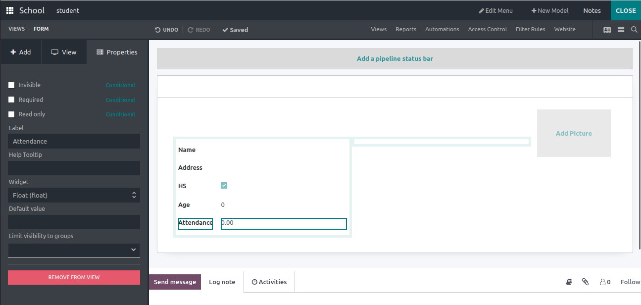
‘Decimal’:
This field allows the user to input decimal values into the form view.
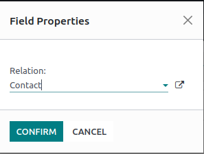
‘Many2One’:
Here, users can select the relation model. I have chosen the Contact
model
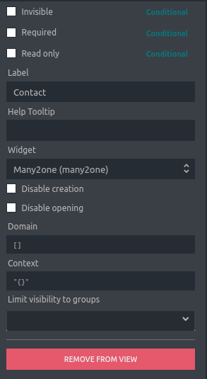
Unlike before, here we can set the domain and context for the field.
Adding a domain expression can limit the selection options for the
Many2One field based on specific
conditions and by setting a context for the Many2One field you can set a
default value for a related field.
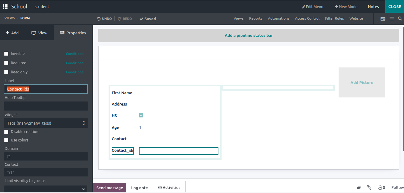
In the same way, we can create the Many2Many fields and choose the widget
as Many2Many tags.
‘Date’:
This field allows users to input and display the date. You can also set
the label of the field and help text.
‘Date & Time’:
Unlike the Date field, this field shows the time along with the date.
‘HTML’:
Used to create and display an HTML field in the form view, where users
can input long words as a description
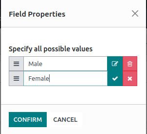
Here we can create multiple options and confirm
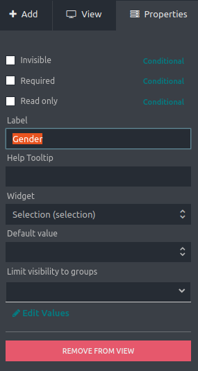
‘Selection’: Allows users to select a value from a pre-defined list of
options created.
‘Image’:
Allows users to upload and display images in the form.
‘Priority’:
Allows users to set a priority level for a record, like a rating.
‘File’:
Allows users to upload and attach files to a record.
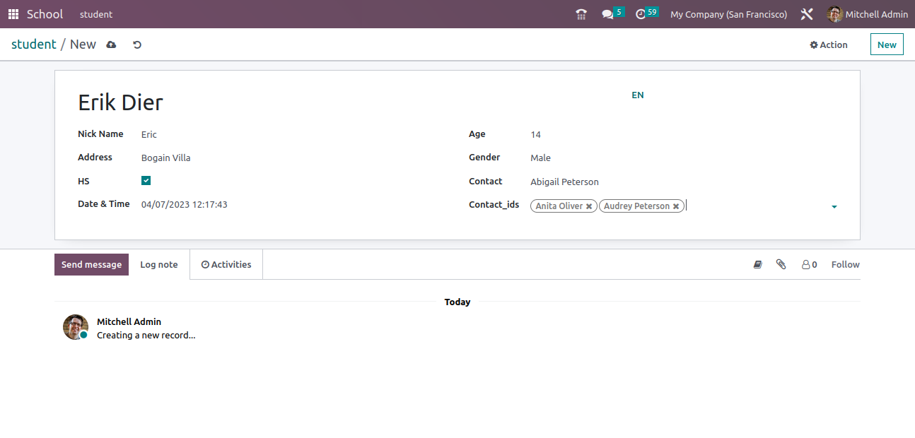
This is the final view of the form view with values in the fields. We can adjust the positions of the field by drag and drop.
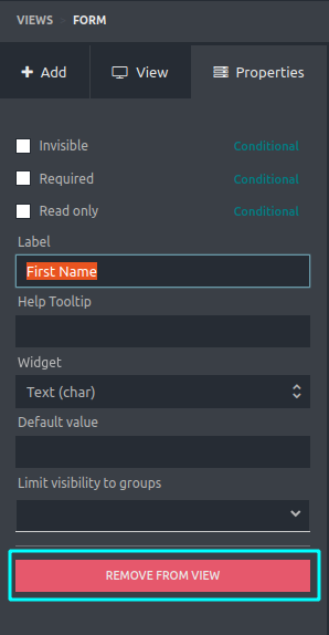
To remove a created field from the form, just select the field and click on the ‘REMOVE FROM VIEW’ button.