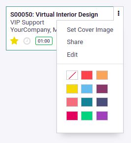
Kanban Cards
For clarity, card definitions can be split into multiple templates, but the Kanban
view defines at least one master template Kanban box, rendered once per record.
Kanban cards are defined in a Kanban box template. This content area can also have
a sub container for the footer. A button to open the action menu may also appear
in the upper right corner of the map. In the footer, we should use a
<div>
element at the bottom of the kanban box with CSS class oe_kanban_bottom. It can
be further divided into left and right footer areas using the CSS classes
oe_kanban_bottom_left
and oe_kanban_bottom_right. Additionally, the Pull-Left and Pull-Right classes provided
by Bootstrap can be used to add left-aligned or right-aligned elements anywhere
on the card, including in the oe_kanban_bottom footer Example QWeb template for
our Kanban card:
<t t-name="kanban-box">
  <!-- Set the Kanban Card color: -->
   <div t-attf-class="
    oe_kanban_color_#{kanban_getcolor(record.color.raw_value)}
    oe_kanban_global_click">
       <div class="o_dropdown_kanban dropdown">
           #Top-right drop down menu here
       </div>
       <div class="oe_kanban_body">
         # Content elements and fields go here
      </div>
       <div class="oe_kanban_footer">
         <div class="oe_kanban_footer_left">
             #Left hand footer
         </div>
         <div class="oe_kanban_footer_right">
             #Right hand footer
         </div>
      </div>
      <div class="oe_clear"/>
  </div> #end of kanban color
</t>
This sets the overall structure of the Kanban card. Use a color field in the top
<div> element to dynamically set the color of the map.
<div class="oe_kanban_body">
  #Content elements and fields go here.
   <div>
     <field name="tag_ids" />
   </div>
   <div>
     <strong>
         <a type="open"><field name="name" /></a>
     </strong>
 </div>
   <ul>
     <li><field name="user_id" /></li>
     <li><field name="date_deadline" /></li>
   </ul>
 </div>
In the left-hand footer, we will insert the priority widget:
<div class="oe_kanban_footer_left">
  #Left hand footer
  <field name="priority" widget="priority"/>
</div>
Here, we can see the priority field added, just like we would do in a form view.
We will place the Kanban state widget and the avatar at the right hand footer.
#Right hand footer
<div class="oe_kanban_footer_right">
  <field name="Kanban_state" widget="kanban_state_selection"/>
  <img t-att-src="kanban_image(
    'res.users', 'image_small', record.user_id.raw_value)"
    t-att-title="record.user_id.value"
   width="24" height="24"
   class="oe_kanban_avatar" />
</div>
The Kanban state is added using a <field> element, just like in regular form
views. The avatar image is inserted using the <img> tag. In some case, we may want
to have a small representative image to be shown on the Kanban card, such as in the
Contacts example. This can be done by adding the following code:
<img t-att-src="kanban_image(
  'res.partner', 'image_medium', record.id.value)"
  class="o_kanban_image"/>
Activities and Kanban Cards
Odoo uses activities to schedule actions on records. These activities can be managed
from the Kanban view.
To manage activity from the Kanban view, first of all we need to add mail dependencies
to the manifest file and inherit activity mixin in to our model.Then add the
activity_state field to the Kanban view.
<field name="activity_state"/>
Then add the activity_ids field inside the kanban template
<field name="activity_ids" widget="kanban_activity"/>

We added the activity widget itself. It uses the activity_ids field..
With the activity
widget, you can schedule, edit, and process the activity directly from the Kanban card.
Interactive Kanban Cards
Kanban cards support all HTML tags, which means you can design them however you like.
Odoo provides some built-in ways to make Kanban cards more interactive
Add a color field to the Kanban view:
<field name="color" />
Add a dropdown to choose a color on the Kanban view:
<t t-name="kanban-box">
  <div t-attf-class="oe_kanban_color_#{kanban_getcolor(record.color.raw_value)}oe_kanban_card oe_kanban_global_click">
      <div class="o_dropdown_kanban dropdown">
          <a role="button" class="dropdown-toggle o-no-caret btn" data-toggle="dropdown" href="#" aria-label="Dropdown menu" title="Dropdown menu">
              <span class="fa fa-ellipsis-v"/>
          </a>
          <div class="dropdown-menu" role="menu">
              <t t-if="widget.editable">
                  <a role="menuitem"type="edit"class="dropdown-item">Edit</a>
              </t>
              <t t-if="widget.deletable">
                  <a role="menuitem" type="delete" class="dropdown-item">Delete</a>
              </t>
              <div role="separator" class="dropdown-divider"/>
              <ul class="oe_kanban_colorpicker" data-field="color"/>
          </div>
      </div>
<t>
To the Kanban card, we added t-attf-class="#{kanban_color(record.color.raw_value)}. This
will be used to display the color of the Kanban card. It uses the value of the color
field and generates a class based on that value. For example, if a Kanban record has a
value of 2 in the color field, it will add kanban_color_2 to the class. After that, we
added a drop-down menu to add options such as Edit, Delete, and the Kanban color picker.
The Edit and Delete options are only displayed if the user has proper access rights
Add tags and a popularity field to the Kanban view:
<span class="oe_kanban_list_many2many">
  <field name="category_id" widget="many2many_tags" options="{'color_field': 'color'}"/>
</span>
<field name="priority" widget="priority"/>
We used the priority widget on the priority field, which displays the selection field
with star icons. In the category_id field, we used the many2many_tags widget, which
displays the many2many field in the form of tags. The color_field option is passed to
enable the color feature on tags. The value of this option is the field name where the
color index is stored.
