Pipeline analysis and pipeline activities
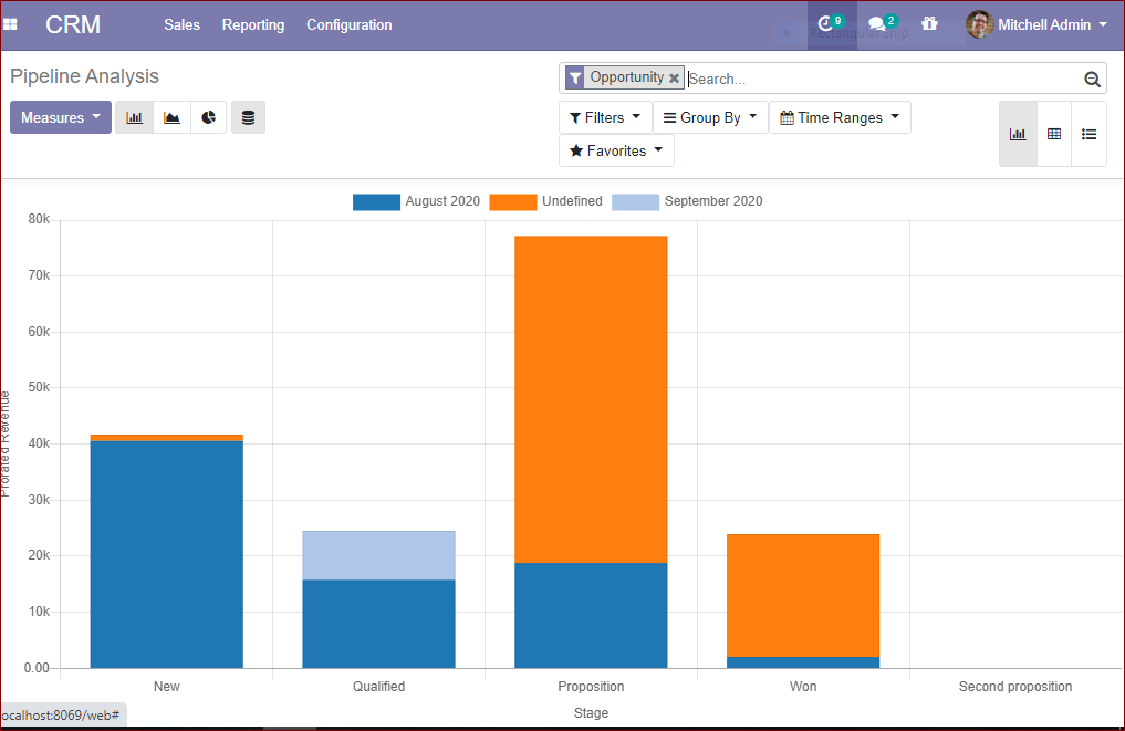
Under the reporting menu, there are pipeline analysis and pipeline activity analysis options. In this dashboard, one can find a clear graphical representation of the pipeline.
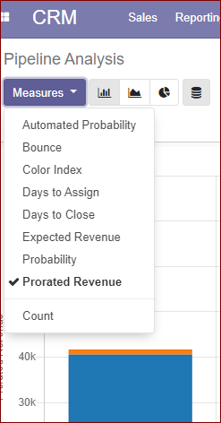
by clicking on the measures option in the pipeline analysis dashboard, the menu showing different types of measures like automated probability, bounce, color index, day to assign, days to close, expected revenue, probability, prorated revenue, and the count could be seen.
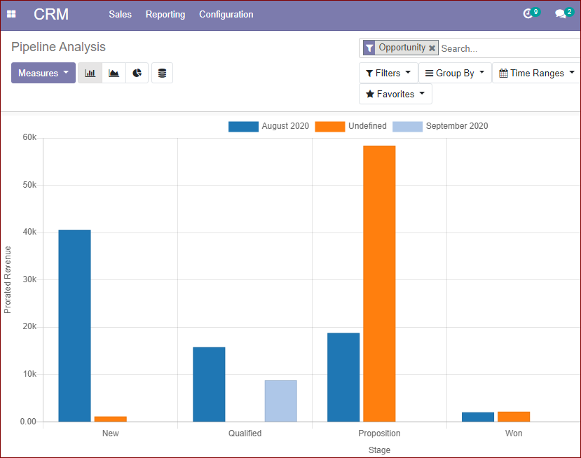
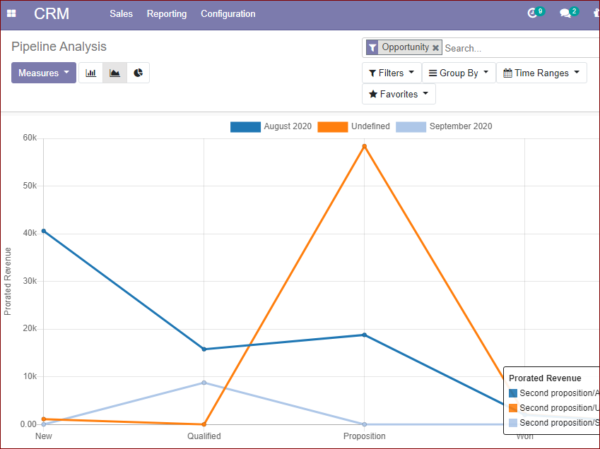
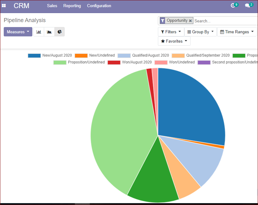
There are different graphical representations available in the pipeline dashboard such as bar chart, line chart, and pie chart which can be summarised a large amount of data in a visually appealing way and one can easily understand the trends and the measures. It can be considered as the efficient communication tool. The data comparison can be conducted effectively. The images of the bar chart , pie chart and line chart is depicted below.
Bar Chart
Line Chart
Pie Chart
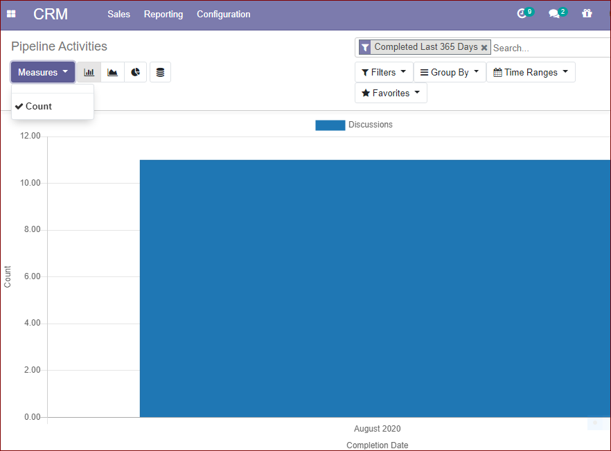
Under the PIPELINE ACTIVITIES DASHBOARD, the measures option is available in the counting method. This gives a graphical idea about all the stages of pipeline activities in the counting method. This view is available in BAR CHART, LINE CHART, PIE CHART. By these representations, we get a clear picture of all stages of activities of the pipeline in a simple click without wasting much time. This graphical analysis is very useful in companies where there are uncountable numbers of leads.
We came through the reporting section of this platform and now we can analyze how Odoo will handle the won and lost opportunities. It is sure that the Odoo CRM module is one of the best tools for managing the won and lost opportunities. Now let us discuss the points.