The List View in Odoo is a powerful feature used to display records in a tabular format, allowing users to efficiently manage and interact with large datasets. It includes various components such as fields, buttons, headers, and control elements, each designed to enhance functionality and user experience. These components can be customized and combined to meet specific business needs and workflows.
In this blog, we are discussing the child elements used in the list view. Such as field, button, groupby, header, control, and create.
First, we want to create a new model, declare the fields, and create a menu, action, and corresponding view, as we discussed in the previous blog, List View Attributes in Odoo 18.
We can declare the list view in an XML file as follows,
<record id="class_teacher_view_list" model="ir.ui.view">
   <field name="name">class.teacher.view.list</field>
   <field name="model">class.teacher</field>
   <field name="arch" type="xml">
       <list string="Teachers">
           <field name='name'/>
           <field name='age'/>
           <field name='email'/>
           <field name='joining_date'/>
           <field name='subject'/>
           <field name='qualification'/>
           <field name="state"/>
       </list>
   </field>
</record>
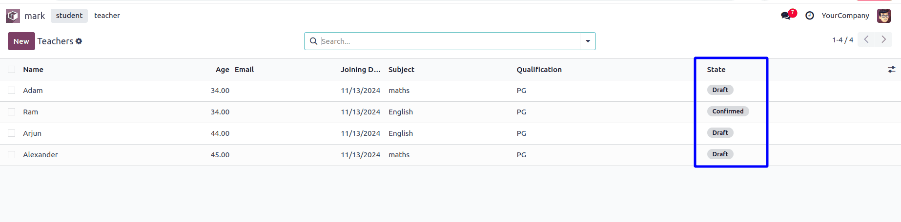
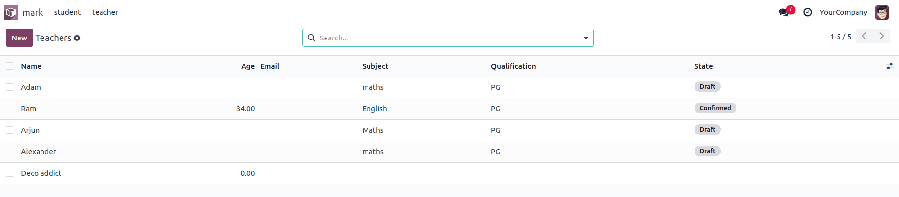
Then we get the following list view in the Odoo.

List view components
1. Field:
Used to display specific data columns in the list. Fields can have attributes like readonly, widget, and invisible to customize their behavior.
<list>
    <field name="FIELD_NAME"/>
</list>
Field Attributes:
A) name(str): The technical name of the field and it is mandatory.
B) widget(str): The widget employed to display the field can alter how the field is rendered and/or how it can be edited.
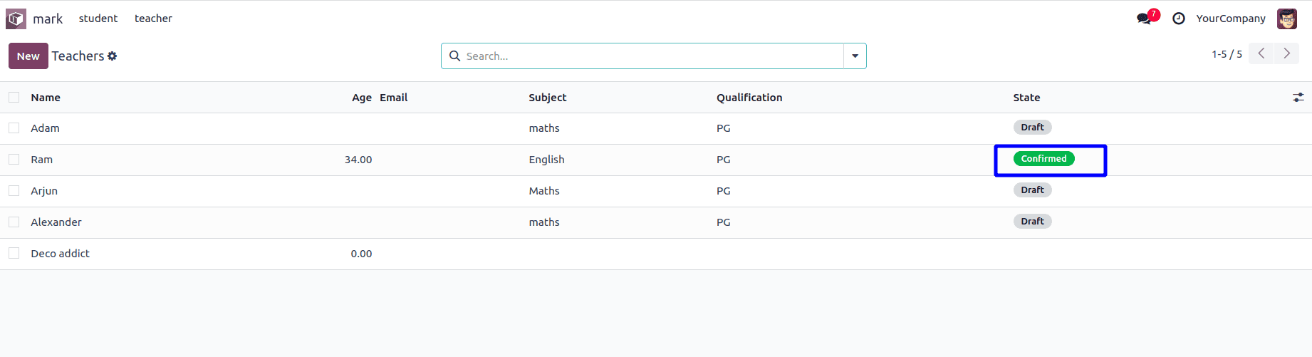
<field name="state" widget="badge"/>
Then the state values are rendered as follows.
C) string(str): We can provide the label for the field.
<field name='joining_date' string="Date of Joining"/>
D) optional(str): Allow the field's visibility to be optional, enabling the column to be hidden or shown via a button in the header of the view.
<field name='subject' optional="hide"/>
<field name='qualification' optional="show"/>

E) readonly: We can make the field is editable or not by giving true or false or Python expression.
<field name='subject' readonly="state != 'draft'"/>
<field name='qualification' readonly="1"/>
F) required: We can make this field as mandatory by setting this attribute.
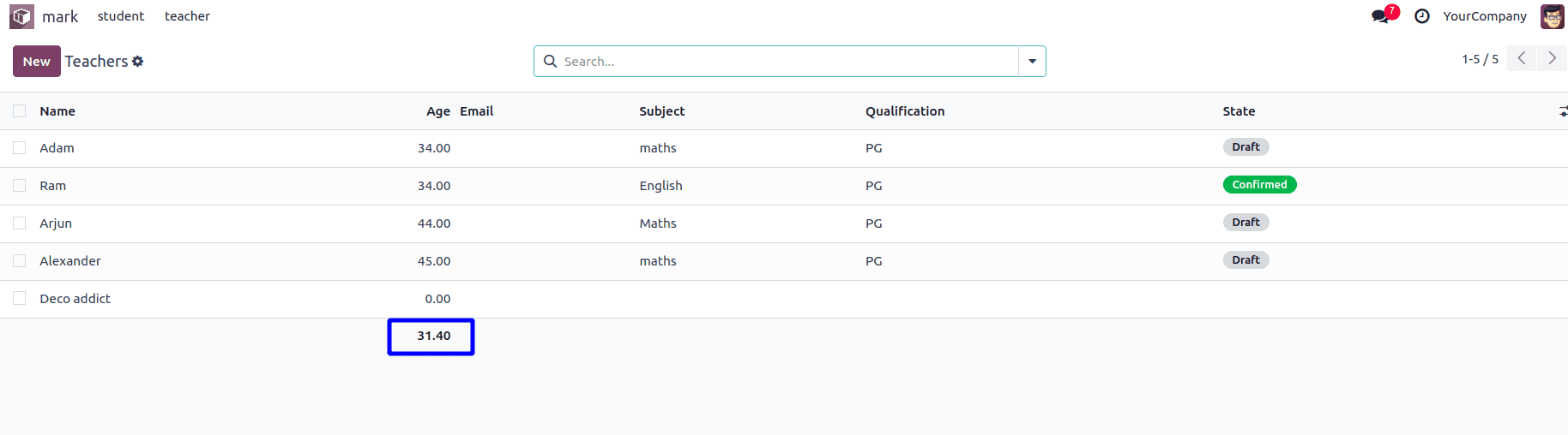
<field name='age' required="state == 'draft'"/>
<field name='email'  required="1"/>
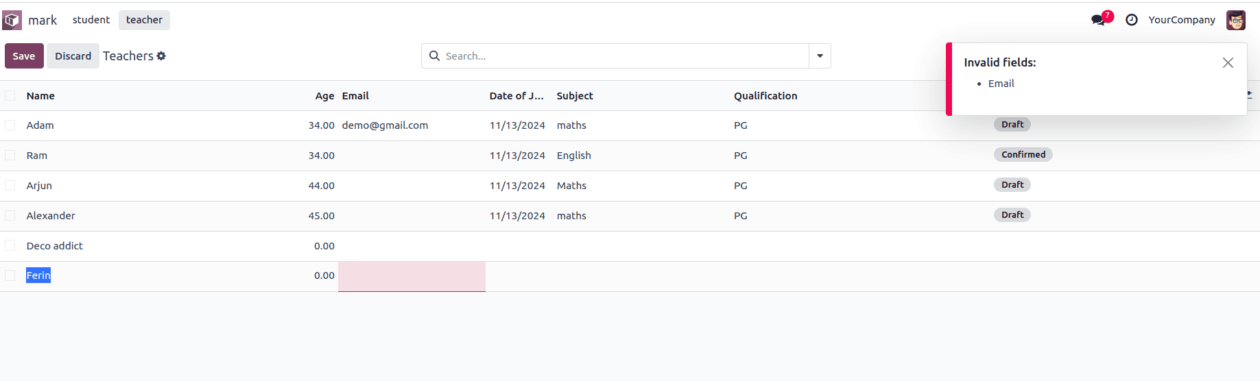
G) invisible: we can decide whether this field is visible or not.
<field name='age' invisible ="state == 'draft'"/>
<field name='email'  invisible="1"/>
In the attached screenshot, we can see that the value in the email column is hidden, and the age in the draft state record is also hidden.
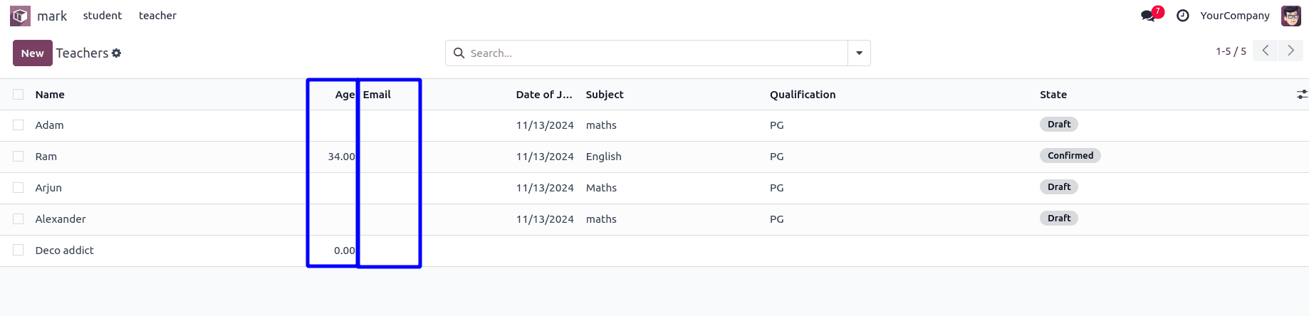
H) column_invisible: We can set the column is visible or not by setting this parameter.
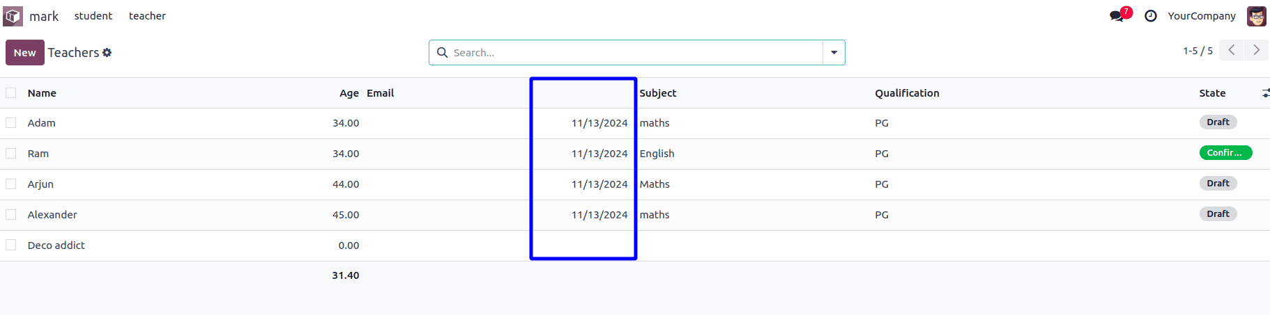
<field name='joining_date' column_invisible="1"/>
The Joining date column is hidden from the list view, unlike the invisible parameter, it affects the entire column.

We can use Python expression for the column invisible parameter in the case of one2mant fields as follows,
<field name="grade" column_invisible="parent.state == 'confirm'"/>
Additionally, the 'Grade' column is hidden for the confirmed record of the parent.
I) groups: To specify who can view the field.
<field name='joining_date' groups="base.group_no_one"/>
Only users of the specified group can view that column. We can add more groups separated by commas.
J) decoration<style>: We can add specified colors to the field based on the condition using decoration attributes.
<field name="state" widget="badge" decoration-success="state == 'confirm'"/>
K) sum, avg: Displays an aggregate at the bottom of the column, calculated from only the visible records, and aligned with the field’s aggregation type.
<field name='age' avg='Average'/>
L) width: This is Odoo 18 new feature, we can set a fixed width for the column, which helps to avoid extra space for the column.
<field name='age' avg='Average' width="40px;"/>
M) nolabel: We can hide the column header by using this parameter.
<field name='joining_date' nolabel='1'/>
2. Button
Allow users to perform actions directly from the list view. Buttons can be configured as object (calling server-side methods) or action (triggering predefined actions).
<list>
    <button type="object" name="ACTION" string="LABEL" icon="FONT_AWESOME"/>
</list>
Button Attributes:
A) type: We can define how it behaves by setting the value
* object: Invoke a method on the view's model. The button's name specifies the method, which is called with the current record ID and context.
* action: Load and execute an ir.actions action record. The button’s name is the XMLID of the action to be loaded.
B) name: Method name or xmlid of action.
C) string: The button label
D) icon: The icon to use to display the button
E) help: The tooltip message is displayed when hovering with the mouse cursor.
F) context: The context added to the view's context during the button call, defined as a Python expression that evaluates to a dictionary.
G) groups: To specify who can view the button.
H) invisible: To make hidden a specific record based on the condition
I) column_invisible: To make hidden for the entire column
J) class: To add HTML class
<list string="Teachers">
   <field name='name'/>
   <field name='age' avg='Average' width="40px;"/>
   <field name='email' invisible="1"/>
   <field name='joining_date' nolabel='1'/>
   <field name='subject' readonly="state != 'draft'"/>
   <field name='qualification' readonly="1"/>
   <field name="state" widget="badge"
          decoration-success="state == 'confirm'" />
   <button type="objet" name="action_confirm"
      string="CONFIRM"  help="To make record confirm"
           invisible="state =='confirm'"/>
</list>
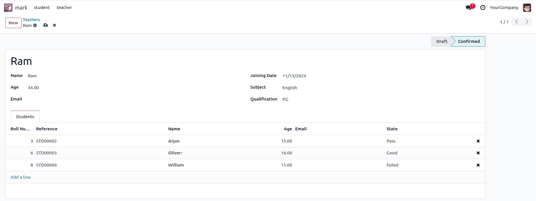
The confirm button appears in the last column of the list view and is only visible for records in the draft state.

3. Groupby
The groupby element defines group headers with buttons when grouping records by Many2one fields.
<list>
    ...
    <groupby name="FIELD_NAME">
        <BUTTONS/>
        <FIELDS/>
    </groupby>
</list>
Groupby Attributes:
A)name: Name of many2one field.
A special button element with type="edit" can be defined to open the Many2one field’s form view.
<list string="Teachers">
   <field name='name'/>
   <field name='age' avg='Average'/>
   <field name='email'/>
   <field name='joining_date'/>
   <field name='student_id'/>
   <field name='subject' readonly="state != 'draft'"/>
   <field name='qualification' readonly="1"/>
   <field name="state" widget="badge"
          decoration-success="state == 'confirm'" width="70px;"/>
   <groupby name="student_id">
       <button type="edit" name="edit" icon="fa-edit"
               title="Edit"/>
       <field name="state"/>
       <button type="object" name="action_click_me"
               title="Click me" icon="fa-star"
               invisible="state !='pass'"/>
   </groupby>
</list>
Then we get the following edit button in the group by option.

4. Header
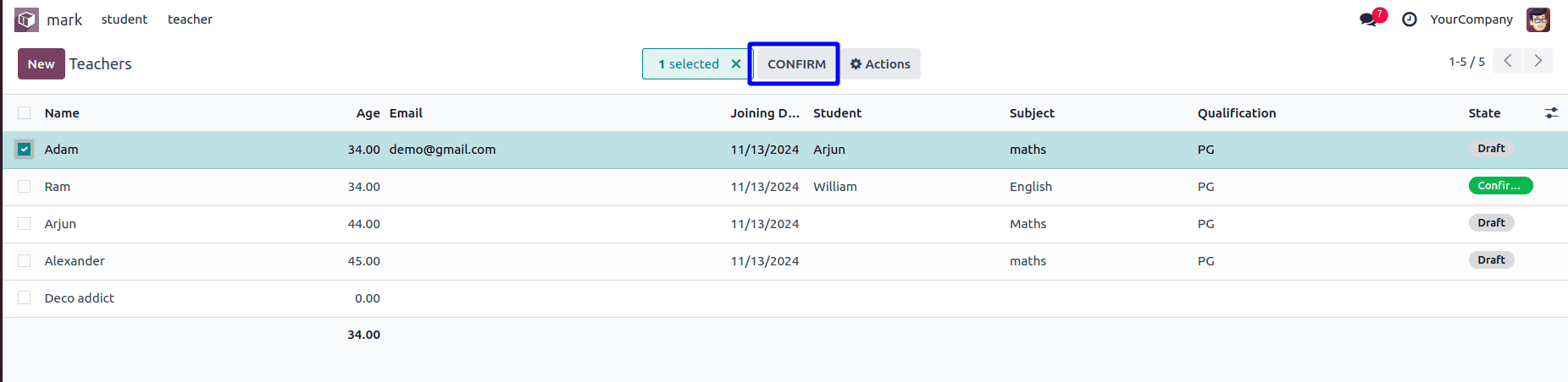
A section at the top of the list view is for global actions or information. Buttons in the header apply to selected or all records, depending on the configuration.
<header>
<button type="object" name="action_confirm" string="CONFIRM"/>
</header>
By adding this code, we get the ‘CONFIRM’ button, which becomes visible upon selecting a record as shown in the screenshot below.
If we want to display this button always, we can add display="always".
<header>
<button type="object" name="action_confirm" string="CONFIRM" display="always"/>
</header>
Then we get the following, as shown in the screenshot below.

5. Control & Create:
Manages interactive elements like the create button. The <control> tag defines a row where such buttons are placed, and the <create> element configures specific "Create" button behavior.
<list>
   <control>
       <create string="LABEL"/>
       <BUTTONS/>
    </control>
    ...
</list>
We can add this in our One2many list view as follows,
<form>
   <header>
       <field name="state" widget="statusbar"
              options="{'clickable': '1'}"/>
   </header>
   <sheet>
       <div class="oe_title">
           <h1>
               <field name="name"
               placeholder="e.g. LOT/0001/20121"/>
           </h1>
       </div>
       <group>
           <group>
               <field name='name'/>
               <field name='age'/>
               <field name='email'/>
           </group>
           <group>
               <field name='joining_date'/>
               <field name='subject'/>
               <field name='qualification'/>
           </group>
       </group>
       <notebook>
           <page string="Students">
             <field name="student_ids" mode="list">
             <list>
                <control>
                <create string="Add a student"/>
                <create string="Add a section"           context="{'default_type': 'section'}"/>
  <create string="Add a note"
       context="{'default_type': 'note'}"/>
  </control>
        <field name='number'/>
       <field name="name" decoration-bf="1"/>
       <field name="age"/>
                       <field name="email"/>
                   </list>
               </field>
           </page>
       </notebook>
   </sheet>
</form>
Attributes:
* string: The button’s text.
* context: The context merged into the view's context during the button's execution is defined as a Python expression that evaluates to a dictionary.
As a result, we get the following views.

The List View in Odoo is highly customizable, with elements like <field>, <button>, <header>, and <control> working together to provide an interactive and user-friendly interface for managing records. Proper use of these components ensures efficient navigation and operation within the system.
To read more about An Overview of List View Parameters in Odoo 17, refer to our blog An Overview of List View Parameters in Odoo 17.