In Odoo, you can leverage various field widgets such as radio buttons, floats, percentages, color selectors, checkboxes, status bars, and URLs to enhance the user experience. By utilizing different rendering templates, you can tailor the interface to meet specific requirements, making development more efficient and visually appealing.
This guide explains how to create a progress bar in Odoo 18.
Step 1: Creating the Progress Bar Template
Begin by defining a new template named ProgressBarWidget in a file called progress_bar_widget.xml. This template uses two CSS classes: progress-bar-inner for styling the progress bar and progress_number to display the progress percentage. You can customize the appearance and styling to meet your needs.
<?xml version="1.0" encoding="utf-8"?>
<templates id="template" xml:space="preserve">
   <t t-name="ProgressBarWidget" owl="1">
       <div t-ref="ProgressBarWidget-root">
           <div class="progress_bar">
               <div class="pro-bar">
                   <span class="progress-bar-inner"/>
                   <span class="progress_number"/>
               </div>
           </div>
       </div>
   </t>
</templates>
Step 2: Adding Styles for the Progress Bar
Define the styles for the progress bar using CSS. The progress bar-inner class controls the width and background color of the progress bar, while progress_number positions the percentage text.
.progress_bar .pro-bar {
   background: hsl(0, 0%, 97%);
   box-shadow: 0 1px 2px hsla(0, 0%, 0%, 0.1) inset;
   height: 4px;
   width: 200px;
   margin-bottom: 15px;
   margin-top: 10px;
   position: relative;
}
.progress_bar .progress_number {
   float: right;
   margin-top: -6px;
   margin-right: -50px;
}
.progress_bar .progress-bar-inner {
   background-color: green;
   display: block;
   width: 0;
   height: 100%;
   position: absolute;
   top: 0;
   left: 0;
   transition: width 1s linear 0s;
}
.progress_bar .progress-bar-inner:before {
   content: "";
   background-color: hsl(0, 0%, 100%);
   border-radius: 50%;
   width: 4px;
   height: 4px;
   position: absolute;
   right: 1px;
   top: 0;
   z-index: 1;
}
.progress_bar .progress-bar-inner:after {
   content: "";
   width: 14px;
   height: 14px;
   background-color: inherit;
   border-radius: 50%;
   position: absolute;
   right: -4px;
   top: -5px;
}
Step 3: JavaScript for Updating the Progress Bar
Next, create the logic for the progress bar using JavaScript. The component will initialize with the setup method, and the progress bar will be updated using the onUpdateProgressBar function. This function calculates the width of the bar based on the provided value (either a float or an integer).
/** @odoo-module **/
import { registry } from "@web/core/registry";
import { standardFieldProps } from "@web/views/fields/standard_field_props";
import { Component, useRef, onMounted, onPatched } from "@odoo/owl";
export class ProgressBarWidget extends Component {
    setup() {
        this.root = useRef('ProgressBarWidget-root');
        onMounted(this.onUpdateProgressBar);
        onPatched(this.onUpdateProgressBar);
    }
    onUpdateProgressBar() {
        if (this.props.record.data[this.props.name] <= 100) {
            this.widthComplete = parseInt(this.props.record.data[this.props.name] / 100 * 100);
        } else {
            this.widthComplete = 100;
        }
        this.root.el.querySelector('.progress-bar-inner').style.width = this.widthComplete + '%';
        this.root.el.querySelector('.progress_number').textContent = this.widthComplete + '%';
    }
}
ProgressBarWidget.template = 'ProgressBarWidget';
ProgressBarWidget.props = standardFieldProps;
ProgressBarWidget.supportedTypes = ["float", "integer"];
registry.category("fields").add("progress_bar_widget", {
    component: ProgressBarWidget,
});
Register the widget in the Odoo registry by adding it to the "fields" category. The widget supports both float and integer field types.
Step 4: Using the Widget in a Form View
Now that the progress bar widget is ready, apply it to any field by specifying it in your XML form view.
<field name="progress" widget="progress_bar_widget"/>
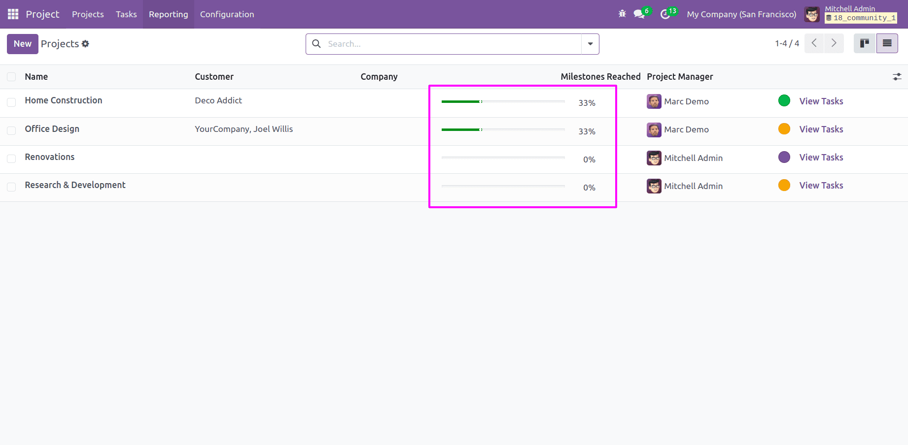
You can test the widget on the milestone_progress field of the project model. The form will look as follows:
<odoo>
    <record id="view_project_form_inherit" model="ir.ui.view">
        <field name="name">project.project.form.inherit</field>
        <field name="model">project.project</field>
        <field name="inherit_id" ref="project.view_project" />
        <field name="arch" type="xml">
           <xpath expr="//field[@name='milestone_progress']" position="replace">
               <field name="milestone_progress" widget="progress_bar_widget"/>
           </xpath>
        </field>
    </record>
</odoo>
The result will be a visually dynamic progress bar indicating the progress of project milestones.

Conclusion
With the progress bar widget in Odoo 18, you can provide a visual representation of task completion across various modules. This solution offers an intuitive and graphical way for users to track task progress, automatically updating based on metrics such as timesheet entries or other relevant values. This not only enhances user experience but also makes monitoring project performance straightforward and engaging.
To read more about How to Create a Progress Bar in Odoo 17, refer to our blog How to Create a Progress Bar in Odoo 17.